|
|
 Clint Tompkins
 {K:1347} 4/17/2007
|
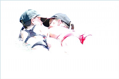
Nice Buns too! It just misses for ME; but what do I know!
Painter Clint
|
|
|
|
 Wayne Winsauer
{K:7331} 2/11/2007
Wayne Winsauer
{K:7331} 2/11/2007
|
Chris, This one is excellent!
I know th pros are saying to tone it down a bit but personally I like the high contrast and the high key effect here. I also like how their caps shade their eyes just enough to catch their faces without being blown out or too dark. Nice creative work!
|
|
|
|
 Jose Ignacio (Nacho) Garcia Barcia
{K:96391} 1/26/2007
Jose Ignacio (Nacho) Garcia Barcia
{K:96391} 1/26/2007
|
very cool. creative portafolio.
|
|
|
|
|
chris d
{K:3046} 1/12/2007
|
Thanx for commenting Tim. I asked for and got your honest opinion which I appreciate.
If the dark hats and bathers were'nt there, there would be nothing left tho....
(unless you meant to crop to just the bums?)
|
|
|
|
|
chris d
{K:3046} 1/12/2007
|
Thanx for the critique Richard, your point is well taken. I suppose a little less might have made at least for an interesting alternative option...
|
|
|
|
 vanessa shakesheff
{K:68840} 1/7/2007
vanessa shakesheff
{K:68840} 1/7/2007
|
Great hi key contrast ..lovel it .7/7..nessa
|
|
|
|
 Timothy Yap
{K:997} 1/6/2007
Timothy Yap
{K:997} 1/6/2007
|
Honestly I'm not sure about this one Chris. I think Hi-key works best with similar light colours such as your other work http://www.usefilm.com/image/1107447.html
(excellent btw) whereas here the dark hats and bathers throw this one off I feel. All the best.
|
|
|
|
|
Richard DuCroix
{K:1142} 1/6/2007
|
this is a great shot...i love high key work although i think this one may have worked a little better if it was toned down just a bit, just to get a little more seperation of the bodies.
|
|