|
|
 Engy Farahat
{K:11591} 8/9/2006
Engy Farahat
{K:11591} 8/9/2006
|
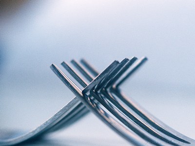
Excellnet close up Ahmed. great & creative idea!
I like the soft tones. and excellent DOF.
well done
ng..
|
|
|
|
|
Malak Rashad
{K:643} 8/7/2006
|
oh, and i dont agree about cutting off the upper part. i especially liked the grading and change of colour, otherwise it would have been a bit monotonous..
malak
|
|
|
|
|
Malak Rashad
{K:643} 8/7/2006
|
excellent abstract, ahmad. i like this one the most in your 'forks' seires :) the bluish tone gives it a calmer feel. great depth of field. i think i'll add it to my faves! ;)
regards,
malak
|
|
|
|
 AHMAD BORHAM
{K:1362} 4/25/2006
AHMAD BORHAM
{K:1362} 4/25/2006
|
thanx ayman for ur architectural comment..it's amazing how a single photo or object can inspire differnt people with diffrenet thoughts...u haven't been photographically active lately...busy working??!!..waiting for ur latest creative additions...
|
|
|
|
|
Ayman M.Abdo
{K:87} 4/24/2006
|
if u give me the permission, i will call it Calatrava, remind me with his mechanical and dynamic structures and architecture, as usual i like your work, the orange prints & the DOF are the keywords, i like it and the cropping is perfect... well done borham.
|
|
|
|
 ahmed saied
{K:8734} 4/20/2006
ahmed saied
{K:8734} 4/20/2006
|
Wounderful abstract Ahmed , i like the oftnes and the tones .
well done
|
|
|
|
 Nour El Refai
{K:12481} 4/20/2006
Nour El Refai
{K:12481} 4/20/2006
|
even more creative, excellent work, i agree about croping the upper part, perfect lighting and title
|
|
|
|
|
Galal El Missary
{K:84569} 4/19/2006
|
Creative mind ya Ahmed , very well taken .
Galal
|
|
|
|
 Omnia Mamdouh
{K:5107} 4/19/2006
Omnia Mamdouh
{K:5107} 4/19/2006
|
Good shot Borham, i like the tones & composition.Good name 2.well done
|
|
|
|
|
Nandor Lang
{K:1257} 4/19/2006
|
Nice one!
I would crop the upper 1/4
|
|
|
|
|
AHMAD BORHAM
{K:1362} 4/19/2006
|
glad u like it shimo..
in general every photo generates it's own concept...and how fun it is when we reread our own photos shooting them..thnx for ur comment
|
|
|
|
|
Shaimaa Hamza
{K:336} 4/19/2006
|
BORHAM!!!!!!
it is just wonderfull, i think you kept the best for the end ;)
eeeh dah tegannen , i love the blue tone , yet the orange reflection of the early morning ...
it reflect this nice atmospher of the chilly early morning..
of course the name is very nice , coz the one you posted before i didnn'y like the name of the fighting evils or something like that..
i thought of a more positve name...
and today you namded your latest foks with a very nice positive name :)-good!!
the focus and the DOF are just lovely....
it is even much better than your black and white ones ....
7elwa awi:)
|
|
|
|
|
Fabio Keiner
{K:81109} 4/19/2006
|
excellentissimo abstract
|
|
|
|
 carlo raingini
{K:11977} 4/19/2006
carlo raingini
{K:11977} 4/19/2006
|
another great macro. effective title. great work my friend. congrats,
carlo
|
|


")