|
|
 Martin .
 {K:24957} 4/3/2006
|
Sam III,
LMAO... Give it to him Sam. Where did this clown come from? What rock did he crawl out from under? Shall I go play with him a bit, Please?
Long time my friend. I just love every thing about this 1. Great glass indeed... I like the brown tint, as well... Ansel would have been very proud of you regarding this "Masterpiece".
Keep up the "Outstanding" work my friend,
Marty
|
|
|
|
 Sam Graziano III
{K:14064} 4/3/2006
Sam Graziano III
{K:14064} 4/3/2006
|
Hi Sal
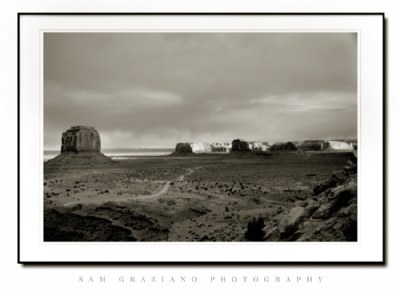
On This preticular Shot I included a slight tint of light brown in a layer mask and set the mask layer to multiply.
I don't think your monitor is off. I will post one today with out the Brown. Let me know if you have the same view.
Thanks for viewing my work and taking the time to comment on it.
Best Regards
Sam Graziano III
|
|
|
|
|
Salvatore Rossignolo
{K:13559} 4/3/2006
|
Without question, one of the most spectacular places on the planet. I've never been here Sam but you've conveyed perfectly here the scope and wide-openness of this scene with this perfectly composed shot.
Sal
PS Sam I need your help, I just got my Huey ( http://www.pantone.com/products/products.asp?idArea=2&idProduct=103 ) and adjusted my laptop with it and this picture looks slightly on the greenish/brown side of black and white. Was that your intention or is thing cock-eyed? thanks,
Sal
|
|
|
|
|
Sam Graziano III
{K:14064} 4/2/2006
|
Hi Douglas, I guess you felt the need to critique my work once again. Can you please explain where the shot is missing the attributes of the zone system? and the f64club as far as the DOF goes?
The top and bottom of the frame were designed the way I wanted them to be. When I Look at the Shot...I see good Tonal qualities. Like Hugo Suggested, I re-looked at my shot and realized that my sky was lacking.
I Shot this with an L-series Lens at f22, the shot was tri-pod and a shutte release was used.
So I don't think there was anything soft about the shot at all.
I dedicated the shot to Ansel Adams not for my quality of work...Because My work wouldn't even be on the same planet as his. But tributed it more for the location of my shoot.
Here Goes the problem I have you critiqueing my work.
1. You do not help people learn, if you would explain yourself in greater detail and gave tips to help them out....(that is what this site is all about!!!)
2. You dish out critique, but whine like my 7year old if you don't get a high rating for your work or if you get a bad rating.
3. you Can never compliment anyones work.
4. You have not posted a shot that was taken in this decade. All of your shot are from a long while ago.
5. The composition of your work is spot on. But the was you process your shots doesn't always please anyone. Art is subjective. what looks good to you may look terrible to another.
6. You can critique my work if you can offer your opinions of what you see wrong with the image, and Tell me what I could have done to improve the image. If you can't agree to that, then please do not critique my work. Fair enough???
So with that being said. Would you care to go into a bit more detail of what I should have done to improve my image.
Thanks for your scrutiny of this image. Next time try helping Photographers out instead of bashing or looking for the minute detail of what may or may not be wrong with an image.
Remember of thing Douglas, when viewing Photographs on the web 60% or greater of the images resolution is lost by posting in Jpeg. Plus there are great big differences in peoples monitors. An images that is work flowed and is satifactory to one person on their monitor may be to light or dark on anothers monitor. so you have to take that into concideration.
And Try and have a fantastic day over there in paridise(Hawaii).
Sam Graziano III
|
|
|
|
 Hugo de Wolf
{K:185110} 4/2/2006
Hugo de Wolf
{K:185110} 4/2/2006
|
Hi Sam, My only thought would be to equalise the tone of sky and foreground a bit more, but other than that, I think there's not much to suggest; it's a beautiful photo and scene, very well captured.
Cheers,
Hugo
|
|
|
|
 Pooriya Zarrabi
{K:3836} 4/2/2006
Pooriya Zarrabi
{K:3836} 4/2/2006
|
nice toning and perfect angle...
|
|
|
|
 Sergio Cárdenas
{K:25028} 4/2/2006
Sergio Cárdenas
{K:25028} 4/2/2006
|
Great work in this tones. I like this composition, DOF and contrast. Well done!
Beautiful presentation too, great frame.
My best regards
|
|
|
|
 神 風
{K:10665} 4/2/2006
神 風
{K:10665} 4/2/2006
|
The image itself is basically descent and the presentation is exhibitionally professional with quite acceptable typesetting although the top and bottom borders are narrower than the left and right margins ...
I am also wondering why you have selected the title as you have: "Tribute To Ansel Adams" when I do not see imho the attributes of the 'Zone System' relative to a wide range of B&W Tones nor values of the 'F64 Club' pertaining to depth of field ...
Perhaps someone else who has extensively studied the works of other 'Sierra Club Members' such as Edward Weston or the like might possibly desire to join me in further constructive scrutiny of this piece ...
Thanks for sharing for now nevertheless ...
|
|
|
|
 Jason Mckeown
{K:22200} 4/2/2006
Jason Mckeown
{K:22200} 4/2/2006
|
this is the quality i've come to expect from you Sam. Beautiful
|
|