|
|
 Kerry Nobbs
{K:2800} 5/30/2007
Kerry Nobbs
{K:2800} 5/30/2007
|
Nice job putting this together. I like them in order from top to bottom but together as one picture it is really good. Kerry
|
|
|
|
 Michael Kanemoto
{K:22115} 5/30/2007
Michael Kanemoto
{K:22115} 5/30/2007
|
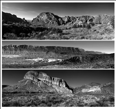
This is an older posting. The selections have been loaded in color and at a larger scale:
http://www.usefilm.com/Image.asp?ID=1036078
http://www.usefilm.com/Image.asp?ID=1036083
http://www.usefilm.com/Image.asp?ID=1036277
http://www.usefilm.com/Image.asp?ID=1032906
|
|
|
|
 Doyle D. Chastain
 {K:101119} 5/30/2007
|
Michael:
Wow . . . I think some very good work, but hooking them together makes for smaller, harder to critique images . . . individually, we would get to check it out in full panoramic size.
At this scale . . . I can point out only a couple of things which seem to strike my eye. The top image, along the central to right side mountaintops . . . I seem to detect a slight halo. I was thinking it might be back lighting . . . but not likely along the entire range like that. The top image also seems to have a clipped or rounded lower right side corner which, ideally, should be pointed like the others even if you have a tad bit of cloning needed to do it. (Opinion, I know - LoL!)
I prefer the top and central images for the skies and the range with variable light that exists in them. They both also seem to show a better depth . . . in the canyon on the top image and in the right side of the central shot . . . with significant drop in focus in the distance to really add impact to that feeling of depth.
At this scale . . . I don't see any issues which are of any concern to me in the bottom image. Just personal preference . . . I imagine . . . makes it my least favorite of the three. All three, though, are quite nice. Exceptional quality work despite the seemingly low rating.
Regards,
Doyle I <~~~~~
PS: There is also possible compression issues on the right side of the central image in what may be banding in the sky. Can't tell for sure, just something for you to look at and decide. :)
|
|
|
|
|
Michael Kanemoto
{K:22115} 5/30/2007
|
Taran:
I agree. I like usefilm precisely for the feedback and all of these went through some changes. I've learned now to appreciate the foreground and background, and to try to build a complete scene when I photograph. Thanks for the critical comment.
|
|
|
|
 taran
{K:1284} 5/30/2007
taran
{K:1284} 5/30/2007
|
I will just chime in that none has a strong element in the foreground. I like landscapes that have stuff in the foreground as well as the background... perhaps next time you could find an interesting tree, a shrub or a flowering bush next time you frame these shots.
They are perfectly fine landscapes, but leading the eye from the front to the back of the frame would help all 3 images.
Just my 2ç.
Always a big fan of your work.
|
|
|
|
 Fadel J
{K:13974} 1/15/2006
Fadel J
{K:13974} 1/15/2006
|
I agree with what have been said Michael, top and bottom are most appealing, and I would have preferred the bottom if there was more sky. I absolutely love the tones of the 3 of them!
|
|
|
|
 Tom Vernon
{K:384} 1/14/2006
Tom Vernon
{K:384} 1/14/2006
|
OOPS! I meant the bottom one...silly me!
The BOTTOM ONE gets the vote.
Sorry.
|
|
|
|
|
Tom Vernon
{K:384} 1/14/2006
|
The top one's nice, but the bottom one is much more interesting...not to mention much less contrasty. The middle one balances them all. If we're judging your best technical work...I'd say the top one.
|
|
|
|
 Roger Williams
{K:86139} 1/14/2006
Roger Williams
{K:86139} 1/14/2006
|
I see your're still working with panoramas. This is a fine set and a tribute to your stitching. I hope you will upload the winner as a panorama 1200 x 300 for us to enjoy the details. The only problem with the top one, which IMHO is the very intense shadows on the left, is probably due to the difference in lighting that naturally comes with pointing the camera in such different directions (when you take 360-degree panoramas as I do you get that problem in spades). And if you adjust the contrast/brightness to reveal the shadows, the sky shows as uneven, so your coice is probably the best that can be done, although there are a couple of tricks to try. The top one gets my vote, although with just a leetle more sky the bottom one would be fine, too.
|
|
|
|
 Ann Nida
{K:45248} 1/14/2006
Ann Nida
{K:45248} 1/14/2006
|
How ironic that my comment on this image makes the front page when my opinion is a stand alone one and the majority likes the upper version. Oh well...different strokes for different folks I guess. That's what makes us all unique. I'm quite humbled after reading the various reasons for choices and almost inclined to change my mind but am too embarrassed now. 
Congratulations for making the front page Michael. A beautiful collage of photos and each one is a good strong images.
Cheers - Ann :)
|
|
|
|
 Nour El Refai
{K:12481} 1/14/2006
Nour El Refai
{K:12481} 1/14/2006
|
the one i like the most is the upper one, because of different levels of scales and contrasting shapes and light
|
|
|
|
 Andre Denis
{K:66407} 1/14/2006
Andre Denis
{K:66407} 1/14/2006
|
Michael,
I think the top image is going to be the hands down winner due to the general appeal of the balance in the sky/land proportions. As mentioned before, if there is not enough sky in a panaramic view, the image tends to look pinched from the top. (if that makes sense) If there was a body of water of some kind in the foreground before the mountains/rocks, then that would be a different story.
The top image also has some appealing cloud detail to add to the image. That never hurts.
Great job on all of them! My vote also goes to the top.
Andre
|
|
|
|
|
So Cal Photograhper
{K:18529} 1/14/2006
|
I'd have to say the one that I like best is the top one. I love the amount of contrast and the sharpenss of the rock formations.
Overall the top one to be is most eye pleasing. There is a perfect balance of foreground, the rock formations and the sky.
I also like the view in the distance - it gives the viewer a feeling of the grand scale of this place.
|
|
|
|
 Roberto Arcari Farinetti
{K:209486} 1/14/2006
Roberto Arcari Farinetti
{K:209486} 1/14/2006
|
marvelous...
congrats
roby
|
|
|
|
 Paul's Photos
{K:35235} 1/14/2006
Paul's Photos
{K:35235} 1/14/2006
|
excellent.... nice series.. they are all great... congrats on the FC
|
|
|
|
 brian underdown
{K:-960} 1/13/2006
brian underdown
{K:-960} 1/13/2006
|
i think all are excellent b/w work,however if theres a choice to make then it is the top one for simply it has the rule of thirds done right.
|
|
|
|
|
Michael Kanemoto
{K:22115} 1/13/2006
|
Jim:
Thanks for the vote, looks like the top image is currently ahead in the vote. I'm going to rethink the bottom composition.
|
|
|
|
|
Jim Goldstein
{K:21230} 1/13/2006
|
I should also mention the top one is my personal favorite. There is a greater sense of space. The others with the shallower inclusion of sky have a different feel to me.
|
|
|
|
|
Jim Goldstein
{K:21230} 1/13/2006
|
Great shots and unique presentation.
I think the bottom image could use more sky above the mountains, but other than that this looks sharp all around. It looks like the individual panoramics stand on their own quite nicely.
|
|
|
|
 Jeanette Hägglund
{K:59855} 1/13/2006
Jeanette Hägglund
{K:59855} 1/13/2006
|
Beaurtiful and fit so perfectly as B/W.. ilike the format as well.
Jeanette
|
|
|
|
 Ace Star
{K:21040} 1/13/2006
Ace Star
{K:21040} 1/13/2006
|
hi again! just checkin your portfolio i like your style of photography! will comment on them :)
make it 2 for the top one hehe :P
|
|
|
|
 Hugo de Wolf
{K:185110} 1/13/2006
Hugo de Wolf
{K:185110} 1/13/2006
|
Hi Mike,
The middle one would be my nr 3 choice, as it's less inspiring. Undoubtedly a beautiful scene, but visually, theres's not much going on; the formation in the back stretches basically from left to right. The heap in front (bad phrasing, but you surely get my drift) is nice, but not enough to compensate, IMO.
The top and bottom one are more difficult to chose between, but I have made my choice: Second place: the lowest pano. The rockformations are much more pleasing to the eye, and I like the strong gradient in the sky, as well as the strength of the geological lines. with their individual angles with the horizon.
My number one choice is the only one left: The top one. Why?
Mainly because of two things. the difference between shadowy parts and sunlit parts is visually very pleasing, and the finishing touch is the opening on the left side, allowing the viewer a glimpse at the horizon. I also think the tonal range / balance in the top pano is the strongest from the three. And third, the trees add the finishing touch here. Only the rock formation is outclassed by the one in the lowest pano.
Hope this is of some use. Looking forward to your views / decision on this...
Cheers,
Hugo
|
|
|
|
|
Ann Nida
{K:45248} 1/13/2006
|
 For my tastes and in my honest opinion here's what I have for you in a nutshell Michael.
The top one has too much dark on the left side of the image.
The centre one is excellent as it shows a great wide angle and to me is a nice subject worthy of such a panorama.
The bottom one appears to have not enough sky for the large main subject. I would hjave liked to have given that great rock formation more space to breathe so a bit more sky would have worked better for me.
Having said all that I like the centre work the best.
All this coming from soneone who is jealous of such great work and who cannot do panoramas. I haven't tried this stitching of images yet but if and when I do delve into this area I hope I can do half as masterfully as you have done here. Lovely tonal depth in all these images. Beautiful work.
Cheers - Ann :)
|
|
|
|
|
Michael Kanemoto
{K:22115} 1/13/2006
|
Thanks Ace -
The top is Sunset view. I like it as well. That is one vote for the top photograph!
I should add all of these are about 120 degree sweeps through the landscape.
|
|
|
|
|
Ace Star
{K:21040} 1/13/2006
|
sorry! i like all of them but like the first one alot ... because the shape of the rocks r pretty diffrent :) lil dark but i like it
good luck
|
|
|
|
|
Ace Star
{K:21040} 1/13/2006
|
stunning landscapes! love in B&W .... good capture Michael :)
regards
|
|