|
|
|
Sandra Bozic
{K:3963} 1/10/2004
|
He,he,  ) )
..Great!
|
|
|
|
|
Getulio Melo
{K:6481} 9/4/2003
|
F A N T A S T I C ! ! !
|
|
|
|
|
gilberto barron
{K:172} 8/19/2003
|
me gusta definitibamente la compocicion es buena
|
|
|
|
|
Valbona Shujaku
{K:71} 8/19/2003
|
wow very impresive
|
|
|
|
|
Pedro Beça Múrias
{K:2076} 6/10/2003
|
Fabulous
|
|
|
|
|
Earl Ortman
{K:187} 6/10/2003
|
Helena, You have a great photo here. From me you have the highest rating possible and I feel well deserved.
|
|
|
|
 Maurizio Massetti
{K:30463} 6/10/2003
Maurizio Massetti
{K:30463} 6/10/2003
|
Dramatic!
|
|
|
|
|
Daniel Headrick
{K:570} 5/7/2003
|
Great color, mood and texture! Composition and cropping is highly original!
|
|
|
|
|
B:)liana
{K:30945} 5/7/2003
|
Bravo! Beautiful fine photograph! Excellent creativity!
|
|
|
|
|
Gerhard BuschEFIAP/AFIAP
{K:18382} 5/7/2003
|
Interessante Idee.
Gruß Gerhard
|
|
|
|
|
Bernt Carlzon
{K:554} 5/7/2003
|
Great work!/Bernt
|
|
|
|
|
Shannon Richardson
{K:1004} 4/27/2003
|
original imagery.
|
|
|
|
|
GP Merfeld
{K:14396} 4/4/2003
|
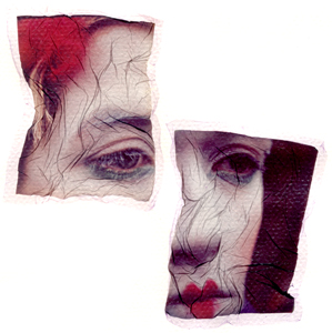
Helena, you should be proud... This image was submitted over two years ago, and here people are still discussing it! ;-). Granted, this latest round is due to the Editor's Choice selection.. But it does drive the point to me that illiciting response and discussion is so much more valuable than just a couple kind words and lots of check marks... There will always be a mix of personal taste and more objective technique issues when reviewing a photo, and I must first say that your technique is wonderful here... Perhaps partly due to the fact that you did it "by hand." If I had done this in Photoshop, I am sure that more people would scoff and accuse of "over the top Manipulation." Which somewhat bothers me, as it is the final image that counts, not the method used to get there, but that is another topic... What does sort of get me here, is how people say "it's been done before," or "it is derivative." Hello! Like, what image has not been done before??? It is the personal sense, vision, or technique that you bring to an image that is your own - certainly there are very few new subjects in the photographed world - only new ways of seeing them, presenting them, or creating an emotional response with them... Sometimes there is even great personal reward in mimicking a certain photographer's style, if it is successful, and knowing only that YOU created this piece that could be mistaken for his... It is all part of the learning process and growth as an imagist...
There will always be this mix of personal taste and analysation of technique when reviewing an image, but we must be careful to better distinguish between the two... Someone like Joel Peter Widkin expresses absolutely incredible technique when rendering images that are of the utmost nightmarish subject matter... On the other hand, yet another pretty sunset picture may cause someone else to wretch and reach for the insulin... I personally find your image to be technically very well rendered, and I also find that it has emotional impact as well... And the very best thing is that it has garnered real discussion. Congratulations! ;-)
|
|
|
|
|
Katherine Hagen
{K:2359} 4/4/2003
|
Helena...this is beautiful. Sometimes one thinks they have seen it all and start to get tired of same thing and poof someone comes along with something creative and it gets the old thought process jazzed again. This is so appealing because of the composition of the pieces; just the shape and edges on the pieces; and that incredible patina on the face. Bravo
|
|
|
|
|
M@rk M@rk
{K:6} 4/4/2003
|
COMPLIMENTI, UNA BELLA COMPOSIZIONE
|
|
|
|
|
K. Lazlow Hud
{K:342} 4/4/2003
|
I applaud anyone pursuing their vision regardless of how it is received. However I do tend to believe this example is good but derivative at best. There is not enough of the photo showing (composition, context etc.) to make accurate criticsm of its basic elements.
I am off to look at Helena's portfolio now to see if I can undertand her purpose here and possibly allow me to re-evaluate. However I am rating and commenting first to give a purer version of my reaction.
I find it more disturbing that this is the Editor's Choice. I don't see it and recent editorial choices seem to be well out of step with the choices of the community. While this is in a sense great, leadership must be shown or the community itself may start to drift. Let's face it, there are artists out there who are composing in order to win the Editor's Choice. I'd hate to see this great site descend to the "This Is My Cat, Fluffy" type of pictures that diminish and render irrelevant other similar sites.
I voted 5's to 6's because I feel the image warrants that rating.
|
|
|
|
|
ROBERT G. DAVIS
{K:708} 2/9/2003
|
DEFINTELY AN EYE STOPPER........GREAT CONCEPT.......RD
|
|
|
|
|
ROBERT G. DAVIS
{K:708} 2/9/2003
|
DEFINELY AN EYE STOPPER........GREAT CONCEPT.......RD
|
|
|
|
|
Jeremy Myers
{K:222} 1/13/2003
|
Helena
I think you should feel honored that this piece has stirred the level of conversation it has. First, let me say, I am a big fan of the emulsion lift. The collage of the two images has wonderful continuity and the manipulation of the emulsion to create the wrinkles goes very well with the overall mood of the image. Great attention to detail in the direction of the cracks and wrinkles, as I think most are contributing to the strength of the image and create a dimensional contour. The photograph is gripping with emotion and explosive in its colours. Kudos on a wonderful, unique and successful variation on an image that we do see often. The other sad clown photographers can only aspire to be as creative as you have been here. I look forward to seeing more of your images!
|
|
|
|
|
Helena K Karlsson
{K:23} 8/23/2002
|
Ronald it is great that you have a different opinion! That is what we all need... What would we all be if we all loved Corinne Day and her light meter in Mobys album cover!?!
|
|
|
|
|
John Doe
{K:155} 8/23/2002
|
I just visited torn_sad_clown.com and then drove to BIG JOE'S SAD TORN CLOWN PHOTO EMPORIUM - it really is such a trite cliché'. These torn sad clowns are everywhere. I think the real innovators are working with architecture, landscapes and pets.
|
|
|
|
Jeroen Wenting
 {K:25317} 8/23/2002
|
Well George, Terrence never claimed it had a lot of content, just that it had content. He didn't state an amount and even a small amount thus qualifies.
|
|
|
|
|
Terrence Kent
{K:7023} 8/23/2002
|
yes, as always its true that the majority of comments are going to be positive and not really constructive, sometimes you just need to express the fact that you are impressed by someone's image and getting into the specifics of why is redundant, i don't think there's anything inherently wrong with that. However, we all want more in depth critiques, its unfortunate that these mainly come out when we aren't satisfied with the image, but that's not terrible - the important issue is to not insult someone when you're explaining to them why that is. It's not that hard to be (or at least sound) objective when you critique, just try using a little tact instead of shocking ppl into paying attention to what you have to say.
Anyway, i tend to agree with Ron, on its own this would be an excellent portrait, great light and subject and so forth, a classic. For me, the ripped and disjointed display makes sense and works, but also seems over the top, as ron put it, it does approach cliche'. There is plenty of "content" here, whether its been "done" before or not is immaterial, let's not delude ourselves into thinking we have the be and end all of artistic taste (for the record the Boris Mikhailov image doesn't do anything special for me either, but im certainly not going to claim it has no "content")
|
|
|
|
|
ronald leive
{K:53} 8/23/2002
|
example of Boris Mikhailov
|

|
|
|
|
|
ronald leive
{K:53} 8/23/2002
|
i'd like to refer to an article about negative critique. I find it striking that most of the comments are like: 'great picture', 'a job well done' and so and so on.
I do have to learn more? Do you think i don't get the content? I just think that it is a cliche-picture: a sad clown torn apart.It's like painting the blue sky blue. The tearing doesn't contribute to the picture. I'd just like to start a discussion in order to get real oppinions. It may be to disturbing for you? Maybe i am focussed on a different field of photography, like Nan Golding or Boris Mikhailov. They don't 'please' the audience like most photographers. Does the 'sad clown' touch you? Not me.That's what i mean by mentioning 'the content'
|
|
|
|
|
al shaikh
{K:15790} 8/22/2002
|
Ronald you may want to learn a bit more before asking where is the content, to most of us it's quite obvious.
|
|
|
|
|
ronald leive
{K:53} 8/19/2002
|
i am sorry to see you use a photographic cliche.The technique could be interesting, but where is the content?
|
|
|
|
|
Kathy Hwang
{K:142} 5/26/2002
|
Love this photo!
|
|
|
|
|
Helena K Karlsson
{K:23} 7/15/2001
|
I am so happy that you like this photo!
It is probably one that I like most :)
Thank you all!!!
// Heléna
|
|
|
|
|
Philippe Talbot
{K:88} 7/13/2001
|
Most certainly art. Very sad, feels like the subject is in a dilemna.
|
|
|
|
|
Tony Smallman
{K:23858} 4/14/2001
|
Tony Smallman
Nice work Helena.
|
|
|
|
|
David Goldfarb
{K:7611} 3/14/2001
|
Perfect use of this technique.
|
|
|
|
|
Artie Colantuono
{K:12275} 3/12/2001
|
makes it
|
|
|
|
|
al shaikh
{K:15790} 3/12/2001
|
This is really great helena.
|
|