Photograph By mike cable
mike c.
Photograph By Jason Mckeown
Jason M.
Photograph By The Pilgrim
The P.
Photograph By a. Scarabeo
a. S.
Photograph By Antonio Torkio
Antonio T.
Photograph By a. Scarabeo
a. S.
Photograph By The Pilgrim
The P.
Photograph By Gene Zonis
Gene Z.
 
imageopolis Home Sign Up Now! | Log In | Help  

Your photo sharing community!

Your Photo Art Is Not Just A Fleeting Moment In Social Media
imageopolis is dedicated to the art and craft of photography!

Upload
your photos.  Award recipients are chosen daily.


Editors Choice Award  Staff Choice Award  Featured Photo Award   Featured Critique Award  Featured Donor Award  Best in Project Award  Featured Photographer Award  Photojournalism Award

Imageopolis Photo Gallery Store
Click above to buy imageopolis
art for your home or office
.
 
  Find a Photographer. Enter name here.
    
Share On
Follow Us on facebook 


Send this photo as a postcard
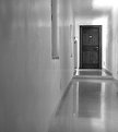
long way (landscape)
 
Send this image as a postcard
  
Image Title:  long way (landscape)
  0
Favorites: 0 
 By: Verena Rentrop  
  Copyright ©2004

Register or log in to view this image at its full size, to comment and to rate it.


This photo has won the following Awards


 Projects & Categories

 Browse Images
  Recent Pictures
  Todays Pictures
  Yesterdays Pictures
  Summary Mode
  All imageopolis Pictures
 
 Award Winners
  Staff Choice
  Editors Choice
  Featured Donors
  Featured Photographers
  Featured Photos
  Featured Critiques
   
 Image Options
  Unrated Images
  Critique Only Images
  Critiquer's Corner
  Images With No Critiques
  Random Images
  Panoramic Images
  Images By Country
  Images By Camera
  Images By Lens
  Images By Film/Media
   
 Categories
   
 Projects
   
 Find Member
Name
User ID
 
 Image ID
ID#
 
   
 Search By Title


Photographer Verena Rentrop  Verena Rentrop {Karma:15233}
Project N/A Camera Model Canon EOS 10D
Categories Others
Film Format
Portfolio b&w
Lines
Lens Canon  28 mm f/2.8
Uploaded 9/13/2004 Film / Memory Type ISO 800
    ISO / Film Speed 0
Views 498 Shutter 1/15
Favorites Aperture f/2.8
Critiques 10 Rating
5.88
/ 4 Ratings
Location City -  Verona
State - 
Country - Italy   Italy
About at the end was a wonderful appartment

which version do you prefer?

http://www.usefilm.com/image/549455.html
Random Pictures By:
Verena
Rentrop


form and light III

Ride

Lenka and hers

the pope was close

Sibelius II

Tip of light

waterworld IV

Final Riding

click - clack

Reflection

There are 10 Comments in 1 Pages
  1
Linda See Linda See   {K:1672} 11/29/2004
I love this version...and i just love it.

  0


Verena Rentrop Verena Rentrop   {K:15233} 9/23/2004
My long time missed dear friend Telmo!

Welcome back in the UF world...

Unfortunately I'm pretty busy in my job but try to comment as much as possible.

Cheers,
Verena

  0


Telmo Domingues   {K:9639} 9/23/2004
Dear Verena!!!!!!!!!!!!!!!!!!!!1 I missed you!
As I told so many times, I admire "your eyes" and the way they see the world around! I don?t know is the appartment was wonderful or not. But I do know that this photo leaves the question in the air!... What's behind the door????
I this I prefer this one... Don't even ask me why! :))))

  0


Gustavo Eulalio   {K:3777} 9/18/2004
Great picture, Verena. I like this version better than the portrait one. Cheers.

  0


Menno Naber Menno Naber   {K:3570} 9/18/2004
I like this one
The picture makes you follow the wall to the door..
And what Ed said, maybe crop the left part a bit
anyway..great picture
Cheers menno

  0


Andreas Marx   {K:1443} 9/16/2004
Hi Verena,

for me personally this one is the preferred version, by far!

Reason:

Using landscape enables you to use strong composotial elemenst such as the more or less empty room on the left hand side. Using Portrait obviously shrinks the available room there.

As a consequence the above photo has a much more feeling related to the title to it.

But this may not be a surprise, I do pefer landscabe anyway :-)

About the photo: Excellent, very good work.

Cheers,

Andreas

  0


b y   {K:2671} 9/13/2004
Hi Verona, find this a good idee like the aspects as the b&w tune and the corridors depth working. I find the wall on the left just a little bit to dominating, i used ps to cut like this.

Kind Regards Ed

  0


Thilo Bayer Thilo Bayer   {K:50358} 9/13/2004
Hi Verena,

du stellst sehr schwere fragen ;-) aber ich bin ehrlich: Die hochkant-version gefällt mir besser, weil im querformat für mich die tür zu weit rechts ist (und zu scharf gezeichnet ist). ich finde, da gehört tiefe rein, und die sehe ich mehr in der hochkantversion ;-)
schön softer look insgesamt. feines stilleben.
Lg,
Thilo

  0


Teunis Haveman Teunis Haveman   {K:53426} 9/13/2004
Verena, beautiful reflection
Teunis

  0


Kim kyungsang   {K:14135} 9/13/2004
nice composition photo!

  0


  1


|  FAQ  |  Terms of Service  |  Donate  |  Site Map  |  Contact Us  |  Advertise  |

Copyright ©2013 Absolute Internet, Inc - All Rights Reserved

Elapsed Time:: 0.359375