Since someone rated the last shot I created in this 'series' really bad and didn't recieve any other comment on it I was just wondering if I actualy could receive any feedback, since that is why we are all here.
I think you were probably a victim of a down-rater or one of the many people who fail to read the project descriptions, (or anything else for that matter). I've got a very specific and useful blind spot when it comes to ratings. ;)
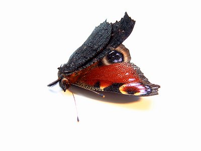
This photo is a great improvement over Never Fly Away Again I. The lighting and detail are fantastic - what did you do differently? I love the sharp detail and the high key light glossing off the black wing.
I agree with Spencer that the butterfly would look better off center. Perhaps if you were to create a longer shadow, you could place the butterfly loosely in a corner and let the shadow run through the photo. I have to disagree about the white background, though. I think it's appropriate and leaves more room for experimentation with shadow. Not that a black background would be bad - it would just be a different feeling or interpretation.
Fly-by bad raters. : ) Gotta love 'em! I'll do my best to tell you what I feel about this picture, although it might not help much as I'm not too experienced! To me.. this picture doesn't have much 'pop' to it.. If you know what I mean. I run into that dilemma with many of my pictures. See if you can get a closer macro shot, maybe fill the frame a bit more. If you are indending to have alot of space around it, I would try to off center it somehow. Putting the object right in the center tends to lead to a static feeling, which takes a way the impact of the picture. Or maybe play with the lighting, and create a long shadow from the wings, something to make it jump out at you. Since it's a dead moth, try using darker lighting or something to that effect, to me, white doesn't fit with death. I hope that helps! Regards, and keep shooting! Your portfolio looks great!