|
|
 Harlan Heald
 {K:15732} 11/18/2003
|
Wow! Amazing focus! Excellent work!
|
|
|
|
|
Kim Culbert
{K:37070} 6/8/2003
|
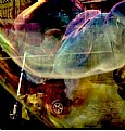
I love the out of focus flowers... it would make a really neat image with all the flowers out of focus, but still obviously flowers. They have a nice flow to them. I waffle back and forth about having the in focus flower a little higher in the frame, but then I waffle back to liking what you have already.
|
|
|
|
|
David Tasker
{K:4281} 6/8/2003
|
I believe there are only 2 kinds of wine in the world.
Wines you like, or Wines you dont'like.
SO! my comment to everyone about the DOF (or not in this picture)
You either like short DOF or you dont.
The whole point of DOF control is
1, to make everything sharp from from to back OR
2, to single out and bring attention to one part of the image.
Roland has taken the 2nd approach.
What is , IS,
Wonderful picture.
Sorry- I did not mean this to be a lesson :-)
(Roland did not pay me to write this ;-)
|
|
|
|
|
MaryBell
{K:32791} 6/8/2003
|
Let's get this straight from the start - I like soft and I like shallow DOFs.
I love this - it has a wonderful pinwheeling effect...
|
|
|
|
|
Alex Uchôa
{K:18547} 6/7/2003
|
Amazing white tones and perfect DOF, Roland. Regards, Alex.
|
|
|
|
|
Ferrell McCollough
{K:577} 6/7/2003
|
I think it would be stronger if the subject-in-focus were separated from the background stem. The sharp stem doesn't really stand alone but merges upward to the blurry stem. I actually like the top half of the image with the bottom cropped. How's that for going against the flow?
|
|
|
|
|
ARMINDO LOPES
{K:2436} 6/7/2003
|
Much better this way than with a good DOF. I like the pic.
|
|
|
|
|
Deb Mayes
{K:19605} 6/7/2003
|
Lovely, lovely. :)
|
|
|
|
|
Andrew Provchy
{K:1075} 6/7/2003
|
Another title for this could be. Down to earth. I like the framing of the shot as it brings a perspective as if the flower is moving quickly. Lovely shot.
|
|
|
|
|
Niko Pietinen
{K:1060} 6/7/2003
|
Beautiful, great photo !!!
|
|
|
|
|
Hayri CALISKAN
{K:16195} 6/7/2003
|
Beautiful work.
Regards,Hayri.
|
|
|
|
|
Marion Luijten
{K:6141} 6/7/2003
|
This could have been a great image, if the focus had been more central. Right now, there's just too much blur at the top of the photo. You could try to crop drastically at the top and a little of the left. Just my opinion of course! :-)
|
|
|
|
|
Shai Ritblatt
{K:3755} 6/7/2003
|
great macro !!!
|
|


