|
|
Jurg Wittwer
 {K:447} 4/2/2006
|
Thanks for your valuable input. I received a similar comment and gave a somewhat lenghty answer, you may read in the previous reply. J.
|
|
|
|
|
Jurg Wittwer
{K:447} 4/2/2006
|
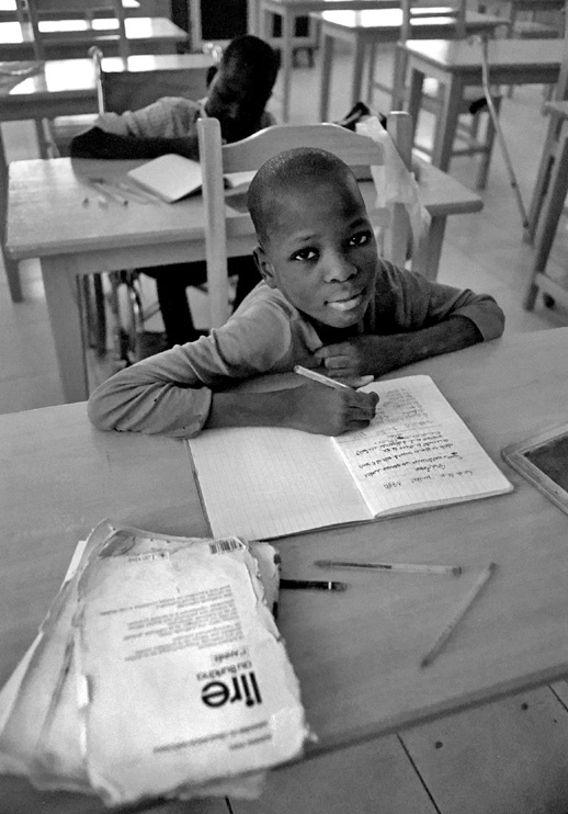
Thanks, Steve and also thanks, Tracey (previous comment) for your input. Indeed, the picture would need some cropping. I didn't do it because of a "stupid" personal reason: I never change the aspect ratio of a picture (except obviously if for professional purpose or if it is a collage like the "triple portrait" I put on usefilm). On one hand, this rule limits the creative freedom, on the other hand it creates a discipline when taking the picture. Most of my pictures on usefilm have not been cropped at all. On paperprint, it allows me to show the black border of the negs.
Cropping this picture, keeping its ratio, would only be possible on the right, and it would leave a unrecognizable triangle where the tablet lies.
Regarding your comments on lightning..... no excuse, you got it better. Thanks again for the input. J.
|
|
|
|
 Steve Aronoff
{K:18393} 4/2/2006
Steve Aronoff
{K:18393} 4/2/2006
|
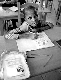
A terrific portrait, Jurg. Well composed and the tonal balance is nice. Plus it's very interesting and the "Lire" face up enhances the feel of the scene very much. I do agree with Tracey that some cropping could be useful, but not perhaps as much as was suggested. Also the lighting could be enhanced a bit to bring out the subject's face a bit more and add a bit more contrast overall. I think you can do this simply with levels adjustment and minor contrast alteration. Here is my rough idea.
However, as it stands the photo is very well done!!
Steve
|

changed version |
|
|
|
 Tracey MacLeod
{K:3244} 3/21/2006
Tracey MacLeod
{K:3244} 3/21/2006
|
It's a portrait... however, in this case I would crop it. Yes the light and the seating has a nice quality but it detracts from the subject... for news you need to get to the point and make your frame as strong as the story your trying to convey. Plus the one thing that really bothers me is the child behind the main boy is just too dark... if you want him in your frame you have to be able to make him out just a little... he can be darker but he does need a face! Plus I would go in and select with quick mask the main face and bring him up as well. Hope you don't mind but I needed to illustrate my point so I reworked your frame. you are on the right track you just need to not be afraid of cutting things out to strengthen your image. (I had a teacher who would literally rip pictures and draw birds in too much white space! I am happy to report they were never mine!~ Take care.
|

|
|
|
|
 Karina Brys
{K:16541} 3/19/2006
Karina Brys
{K:16541} 3/19/2006
|
Hello Jurg. Nice to see you back on UF. I like this photo very much, the eye contact and the angle are great!
|
|
|
|
|
Golboo Fiuzy
{K:2359} 3/18/2006
|
Wow!
Such an especial photo!
|
|


")
")
")
")
")
")
")
")
")
")