|
|
 Dave Arnold
{K:55680} 10/15/2006
Dave Arnold
{K:55680} 10/15/2006
|
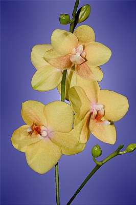
Nicely accomplished floral, Laura. I like the background with this. I don't see where it looks too fake and I think the color and fade in the center works well. You have a very nice clear, crisp image here, congrats,
Best wishes,
Dave
|
|
|
|
 Mark Mahar
{K:3233} 6/18/2006
Mark Mahar
{K:3233} 6/18/2006
|
Laura,
It's hard using flash on this with a darker background as it tends to make the edges of the flower look too sharp. At least that's what I see as being the downside here. It creates a black edge around the petals. One solution is to bounce the flash off the ceiling or diffuse it with any one of the add on diffusers out there. What type of flash was used, the on-camera flash of the D100? I use a ringflash on macros like this for a more natural look. Was this shot indoors? Anyway to use some natural light? The D100 is a good camera, some of my best shots were made with a D100.
Cheers,
-mm
|
|
|
|
 Tracey MacLeod
{K:3244} 4/12/2006
Tracey MacLeod
{K:3244} 4/12/2006
|
Your Dahlia is very lovely! I just think you need to get a little darker... maybe go into your levels and pull them in and saturate a touch. It's just getting deeper into PS. (in general not on your dahlia) But lucky me that's what I do most of for a living (PS goddess). Keep up the great work! Tracey
|
|
|
|
Laura E.
 {K:5598} 4/11/2006
|
Hi Tracey,
I have never been satisfied with this image, and was hoping to get a fair number comments so that I could figure out precicely what went wrong. The flat background is definitely one of the issues! I will add more texture in PS and deepen the color. I will also add more saturation. I needed a bit of a fill flash because of the lighting. I don't like to use flash because I'm not at all proficient at manipulating it yet, and it always washes my images out. So, I will definitely turn up the saturation!
Sometimes I do cut into my images, please see the attached!
Thanks so much for your comments Tracey, they were very helpful!
Laura
|

Pink Dahlia |
|
|
|
|
Tracey MacLeod
{K:3244} 4/10/2006
|
this is a lovely frame and is a little flat.... might be the way use film interpretes it for me... but personally I would darken the vignette and saturate slightly. (Sorry made a example I don't think I translate my thoughts as clearly as I probally should!)
Also looking at your folio you have some nice images but all are safety cropped.... don't be afraid to cut into your subject.... But just something that struck me looking at all of them. Keep up the good work!
|

|
|
|
|
|
******** ********
{K:1948} 4/9/2006
|
Gorgeous detail in the orchid flowers and the blue background really sets them off,
Chris.
|
|
|
|
 Robert Kocs
{K:89085} 3/4/2006
Robert Kocs
{K:89085} 3/4/2006
|
Oh dear Laura, what an amazing floral composition with great details. The violet background is the best choose for this beauty. Perfect contrast, very
nice photograph.
Have a nice week end!
Robert
|
|