|
|
|
choeN Lee
{K:102} 1/20/2003
|
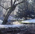
This shot shows the optical beauty and excellence of Pentax glass, even when the 50mm 1.2 is not known to be the sharpest of the Pentax standard lenses. Want a glass similar to Zeiss but cost effective? Use Pentax.
Even if this is an autobiographic shot, the title seem a bit lost with little to do with the photography subject. Perhaps you could call it 'Lonely Bench', but even so, the picture narrates little to me.
|
|
|
|
|
Thibault Grouas
{K:848} 12/28/2002
|
I know it would have been far better to get more DOF, but at that time I didn't had a tripod with me and I urgely needed to take that photo at that precise moment.
Technically I find it very poor, but it's something more personnal and I was in the mood to do it like that. I wouldn' change a thing. The other problem is that it was taken during an heavy, windy rain shower without an umbrella and the whole camera and lens where getting so wet that I had to clean the lens just before firing the shutter !
I founded very interesting to submit it for critique here and see what people that dont know me think of it, although I hesitated a lot. The only one print - it was a gift - has proven to be talked about at times and that surprised me because I really didn't liked it a lot.
Thanks a lot for your comments.
|
|
|
|
|
Petra Engle
{K:1282} 12/28/2002
|
The dof seems fine, but the first thought looking at this was "bar". All I saw was the back of the bench, centered in the image. Too bad too, that the car had to be right behind it. Overall, the image is not really that interesting, it would have been more so, I think, if the bench were the complete focus subject and for that purpose, cropping a bunch of the top might work. All personal preference of course :).
|
|
|
|
|
Kenneth Liang
{K:290} 12/27/2002
|
Nice usage of the dof. and i somewhat like the reflections, even thought it can be a distraction.
and having the bench slanted in an angle, hmmmm, i dont really like it either.
If i were to approach this image, i would maybe shoot it from a farther distance....so to create a more sense of Alone.
I do like your intended idea.
|
|
|
|
|
Antonio Díaz
{K:2710} 12/26/2002
|
very nice idea, what i would suggest is to try to avoid those light reflections on the floor and the bench... maybe changing the angle of the shot a little bit would make the reflection dissapear...
|
|
|
|
|
Thibault Grouas
{K:848} 12/26/2002
|
>There's no one there!
This is kind of autobiographic shot :-/
|
|
|
|
|
Ken Alexander
{K:3905} 12/25/2002
|
It's nice technically--great tones--but to me it doesn't convey the idea of "alone". There's no one there!
|
|
|
|
|
Molly Walters
{K:1284} 12/25/2002
|
nice perspective , it really looks kind of spooky great job ! keep up the good work.
|
|


