|
|
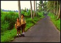
Critique By:
Andy Eulass (K:13435)
5/11/2003 4:38:32 AM
Excellent composition: simple and direct. The line of the road leading up the frame is very well placed. Looks like your little friends were off to school. Your observation about the Balinese is well noted, which is why that bombing last year is all the more repellant to me. I just hope to God the horror of that experience didn't snatch away the innocence of these lovely people. I guess the thought of that gives this image an element of poignancy to me.
|
| Photo By: Darrin James
(K:3944)
|
|
|
Critique By:
Andy Eulass (K:13435)
5/11/2003 4:31:13 AM
Oh no, not the snail man! Actually, it looks as if the snail man has some pretty tasty wares to sell. Love the light playing on his face. I detect just a wee bit of motion blur on his face but I still think the shot works. Great capture.
|
| Photo By: Darrin James
(K:3944)
|
|
|
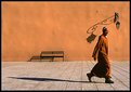
Critique By:
Andy Eulass (K:13435)
5/9/2003 10:58:46 AM
Compositionally this is dynamite. The placement of the doorway is excellent, and it was excellent that you caught the monk as he was departing. Where my concern lies is with the detail outside. It may be my monitor but it seems a bit too sharpened or perhaps it needs a bit of contrast adjustment, particularly around the bottom of the doorway. What do you think?
|
| Photo By: Darrin James
(K:3944)
|
|
|
Critique By:
Andy Eulass (K:13435)
5/9/2003 10:52:29 AM
The smile has definitely been triggered here. It always amazes me how people are willing to mug for the camera even when travelling down the road. The grin of the guy in the middle is absolutely priceless! Who cares about the technicalities of the image when you get something this good? By the way, I hope you weren't operating the other motorbike when you got this one. Please don't pull a Gary Busey on us pal.
|
| Photo By: Darrin James
(K:3944)
|
|
|
Critique By:
Andy Eulass (K:13435)
5/8/2003 5:44:53 PM
Ah, good! I see you're trying to work the angles and explore this old wreck. Good job! This gives a nice new perspective. It kind of has the look of an old beast here. Keep going with it Renee. Be careful though and don't poke your head in the thing unless you know its stable. 
|
| Photo By: Renee Robinson
(K:2112)
|
|
|
Critique By:
Andy Eulass (K:13435)
5/8/2003 5:40:04 PM
Beautifully done Karen. The descending arrangement of the tulips is great. What really gets me is the wonderful soft shimmering light on the flowers. Marvellous!
|
| Photo By: Karen Johnson
(K:2951)
|
|
|
Critique By:
Andy Eulass (K:13435)
5/8/2003 2:19:13 PM
Very effective use of the wide-angle. The polarizer did a great job making a nice gradation in the color of the sky. Excellent.
|
| Photo By: Darrin James
(K:3944)
|
|
|
Critique By:
Andy Eulass (K:13435)
5/8/2003 2:17:07 PM
I know the feeling. I often look like this myself after a night's binge. Darrin, you've done something extraordinary: you've captured on film for the first time a camel with a bad case of bed-head! Actually, the detail is very nice on the camel's face and neck. Possibly be the eye could be lightened but its a neat capture nonetheless.
|
| Photo By: Darrin James
(K:3944)
|
|
|
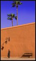
Critique By:
Andy Eulass (K:13435)
5/8/2003 4:49:49 AM
This is so hot, I bet I could fry an egg on my computer screen right now. Excellently composed Darrin. The camels necks almost function as leading lines for the image and excellent vehicles for emphasizing the man. The addition texture and colors of the tufts of grass(?) in the distance also do great work to emphasize the extent of the space. Excellent job.
|
| Photo By: Darrin James
(K:3944)
|
|
|
Critique By:
Andy Eulass (K:13435)
5/8/2003 4:45:37 AM
Rafal, I think the varying color of the sky is just the nature of the beast when you use a polarizer (which I assume has been done here). I like the use of the 16mm which adds great perspective on the scene. Good work, Darrin, on including the guy in the foreground to add some life and "pop" to the image.
|
| Photo By: Darrin James
(K:3944)
|
|
|
Critique By:
Andy Eulass (K:13435)
5/8/2003 4:42:04 AM
Mary Sue is absolutely right. Each of three images have an inseparable relationship to each other, so its very wise that you turned this into a triptych. Wonderful work using these images to convey a story.
|
Photo By: Alisa Mudge
(K:7511)

|
|
|
Critique By:
Andy Eulass (K:13435)
5/8/2003 4:23:41 AM
Is this a new session with Diane or still the same one as the earlier photos? Regardless, these shots are just brilliant! This one is so nice with the lighting and that wonderfully alluring pose. The Sphinx never looked so appealling.
|
| Photo By: Karen Johnson
(K:2951)
|
|
|
Critique By:
Andy Eulass (K:13435)
5/6/2003 2:11:17 PM
I guess that's where Rudolph Valentino lives, eh? But on a serious note, these desert shots are absolutely wonderful. As I think I noted in another of your images, the mind-blowing aspect is how you utilized tone in the main, rather than hue, to generate the power and effect of this image. The silhouetted camels and their riders are such a great anchoring element of this image. Brilliant work.
|
| Photo By: Darrin James
(K:3944)
|
|
|
Critique By:
Andy Eulass (K:13435)
5/6/2003 2:06:59 PM
Thanks for taking note of my efforts Darrin, poor as they were. Judging from the responses here, though, it seems that people certainly recognize a powerful image, even with the flaws of processing that you certainly couldn't control.
|
| Photo By: Darrin James
(K:3944)
|
|
|
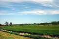
Critique By:
Andy Eulass (K:13435)
5/5/2003 7:42:52 PM
Certainly reminds me of the England I love. Lovely colors and composition. Great sky for shooting as well. Didn't know you were in Maidstone. I went to school for a year right down the road in Canterbury. Give the lovely green hills of Kent my fondest. Can't wait to see it again at the end of the month. Always considered it my home away from home. Thanks for triggering the memories Megan.
|
| Photo By: Megan Forbes
(K:4617)
|
|
|
Critique By:
Andy Eulass (K:13435)
5/5/2003 7:18:28 PM
I was looking through your portfolio and this one really jumped out at me. I just love the mood and atmosphere this image conveys. You picked the perfect moment to take the shot. The figure loping across the grass adds a real important element to the composition. I'm not completely hot on the presence of the headlights but there's not much control you can have over something like that. Wonderful work Jamie.
|
| Photo By: Jamie Haggett
(K:694)
|
|
|
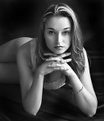
Critique By:
Andy Eulass (K:13435)
5/5/2003 2:40:10 PM
Wonderful to see you here, sir. An excellent portrait by any measure. The light is diffuse and very flattering to the model. Her pose is relaxed and I love the flow of her hair in the shot. Excellent work. Welcome aboard Usefilm.
|
| Photo By: Mauricio-José Schwarz
(K:160)
|
|
|
Critique By:
Andy Eulass (K:13435)
5/5/2003 2:31:25 PM
Definitely among your best work Eric. The lighting and that EXCEEDINGLY shallow DOF worked perfectly to create this image. The colors couldn't be nicer. Way to go Eric.
|
| Photo By: Eric Goldwasser
(K:4294)
|
|
|
Critique By:
Andy Eulass (K:13435)
5/5/2003 2:41:11 AM
Renee, this is excellent. I remember the other submission of yours with this subject and here I think the color works extremely well. The rusty colors of the car are excellent here and really let it stand out from the background. The color also enhances the sense of age and abandonment. Great work.
|
| Photo By: Renee Robinson
(K:2112)
|
|
|
Critique By:
Andy Eulass (K:13435)
5/5/2003 2:37:43 AM
Nicely done Eric. The reddish cloud really works well to create a bit of compositional tension in the image. Overall the colors and details are outstanding.
|
| Photo By: Eric Goldwasser
(K:4294)
|
|
|
Critique By:
Andy Eulass (K:13435)
5/3/2003 6:24:21 PM
Hey, I know that town! Very good eye for this shot Amy. I like how you used the bridge to frame the shot. Its a shame it couldn't have been taken on a sunny day. I bet those colors would really pop in the sunshine. I'd suggest you think possibly about a square crop with some of the left side taken off thats outside the "circle" of the opening you shot through. Still, not bad work at all.
|
| Photo By: amy douglas
(K:425)
|
|
|
Critique By:
Andy Eulass (K:13435)
5/2/2003 2:08:15 PM
I guess you might have a copyright problem if you borrowed the Beatles' title "Why Don't We Do It in the Road?". Great capture Megan. Ah, the rituals of spring...
|
| Photo By: Megan Forbes
(K:4617)
|
|
|
Critique By:
Andy Eulass (K:13435)
5/2/2003 2:01:02 PM
I like the crop of this a lot Mary Sue. The lines radiating out from the center give one the feeling of looking at an abstract sunrise. Lovely color and lighting. Nice work.
|
| Photo By: Mary Sue Hayward
(K:17558)
|
|
|
Critique By:
Andy Eulass (K:13435)
5/2/2003 1:52:11 PM
Mike, this is such a great image. Whether or not you intended it, this has the feel of those extraordinary signage photos done by Walker Evans in the 1930s and 1940s (although his were B/W). The has so many nice elements with excellent textures and colors and the added "pop" of the man in the doorway. Really outstanding work. This is a real jewel.
|
| Photo By: Mike Scott
(K:1817)
|
|
|
Critique By:
Andy Eulass (K:13435)
5/2/2003 1:47:13 PM
This is just gorgeous. The light painting is just perfect with proper emphasis on her most compelling features. Those eyes just leap out of the image and grab you. I love the subtle contours of her face and the pose is very good for the image. Tremendous work.
|
| Photo By: emil schildt
(K:427)
|
|
|
Critique By:
Andy Eulass (K:13435)
5/2/2003 1:43:41 PM
Not sure I agree with Mr. Arrey about increasing the contrast. I think you risk it getting too posterized if you pump up the contrast much more. This is a very cool image with great patterns and details. I think the grain works very well with the industrial subject.
|
| Photo By: Roland Le Gall
(K:7018)
|
|
|
Critique By:
Andy Eulass (K:13435)
5/2/2003 11:22:52 AM
Very nice image Brendan. I'd suggest a little dodging of the left side of the cupola at the top of the light house. However, the composition is great and (aside from the point about the cupola) the tonal range is great.
|
| Photo By: Brendan Bhagan
(K:531)
|
|
|
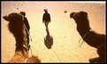
Critique By:
Andy Eulass (K:13435)
5/2/2003 11:16:09 AM
The head of the camel and the placement of the man provide amazing perspective to the shot (as Marco said, a sense of the infinite). There's a loneliness that it also conveys which I guess is very peculiar to being the desert. Though I never have been in Morocco, I certainly get the feeling I got when I spent a little time in the New Mexico desert. Excellent work.
|
| Photo By: Darrin James
(K:3944)
|
|
|
Critique By:
Andy Eulass (K:13435)
5/2/2003 10:27:42 AM
Now this is a shot that Velvia is made for. God, those big blocks of color are just amazing. Simple and very powerful. Lovely work.
|
| Photo By: Dana James
(K:191)
|
|
|
Critique By:
Andy Eulass (K:13435)
5/2/2003 10:25:25 AM
Marvellous work Dana. I think some of the softness could be remedied with a touch more USM. The composition is absolutely phenomenal with those wonderful long shadows. The shadows really add a dynamic quality to the shot. You just illustrated the virtues of simplicity in composition with this powerful image.
|
| Photo By: Dana James
(K:191)
|
|

 Das")