|
|
Critique By:
Kim Culbert (K:37070)
9/21/2005 3:19:36 PM
*grin* I was just going to say what you have in your "about" ... a little soft, but the light is gorgeous! The way it falls across his face really lights it up and gives off some of that boyish charm/mischief.
|
| Photo By: Alison DuFlon
(K:36566)
|
|
|
Critique By:
Kim Culbert (K:37070)
9/21/2005 3:17:30 PM
I like the texture in the sky here... it does look like a painting on cloth... the colours are very earthy and the combination of oranges and yellows work nicely together.
It seems like there is a lot of digiral noise in this though... looking at the cloud directly to the left of the sun... it has a lot of blue / purple noise flecks in it, which I find a little distracting to the image.
Great use of layers...
|
| Photo By: Aimee' Desire'
(K:744)
|
|
|
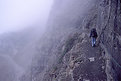
Critique By:
Kim Culbert (K:37070)
9/21/2005 3:13:55 PM
Just looking at this makes me feel nausetated... the mist obscures parts of the trail, adding to the motion sickness... although I love hiking I'm not sure if you'd find me on this one... anything that makes you clip yourself to the cliff beside you seems a little too hardcore for me!
Love the bluish toning... really gives this a chilly, foggy feel.
|
| Photo By: Dave Holland
(K:13074)
|
|
|
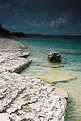
Critique By:
Kim Culbert (K:37070)
9/21/2005 2:01:53 PM
To me, the optical illusion is that the horizon is tilted to the left... with the mountain slanting down and the shoreline curved the way it is. I'm sure that it is straight, but I find it a tad awkward... not sure how to compose so this doesn't happen though...
Beautiful colours and nice use of foreground to pull me in!
|
| Photo By: Ryan Moss
(K:371)
|
|
|
Critique By:
Kim Culbert (K:37070)
9/21/2005 1:59:00 PM
I'm with Pat on this one... although I can see where you were going, and that the whole point was selective focus with the flower, I would have like the girl sharp as well. There are so many great colours and details that having her in focus as well would have really added some power.
The blurred bg is awesome though... looks like a stunning location!
(thanks for the comment on my baby shot... I will have to try to colour the rose differently to make it more recognizeable... green stem maybe!)
|
| Photo By: Ryan Moss
(K:371)
|
|
|
Critique By:
Kim Culbert (K:37070)
9/21/2005 1:56:16 PM
Or here it is without the rose coloured in... just plain B&W.
I was just playing around in PS, trying to add colour to B&W images, but then a friend said that she liked the B&W better than the splash of colour... I'd like to know what everyone thinks...
cheeers
Kim
|
| Photo By: Kim Culbert
(K:37070)
|
|
|
Critique By:
Kim Culbert (K:37070)
9/18/2005 12:36:57 AM
hahahaha... thanks for the giggle... this shot is so cool. I love the "net" and all those Nemo's caught inside.
You can't help but smile with this image.
|
| Photo By: Alison DuFlon
(K:36566)
|
|
|
Critique By:
Kim Culbert (K:37070)
9/18/2005 12:35:05 AM
The colours are jumping off the screen here... almost looks like it's been lit with a blacklight to get those over-the-tops neons. I love the way the jar acts as a natural frame for the stars... thanks for all the comments!
|
| Photo By: Alison DuFlon
(K:36566)
|
|
|
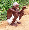
Critique By:
Kim Culbert (K:37070)
9/17/2005 5:57:13 AM
I think this is a wonderful portrait study... the character of this man, from his posture, to his frail body is truly amazing. You've really captured something in this portrait... the exposure is perfect, the colours eye-catching. Like you said, he is clean, well taken care of, and it's a good shot.
It's something that someone in Vancouver can't go a day without seeing as well.
|
| Photo By: Ian McAllister
(K:124)
|
|
|
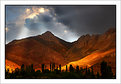
Critique By:
Kim Culbert (K:37070)
9/17/2005 5:52:02 AM
Gorgeous light... this is the perfect exposure. Congrats on getting up so early (or staying out to watch the sun set) to capture this beautiful image.
The entire image has magical light, from the interesting cloud shapes and light, to the varying shades of burnt orange in the mountain.
|
Photo By: Jan Symank
(K:22030)

|
|
|
Critique By:
Kim Culbert (K:37070)
9/17/2005 5:50:12 AM
I like how the "shadows" have varying amounts of solidness to them... it gives an interesting depth to the image. I wish they were spread out a little more in the water so no one was overlapping.
Great colour, and great idea... it comes across very well.
|
| Photo By: Francesca May
(K:6877)
|
|
|
Critique By:
Kim Culbert (K:37070)
9/17/2005 5:48:24 AM
There is some nice atmosphere in this image.. .the lighting seems to add to the tension I feel. It's a shame that it's blurry and soft... with this kind of light it could be a stellar shot. Probably a higher shutter speed would help.
|
| Photo By: Oguz Uydu
(K:-37)
|
|
|
Critique By:
Kim Culbert (K:37070)
9/17/2005 5:45:41 AM
I was going to say that I had never heard of twin foals before... that is great that they both look healthy!
Very cute capture... It's a little soft, but makes up for it in cuteness.
|
| Photo By: Pat Snelling Weiner
(K:1920)
|
|
|
Critique By:
Kim Culbert (K:37070)
9/17/2005 5:44:09 AM
So many views, but for some reason, people aren't commenting. I think you've done a nice job with the effect... the soft light works well to give a glow to the image. She looks 25!
I wish her hair wasn't in front of her face so much, as I'd want to see more of her features. (I also wish that her face was more the focus of the image, not so much on her breasts, but this is how you chose to take the picture, so it doesn't really matter what I wish *grin*.)
It seems that she is very comfortable with you, as her expression is relaxed and open.
|
| Photo By: Twisted Rich
(K:691)
|
|
|
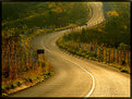
Critique By:
Kim Culbert (K:37070)
9/17/2005 5:40:09 AM
When does the car commercial start? This is such a scenic road, and you captured the golden light perfectly. I love the way the road snakes through from front to back, keeping in focus the whole way.
|
| Photo By: Eduardo. B
(K:330)
|
|
|
Critique By:
Kim Culbert (K:37070)
9/17/2005 5:38:36 AM
A stunning waterfall! I like the amount of foreground as it makes me feel like I am there, so close to these roaring falls. It almost gives me a sense of scale, although put a person in there and I would probably be surprised at how wrong I was! But it gives a perceived notion of scale, other than just having the water. Great use of slow shutter speed to get the ribbons of water.
|
| Photo By: Becky V
(K:9699)
|
|
|
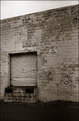
Critique By:
Kim Culbert (K:37070)
9/16/2005 3:45:44 PM
"This is no dump" (it just plays one on TV!)
The signs people put up really crack me up! There is one sign near where I live, attached to a wall, that says "Do not put up any signs." Hmmmm.
I like the graffitti on the wall under the sign and the dinginess of the bay door... I find the top of the building a bit of a harsh line that pulls me to the top though... what about cropping just below that line to keep all the interesting bits (sign, door, blob cartoon) on a brick background?
|
| Photo By: Stefan Engström
(K:24473)
|
|
|
Critique By:
Kim Culbert (K:37070)
9/16/2005 3:40:27 PM
What a cute capture... it looks funny to me because I have never seen a giraffe drink before, but I guess this is how they would all do it, with such long necks. Thanks for sharing part of Africa that I wouldn't get to see otherwise!
|
| Photo By: James Hager
(K:6285)
|
|
|
Critique By:
Kim Culbert (K:37070)
9/16/2005 3:38:23 PM
Stunning capture... the sharpness throughout the coyote and the light in its eyes truly makes this stand out.
|
| Photo By: James Hager
(K:6285)
|
|
|
Critique By:
Kim Culbert (K:37070)
9/16/2005 2:15:08 PM
Hi Alvin.
I wish I had gotten it all in focus as well... I was working with macro lenses and the DOF really sucks with them.
I use desk lamps to get a warmer tone to the setups in my house... I am a fan of warm oranges/reds and I find that a desk lamp works perfectly.
Thanks for the comment!
|
| Photo By: Kim Culbert
(K:37070)
|
|
|
Critique By:
Kim Culbert (K:37070)
9/16/2005 2:13:30 PM
Here it is with a colour boost... looks much for natural...thanks Chris!!!
|
| Photo By: Kim Culbert
(K:37070)
|
|
|
Critique By:
Kim Culbert (K:37070)
9/16/2005 2:09:40 PM
Hi Debershi,
I don't think that one is better than the other, it just depends on how you like to shoot. I like to shoot in manual settings, so I like to use the spot metering... this way I can choose which part of the image to focus on for metering.
Centre will just use whatever is in the middle of the frame as a reference and the 3D matrix uses a range of pre-set conditions to choose what is best for the scene you are shooting.
Good luck, and have fun! Thanks for the comment!
|
| Photo By: Kim Culbert
(K:37070)
|
|
|
Critique By:
Kim Culbert (K:37070)
9/16/2005 2:05:41 PM
Hi Chris,
Thanks for the comment... I'll have to take it into PS and try to counter the blue... it was shot with the old 100F.. we haven't got the new one here yet. But we still have the 50. which I've heard they are discontinuing... I'll have to stock up soon!
|
| Photo By: Kim Culbert
(K:37070)
|
|
|
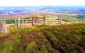
Critique By:
Kim Culbert (K:37070)
9/15/2005 3:01:16 AM
Is it the too vivid colour that looks unreal? Let me know so I can tune and repost to try to figure out what works better... I like the effect of the filter, but it's not for everyone, and maybe I can find a middle ground of still nice, but more beliveable.
Thanks for the comment!
|
| Photo By: Kim Culbert
(K:37070)
|
|
|
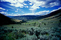
Critique By:
Kim Culbert (K:37070)
9/15/2005 2:58:36 AM
Take it easy, Colin! We don't want you hurting yourself to get these amazing views!
I love the exposure in the foreground but wish the the sky was equally as stunning. A neutral density graduated filter would do just that. You can even hold them in front of the lens of your powershot!
Thanks for sharing the views... now watch where you're stepping! *grin*
|
| Photo By: Colin Cartwright
(K:15699)
|
|
|
Critique By:
Kim Culbert (K:37070)
9/15/2005 2:28:29 AM
I love how all the lines in each image seem to pull me to the centre and into the rest of the shots. It's like a cycle...
And I love water, so this is great to me! Nice matching tones, especially in the top right and lower left... gives it a nice sense of balance!
Creative and unique... of course it's Stefan's!
|
| Photo By: Stefan Engström
(K:24473)
|
|
|
Critique By:
Kim Culbert (K:37070)
9/15/2005 2:15:19 AM
hahahha, I thought that this was like those cardboard cut-outs that you can stick your face through and take pictures, only this one you can stick your legs through and it looks like you are leaning against a car!!!! No more sugar for me tonight!
Anyways, it is a very cool effect!
|
| Photo By: sonny saenz
(K:2423)
|
|
|
Critique By:
Kim Culbert (K:37070)
9/15/2005 2:12:09 AM
I think that the ND is too dark... that's why there is such a difference between the foreground and the sky.
If you have a 1 stop and 2 stop grad ND try bracketing your shots... do one with the 1 stop, one with the 2 stop and maybe even 1 with both filters (only if there is a major extreme light condition going on though...)
It looks as though it's maybe a little bit too far down as well... it should sit as close to the horizon as possible so that the line is unrecognizable from the image... you want the nice effects but not to state that you've used a ND grad filter. Try googling the difference of ND grad filters and read more about them.. and bracket, bracket, bracket.
Looks like an amazing location... hopefully you can get back there soon! I like the way the foreground edge of shore leads my eye up and into the image, and the colour of the water is spectacular.
|
| Photo By: Marc Robin
(K:3385)
|
|
|
Critique By:
Kim Culbert (K:37070)
9/15/2005 2:05:42 AM
I love these shafts of light... truly a beautiful capture of light, and to have the sailboat out at that minute as well... it's really nice!
Perhaps the only thing to change is to burn the top right corner as it's super bright.
|
| Photo By: Brent Powell
(K:213)
|
|
|
Critique By:
Kim Culbert (K:37070)
9/15/2005 1:47:45 AM
Hi Stefan,
Thanks for the comment... the P173 is the blue/yellow polarising filter... I love how it works with sunsets... depending on which way you rotate it.
|
| Photo By: Kim Culbert
(K:37070)
|
|