|
|
Critique By:
Kim Culbert (K:37070)
11/26/2005 5:51:40 AM
Hey Dave,
Thanks for the comment... my family has been going through a tough time with some deaths... I've been too busy traveling back and forth to visit Usefilm, and haven't been in the mood to post lately. Now with Christmas only a month away (and my Photoshop deciding now is the perfect time to crash) it looks like it will be a while longer before I come back.
Thanks for wondering though!
Nice close shot of the "kid"... great detail in the fur, and sharpness in the eyes. Perfect timing while he was posing in the flowers!
|
| Photo By: Dave Holland
(K:13074)
|
|
|
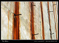
Critique By:
Kim Culbert (K:37070)
11/12/2005 5:20:18 PM
To me this has a very omnious feel... rusty nails and dried blood. Interesting to read in your comment that this was a WWII bunker... it just adds to the haunting feel.
Wonderfully seen capture... the colours jump from the screen.
|
| Photo By: Jim Goldstein
(K:21230)
|
|
|
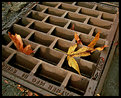
Critique By:
Kim Culbert (K:37070)
10/19/2005 1:25:41 AM
Yep, the colour makes up for the lack of sharpness... you've captured the essense of fall, especially with the leaf partly rotting. Very nice~
|
| Photo By: Robin W
(K:16308)
|
|
|
Critique By:
Kim Culbert (K:37070)
10/19/2005 1:24:20 AM
Gorgeous scene, Colin, and well captured! I wish that there wasn't so much digital noise in the sky. I'm not sure what caused this but I've heard of a program called Neat Image that can clean it up a bit. Although I haven't tried it, I think there might be a free trial on their website.
Looks like quite a peaceful place!
|
| Photo By: Colin Cartwright
(K:15699)
|
|
|
Critique By:
Kim Culbert (K:37070)
10/19/2005 1:18:44 AM
Here's with a little more PS work to try to get rid of the blue cast... added a bit more yellow into the mix... Thanks again Stefan for noticing... I think it's more true to life now!
Hopefully someone can help me with my legal question.. I should really just post it in the forums...
Cheers
|
| Photo By: Kim Culbert
(K:37070)
|
|
|
Critique By:
Kim Culbert (K:37070)
10/18/2005 9:02:34 PM
What a strong composition, and awesome colours... the rust just adds to the fall motif.
Love how the lines pull me into the photo, and around the leaves!
|
| Photo By: Kathy Hillard
(K:25721)
|
|
|
Critique By:
Kim Culbert (K:37070)
10/18/2005 3:19:33 PM
I added a gradient blue to the sky in PS, but I will have to try to reduce it in the rest of the image.
Thanks for the comments! It's good to have a pair of fresh eyes to see what I missed!
Cheers
|
| Photo By: Kim Culbert
(K:37070)
|
|
|
Critique By:
Kim Culbert (K:37070)
10/17/2005 6:32:30 PM
Nope, doesn't look fake to me.. it helps that the cloud in the right corner is lighter... like the sun is shining on it.
Very well handled as a composite!
|
| Photo By: Stefan Engström
(K:24473)
|
|
|
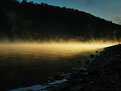
Critique By:
Kim Culbert (K:37070)
10/17/2005 4:06:03 PM
Gorgeous atmosphere again, Stefan... that mist is stunning! I'm still on the fence about having the lighted mist in the centre of the frame... it splits the image in top & bottom, but I'm not sure how you could have otherwise framed this to give more power to either side but still keep the dynamics that are present now. I like how the shore falls away from the mist towards the bottom left and the mountains grow up from the mist to the top left... well seen!
|
| Photo By: Stefan Engström
(K:24473)
|
|
|
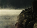
Critique By:
Kim Culbert (K:37070)
10/17/2005 4:00:00 AM
Very moody... love the dark tones and the atmosphere of the mist clinging to the water... it takes a lot of patience to capture mist when the light is just right... congratulations!
|
| Photo By: Stefan Engström
(K:24473)
|
|
|
Critique By:
Kim Culbert (K:37070)
10/17/2005 3:13:57 AM
Hi Stefan...
Thanks for the comment... it could have been me leaning, or the buildings... not quite sure! *grin*
For this shot I was using Sensia... some that Becky V gave me now that she's using digital... but I have to say that I really like the saturation of the 50 better for Velvia... but I haven't tried the NEW 100... but the old 100F was not quite as good. I've heard great things about the new 100 though, and look forward to burning through a few rolls soon!
Cheers!
|
| Photo By: Kim Culbert
(K:37070)
|
|
|
Critique By:
Kim Culbert (K:37070)
10/15/2005 4:50:44 AM
Excellent sharpness and detail... I feel like I am standing in your image, looking at the vast scenery around me.
The clouds have such depth and clarity... very well captured.
I wish I was there as well!
|
Photo By: John Bohner
(K:8368)

|
|
|
Critique By:
Kim Culbert (K:37070)
10/5/2005 4:17:39 AM
*lol* Ask your dad to tell you about the horizon police!
Great colours here Scott, and I like the way the hammock is lit with such warm light. Just wish that horizon was a little more straight!
|
| Photo By: Scott Tylor
(K:407)
|
|
|
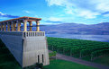
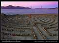
Critique By:
Kim Culbert (K:37070)
10/5/2005 3:50:24 AM
What a great image to capture a) a beautiful scene b) an artist's amazing work!
The two could easily be two different images, each producing pleasing shots, but together they capture something new and exciting... the lines of the labyrinth curve throughout the foreground and finally I rest on the sculpture in the middle, which happens to be on the same axis as the bridge vertical. Very cool image, and congrats on finding the artist and inquiring more about him.
|
| Photo By: Jim Goldstein
(K:21230)
|
|
|
Critique By:
Kim Culbert (K:37070)
10/3/2005 6:35:17 PM
The red on black is certainly eye catching! I had to open the thumbnail to see why the leaf was black! It's quite a stark change... have you tried desaturating the leaf, but still leaving a touch of colour? It might not have the impact you're going for.
Great placement of the leaf and the berry in the frame!
|
| Photo By: Alison DuFlon
(K:36566)
|
|
|
Critique By:
Kim Culbert (K:37070)
10/3/2005 6:28:54 PM
The wind does add a nice blur effect to this image, but what I like best is the muted colours. Very painterly and calming. Sharpness and detail aren't an issue here, but the image as a whole is wonderful!
|
| Photo By: Jason Mardell
(K:1113)
|
|
|
Critique By:
Kim Culbert (K:37070)
10/1/2005 10:12:29 PM
Love the warm colours and the hint of cool autumn air... I find the top of this image just a little too busy... perhaps a crop of the very top horizon? This would put a ton of emphasis on the refeclection and those wonderful golden hues at the bottom.
|
| Photo By: Matt Pals
(K:1722)
|
|
|
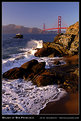
Critique By:
Kim Culbert (K:37070)
9/26/2005 4:45:02 PM
Wonderful colours in here, Jim... the golden/red sand really adds impact and re-inforces the colour of the bridge.
I would have like some separation between the rocks on the bottom and the edge of frame, but it's just a minor thing. Excellent detail in the water swirls and the splash.
|
| Photo By: Jim Goldstein
(K:21230)
|
|
|
Critique By:
Kim Culbert (K:37070)
9/25/2005 12:41:44 AM
The colours are very eye-catching here, but I agree about the object on the right. Foreground is a wonderful thing, but because it's not recognizable I find it distracting. If it stood out more, or was more defined it would be great, but as it stands now it grabs a lot of attention but is not recognizable.
Love that sky!
|
| Photo By: Tobiasz Siotor
(K:1383)
|
|
|
Critique By:
Kim Culbert (K:37070)
9/25/2005 12:36:29 AM
The long exposure works wonders on the water here... the foreground melts with reflected colour!
I swear that Australia has the most beautiful sunrises in the world. Congrats on getting up early to capture this beauty!
|
| Photo By: John White
(K:76)
|
|
|
Critique By:
Kim Culbert (K:37070)
9/23/2005 7:12:42 PM
I love the sweep of the foreground... pulls me in, and forces me to look at the great detail.
I also really like the 1/3 sky, 2/3 foreground. Very pleasing.
|
| Photo By: Jim Goldstein
(K:21230)
|
|
|
Critique By:
Kim Culbert (K:37070)
9/23/2005 7:10:56 PM
LOL... I love the devil dog, so nicely placed admist the photographic leaves. Your dog looks way too content in that costume!
I like the family portrait... the toning gives it a sense of time-passing, although I see your daughter in there so I know it's recent. (Stefan, are you hiding behind the camera??)
Tough challenge, but I think you've pulled it off nicely. I hope it prints well for you!
|
| Photo By: Stefan Engström
(K:24473)
|
|
|
Critique By:
Kim Culbert (K:37070)
9/22/2005 2:05:20 PM
And the last option.... (I just figured out how to colour different parts of the image on a B&W ... at least this exercise has taught me something!!!)
Made to look more like a rose, as per Ryan's suggestion... more suggestions are welcomed!
|
| Photo By: Kim Culbert
(K:37070)
|
|
|
Critique By:
Kim Culbert (K:37070)
9/22/2005 1:45:22 PM
Thanks Trish... I didn't even notice the shadow on her chest! Always helps to have more pairs of eyes looking at stuff!
Cheers
|
| Photo By: Kim Culbert
(K:37070)
|
|
|
Critique By:
Kim Culbert (K:37070)
9/21/2005 3:32:50 PM
The textures in this are very pleasing to the eye.. although this looks more like wood bark to me than a rock. Funny how the eyes play games with the mind.
Very unique leaf you've captured as well... I'm glad that it is not perfect... adds to the beauty.
|
| Photo By: Kathy Hillard
(K:25721)
|
|
|
Critique By:
Kim Culbert (K:37070)
9/21/2005 3:30:42 PM
Excellent detail and sharpness... what a great capture. Ears perked forward, attention towards the camera. The background is blurred nicely, although I find the blurred foreground just a little distracting. What are the thoughts of magazine editors in regards to blurred foregrounds? Does it matter?
|
| Photo By: James Hager
(K:6285)
|
|
|
Critique By:
Kim Culbert (K:37070)
9/21/2005 3:28:03 PM
This is a great shot to end on... I wish I knew who the man on the sign is as well. (I wonder if he knows he has become the object of attention on a photo site? *grin*)
I agree with Dirck to clone out the top left.
I like the grain in the sky... gives this an antique feel.
|
| Photo By: Stefan Engström
(K:24473)
|
|
|
Critique By:
Kim Culbert (K:37070)
9/21/2005 3:22:25 PM
Very well seen... the colours are amazing. I wonder if a more selective focus would have worked better here... just to keep the focus on one or two of the bowls of powder. I find that with the DOF so deep it's a little busy, whereas if you had a shallow DOF it would have put more emphasis on the colour.
|
| Photo By: Ian McAllister
(K:124)
|
|
|
Critique By:
Kim Culbert (K:37070)
9/21/2005 3:19:36 PM
*grin* I was just going to say what you have in your "about" ... a little soft, but the light is gorgeous! The way it falls across his face really lights it up and gives off some of that boyish charm/mischief.
|
| Photo By: Alison DuFlon
(K:36566)
|
|
|
Critique By:
Kim Culbert (K:37070)
9/21/2005 3:17:30 PM
I like the texture in the sky here... it does look like a painting on cloth... the colours are very earthy and the combination of oranges and yellows work nicely together.
It seems like there is a lot of digiral noise in this though... looking at the cloud directly to the left of the sun... it has a lot of blue / purple noise flecks in it, which I find a little distracting to the image.
Great use of layers...
|
| Photo By: Aimee' Desire'
(K:744)
|
|