|
|
Critique By:
Kim Culbert (K:37070)
10/5/2007 5:14:06 AM
Those eyes are unreal! They have so much power in them. Love the way the lighting falls off at the bottom as well.
|
| Photo By: el kara
(K:99)
|
|
|
Critique By:
Kim Culbert (K:37070)
10/5/2007 5:11:45 AM
This is stunning... it should have been in National Geographic. The expression and soulfulness in his eyes is unbelievable. Truly, an amazing image!
|
| Photo By: Shirley Grove
(K:5514)
|
|
|
Critique By:
Kim Culbert (K:37070)
10/5/2007 5:10:22 AM
Still an interesting image, although the way you handled it with the solarizing really makes it more powerful. Well seen!
|
| Photo By: Shirley Grove
(K:5514)
|
|
|
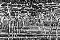
Critique By:
Kim Culbert (K:37070)
10/5/2007 5:08:17 AM
This looks like a optical illusion painting... very interesting lines and effect! You have a great eye for the graphic nature of images and how to really make them stand out. I'm off to check out the original.
|
| Photo By: Shirley Grove
(K:5514)
|
|
|
Critique By:
Kim Culbert (K:37070)
10/5/2007 5:06:24 AM
You love nature, and nature loves you! This is a fabulous shot, full of vibrant colours, great composition and excellent DOF. I hope you have this on a wall somewhere!
|
| Photo By: Shirley Grove
(K:5514)
|
|
|
Critique By:
Kim Culbert (K:37070)
10/5/2007 4:47:06 AM
Stunning picture Dave! It's so sharp, and well composed. Poor dragonfly!
|
| Photo By: Dave Holland
(K:13074)
|
|
|
Critique By:
Kim Culbert (K:37070)
10/5/2007 4:45:42 AM
Hi Dave!
I tried playing with it photoshop... I used the REPLACE COLOUR tool and made the creams blue. Then I took the history brush tool and ran it over the feathers again, to bring back the colour. I'm trying to learn a little more about photoshop, and to use what I learn so I don't forget it.
Hope you don't mind my messing around!
|
| Photo By: Dave Holland
(K:13074)
|
|
|
Critique By:
Kim Culbert (K:37070)
8/27/2007 4:23:11 PM
Such sharpness and detail! It's too bad about the faded yellow background... it makes this amazing capture not stand out as much as it should. Once opened to full size its' very impressive.
Next time there is a blue sky you should go Merlin hunting again!
|
| Photo By: Dave Holland
(K:13074)
|
|
|
Critique By:
Kim Culbert (K:37070)
8/27/2007 12:54:53 AM
Thanks for the comments! I'll have to go check out Fabio's work... I'm getting the feeling I will be amazed with abstracts-galore!
John... that is a neat effect... I might have to create a slideshow of a bunch of images that I process like that! Thanks!
|
| Photo By: Kim Culbert
(K:37070)
|
|
|
Critique By:
Kim Culbert (K:37070)
8/26/2007 2:56:41 PM
We spent a month up at my in-laws cabin this summer (I was still on mat. leave and my husband's a teacher, so we thought we should take advantage of both having 6 weeks off together!)
I've got some really great shots from around the area... it was an amazing summer! Thanks for looking!
|
| Photo By: Kim Culbert
(K:37070)
|
|
|
Critique By:
Kim Culbert (K:37070)
8/23/2007 4:59:04 AM
I like the colours and the framing in this one better. Love those backlit jet trails!
|
Photo By: Dan TDFoto
(K:8618)

|
|
|
Critique By:
Kim Culbert (K:37070)
8/23/2007 4:56:15 AM
Were you on Knox Mountain? *grin* I used to live in Kelowna... it's nice to see other BC'ers on here!
I like the grain in this photo... makes it feel like a war time photo with the muted colours and grain. The one thing that I think would make this stronger would be to crop it to put the plane off centre with the jet trails leading through the image at a diagonal.
|
| Photo By: Dan TDFoto
(K:8618)
|
|
|
Critique By:
Kim Culbert (K:37070)
8/23/2007 4:52:33 AM
This is really neat... great detail in the cube and the lighting is very dramatic. The composition doesn't work as well for me, as there is so much darkness on the right.(almost cuts the picture in half)
Oh, and hey fellow Vancouverite!
|
| Photo By: Braden Hanna
(K:451)
|
|
|
Critique By:
Kim Culbert (K:37070)
8/23/2007 4:50:23 AM
Great colours and nice DOF to put the flowers in the bg out of focus.
|
| Photo By: Amy Astolfi
(K:160)
|
|
|
Critique By:
Kim Culbert (K:37070)
8/23/2007 4:49:37 AM
Very pretty eyes, and I like the way her face fills the frame. Looks a little soft though... maybe a bit bigger of an aperture would keep more of her face in focus since her mouth looks the most in focus.
Very cute!
|
| Photo By: James Lee
(K:86)
|
|
|
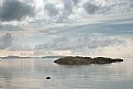
Critique By:
Kim Culbert (K:37070)
8/23/2007 4:46:12 AM
Gorgeous colour and excellent use of a slower shutter speed. The use of the filters is well done, and really adds a dreamy effect to the image. I'm sure the file is super sharp, but for some reason the rock in the ocean looks a little soft around the edges to me.
|
| Photo By: Paul Harrett
(K:791)
|
|
|
Critique By:
Kim Culbert (K:37070)
8/12/2007 3:56:21 AM
I thought for sure this was going to be a composite image.. very cool that it is for real ,how you saw it! Love the bright colours and the tilt... adds to the power.
|
| Photo By: Viorel Dragan
(K:-22)
|
|
|
Critique By:
Kim Culbert (K:37070)
8/11/2007 3:05:38 PM
It's perfectly set up for a book cover... now you just have to write the book! *grin*
Thanks for the explanation!
|
| Photo By: heather martino
(K:3648)
|
|
|
Critique By:
Kim Culbert (K:37070)
8/7/2007 5:43:27 PM
Love the action and energy in this one, but I do wish I could see a hint of her expression, to share in the fun she is having!
|
| Photo By: Petros Stamatakos
(K:12101)
|
|
|
Critique By:
Kim Culbert (K:37070)
8/7/2007 5:38:46 PM
I like the angle and the colour mix in this shot, but I find all that empty space at the top not needed. I'm sure you framed it this way for a reason though, and I would love to hear your comments.
|
| Photo By: heather martino
(K:3648)
|
|
|
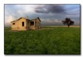
Critique By:
Kim Culbert (K:37070)
8/7/2007 5:35:11 PM
Dave, I love this one. The colours are so vivid, and the scene so stark. It's a very interesting contrast, and you really did catch the magical light.
I've never been to Vulcan, but after seeing this, I think I should!
I can't believe how sharp the roof of the house is... it stands out so well against the sky. Truly a breathtaking image.
|
| Photo By: Dave Holland
(K:13074)
|
|
|
Critique By:
Kim Culbert (K:37070)
8/7/2007 5:32:18 PM
I'm with Collin... I like the composition. And the soft pastels are really soothing, which go along with the watery tones.
Is this one from a while ago, or did you slip away to Pender Harbour again recently?
|
| Photo By: Becky V
(K:9699)
|
|
|
Critique By:
Kim Culbert (K:37070)
8/7/2007 5:29:48 PM
This has such a dramatic feel to it (except for those goofy golden grins!hahahaha) The shadows on your face are lit wonderfully and nothing seems too hot or too dark. I love the sky although it seems maybe just a touch too black and white.
|
| Photo By: Dave Holland
(K:13074)
|
|
|
Critique By:
Kim Culbert (K:37070)
6/18/2007 5:14:16 AM
Hi Dave,
Nope, she's my friend's little girl... such a cutie. We still only have Ian. One is way more than enough for now!
|
| Photo By: Kim Culbert
(K:37070)
|
|
|
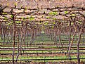
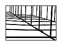
Critique By:
Kim Culbert (K:37070)
6/16/2007 5:22:34 AM
This is very cool... reminds me of a perspective puzzle. Are the lines on the outside, or inside? My mind can't figure it out. Great abstract!
|
| Photo By: Sandip Aine
(K:5008)
|
|
|
Critique By:
Kim Culbert (K:37070)
6/16/2007 5:20:22 AM
I don't think I'd seen this one before... I like the stump... it reminds me of an animal coming out of the water. (maybe a sea lion?) I agree about cropping the tiny bit of sky in the top right... keep it more uniformly green.
|
| Photo By: Becky V
(K:9699)
|
|
|
Critique By:
Kim Culbert (K:37070)
6/16/2007 5:18:49 AM
hahaha, LOVE the title! And your goldens are so cute. (and a little toy crazy!) Awesome details in the dogs and the toy... I know exactly where I am supposed to look!
|
| Photo By: Dave Holland
(K:13074)
|
|
|
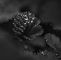
Critique By:
Kim Culbert (K:37070)
6/16/2007 5:17:22 AM
The detail in this is amazing... and I like how the drops pull my eye from one corner to the next. At first I thought it was a little too dark, but it's grown on me. Interesting shades!
|
| Photo By: Audrey Reid
(K:5872)
|
|
|
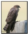
Critique By:
Kim Culbert (K:37070)
6/16/2007 5:12:17 AM
Ahh, he looks so at peace with the world! Great DOF and lighting.
|
| Photo By: Agnieszka Borkowska
(K:1427)
|
|
|
Critique By:
Kim Culbert (K:37070)
6/16/2007 5:06:02 AM
If there is any way to get her further from the background it would blur the sheet so you wouldn't see the wrinkles and make for a smooth bg.
She looks like a cutie!
|
| Photo By: Amy Marchand
(K:15)
|
|