|
|
Critique By:
Angelo Villaschi (K:49617)
6/20/2005 7:12:41 AM
Hi Dawn,
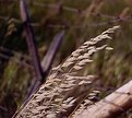
Very nice diagonals in this photo, and a good choice of square crop.
As far as saving photos for upload to UF, this is what I do: Image>Duplicate, flattening any layers. Then on the new image, I resize (Image>Image size) to the required dimension (usually I just resize it to 50% or 25% of the original, whatever fits), do any required sharpening with Filter>Sharpen>Unsharp Mask. Finally, File>Save for web... which is the only stage at which I save to JPEG.
Hope this helped.
|
| Photo By: Dawn F. Collins
(K:560)
|
|
|
Critique By:
Linda Imagefree (K:72276)
6/20/2005 1:13:33 AM
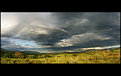
Angelo this is wonderful, love the panoramic view again...Such an interesting contrast between the sunny landscape and the dark drama in the sky...love the rainbow, that really makes this image for me...A great wide angle capture, well seen and appreciated.... Linda Linda
|
| Photo By: Angelo Villaschi
(K:49617)
|
|
|
Critique By:
Carsten Ranke (K:14476)
6/19/2005 10:42:30 AM
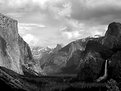
This would be my favourite, without the little bush in the right corner, perhaps. There is so much drama in the sky that I would love some more contrast there. It is more advisable to shoot color and convert to B&W afterwards, IMO. The G2 makes a simple desaturation, you have much less control shooting straight B&W, and you get a jpeg, not a RAW (right ?). Anyway, a majestic landscape, I like it very much !
|
| Photo By: Naomi Weidner
(K:6636)
|
|
|
Critique By:
Ellen Smith (K:14418)
6/17/2005 4:09:10 AM
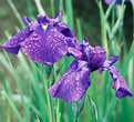
I gave it a stab. I adjusted the levels added a photo filter to make the background more green and then selected the iris and adjusted the levels again to deepen the purple. I do prefer darker images so this may be way over the top.
|
Photo By: Roger Williams
(K:86139)

|
|
|
Critique By:
Michael Kanemoto (K:22115)
6/15/2005 1:45:52 PM
I'm still trying to contemplate what goes through your mind to say: "that would make a great photograph"... Most of us (me included), wouldn't consider this location.
The composition really makes this a great photograph, but ultimately the subject, color, and just the plain subject of it all really has a thoughtful presentation.
Thanks for posting - you give newbies like me something to consider and a new way of seeing.
|
| Photo By: Todd Miller
(K:16464)
|
|
|
Critique By:
Ned Ali (K:11928)
6/15/2005 3:13:57 AM
you have a great eyes for compositions, Fadel.
the way these lines leading the viewer's eye through the image is fantastic!
the dark area in the trees where the fence ends adds to the composition.
well done, Fadel.
keep them coming.
|
| Photo By: Fadel J
(K:13974)
|
|
|
Critique By:
arwa abdullah (K:34415)
6/13/2005 1:04:01 PM
Awwwwwwwwwwwwwww its unbelievably adorable!!!!! The cutest mearcat image!!!
Its not just cute but it takes a while to get over the cuteness to appreciate the outstanding photography skills shown here!
All the important details are sharp! we can even see the hair on his belly, excellent moment it seems as if hes grinning looking with curiously at the photographer or maybe the huge lens lol
The background is perfectly blurred but what makes it really special is the composition with the upper and lower branch framing this cute little guy!
Well done my friend! very impressive work
to my favorites
|
| Photo By: James Hager
(K:6285)
|
|
|
Critique By:
Fadel J (K:13974)
6/13/2005 2:52:40 AM
Hey Peter, first of all thank you very much for all your lovely comments! this is a very beautiful image indeed, and a very nice long exposure idea. Regarding adding drama to the image, I'm not really sure if BW would work because of the amount of lights in the scene, also the sky is blown out in the distance (because of the long exposure) so I guess the best thing to do to it in this case is to replace it
But in general the main idea to make a sky look interesting is to make sure it is not over-exposed when shooting it (even if you have to take multiple exposures one for the sky and one for the foreground), and then darken it in post processing (in PS elements you can use Levels and move the middle slider little to the right, and create a mask to avoid darkening the foreground), this will bring out the cloud details which will make it look good. Also if there are heavy clouds, then darken using the same technique above and also move the right-most slider little to the left, this will add contrast and create a dramatic feel to it.
Also check Carsten Ranke's portfolio, he has a set of fantastic skies and he usually describes the used technique in the about. And later I will give you some links that might be useful as well. Beautiful work!
|
| Photo By: P R
(K:341)
|
|
|
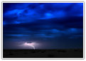
Critique By:
Steve Hennerley (K:5776)
6/12/2005 11:34:37 AM
Hi Latif -
Awesome shot - I can well believe it took two hours waiting. The color of the sky is just captivating...
Great composition - even though the actual composition was completely not under your control!
Nice simple lanscape hightlights the beauty of the sky and the power of the lighning.
Thank you very much for your comment on "the fishermen"
Kindest Regards
Steve
|
| Photo By: Latif alobaida
(K:5005)
|
|
|
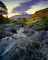
Critique By:
Andy Radford (K:680)
6/10/2005 7:12:17 PM
Ahhh! Ashness Bridge - wonderful, atmospheric shot. Derwent Water and Borrowdale are my favourite parts of the Lake District. Did you take some landscapes from the crag overlooking the lake? The crag is a few minutes walk from the car park at Ashness Bridge. I got some great shots from there last winter, but lost them due to a virus on my PC. I'm going back at the end of this month.
|
| Photo By: Barry Wakelin
(K:7838)
|
|
|
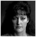
Critique By:
SarahM none (K:7836)
6/8/2005 11:33:31 PM
There are many things to like about this image. It has very strong lighting that gives it a unique look. I like the shadows that are created as well. I would be interested to know how you lit this? It reminds me of the lighting we practiced to create texture, which shows in her face. Great job!
|
| Photo By: David Wagner
(K:165)
|
|
|
Critique By:
SarahM none (K:7836)
6/6/2005 1:59:18 AM
I think this couldn't be cuter and will be a family treasure for years to come. Love the composition and it is a perfect moment!
As a suggestion, to me on my monitor, the girls face seemed just a little bit dark and caught a lot of blue reflection from the water. I took this into photoshop and drew a circle around her face and increased the levels a bit and dropped the blue color just a bit in the color balance. Just some ideas though. Great shot!
|
| Photo By: Dan Lightner
(K:12684)
|
|
|
Critique By:
Steven H (K:7142)
6/1/2005 12:58:43 AM
This is really exceptional . . . it verges in some ways into the abstract with the forms and shapes you have created in the choice of shot, and in the cropping and framing . . . I like that you didn't apply a title to it . . . it adds to the mysteriousness of the moment . . . what is she doing, what is she looking back towards . . . where is she . . . all left open questions by your choices, and appeallingly so . . . the tones and sense of movement are all wonderful . . . a winner . . . and a further demonstration of your versatility . . .
|
| Photo By: Dina Marie
(K:-1410)
|
|
|
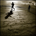
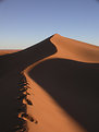
Critique By:
Caitlin Carr (K:245)
6/1/2005 3:50:33 AM
I really like this photo, especially how you kept the footprints in the foreground, it gives the picture more depth and adds to the story. Was the subject actually a soldier? The fisheye adds a lot to the picture also, along with the awesome clouds and contrast in the background. Great job.
|
| Photo By: Sigit Prasetio
(K:354)
|
|
|
Critique By:
Petal Wijnen (K:50989)
6/1/2005 4:40:44 AM
Beautiful shot in B&W!! Great shape(s), excellent crop and composition.... well done!!! Sounds like you did quite some 'work' on this shot (I stopped understanding what you did after the word subject... ;-D)... makes me somewhat curious as to how the 'original' one looked.... but it looks like a job well done...;-D!!!
|
| Photo By: Angelo Villaschi
(K:49617)
|
|
|
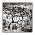
Critique By:
Linda Imagefree (K:72276)
5/30/2005 6:56:17 PM
This is so wonderful, what an eye treat, I just love it...You know Angelo art is very subjective, and sometimes I think rules are just rules and sometimes they need to be broken. I just don't think that we have to always judge a work of art by "the rules"..although I know we all have a tendency to do that..this is a beautiful, lovely image, I love the tones, and this tree is so proud to be there in its surroundings that you so wonderfully captured.. I like it contrasted against the open space, it's like saying this land is mine, and he's so proud of it, and to be a part of it, the lighting speaks well of that...I think when something speaks to you like this, that you have to listen..and I like the way you framed it as well....Linda
|
| Photo By: Angelo Villaschi
(K:49617)
|
|
|
Critique By:
Linda Imagefree (K:72276)
5/29/2005 3:11:55 PM
Wonderfully done Hanggan, sorry I've been missing some of your works, trying to get my camera and computer coordinated, had some problems with colors etc..I have to tell you that you do a wonderful job with your tones..I would love to know more about that, since I am exploring the idea of doing black and white...this is another one of your brilliantly composed images. You manage to capture the movement here as well as the expression..the lighting looks perfect to me, and frame is just right...a lovely portrait my friend...hugs..Linda
|
| Photo By: Hanggan Situmorang
(K:24833)
|
|
|
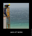
Critique By:
Khaled Mursi Hammoud (K:54005)
5/27/2005 12:06:47 PM
Excellent compositin AJM... I like the composition and tones a lot but I would prefere more space on the left side behind the guy (IMHO).
I like the different tones of the sea in the background... great capture and framing my friend,
Khaled.
|
| Photo By: AJ Miller
(K:49168)
|
|
|
Critique By:
Angelo Villaschi (K:49617)
5/23/2005 10:05:15 AM
Absolutely wonderful photo of a beautiful scene. I very much like the composition with the leading line, and also the play with shadows. Good job to leave some detail in the shadow areas.
The sky colour is very nice, a very deep blue. There is a tiny bit of vignetting on the corners, but it's still very nice.
|
| Photo By: Melody Russell
(K:1089)
|
|
|
Critique By:
James Silcock (K:12501)
5/20/2005 6:59:47 PM
Nicely composed and I like the colours both in the flower and in the background. On my monitor it shows as underexposed an adjustment would lift the contrast and colours even more.
I also think the pink and blue contrast in colour and meaning.
Thanks.
|
| Photo By: Albert Clair
(K:445)
|
|
|
Critique By:
David McClenaghan (K:9481)
5/14/2005 3:27:34 AM
Hi Henk
Yes I realise that the light and window affect the image, not much you can do at the time.
I was thinking more about boosting the contrast in Photoshop. Its a valid technique, after all thats what we did in the darkroom in the good old days.
If you send me a copy of the original I might be able to 'tweak' it to give you an idea.
|
| Photo By: Henk-Jan Kooiman
(K:-129)
|
|
|
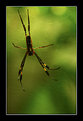
Critique By:
arwa abdullah (K:34415)
5/12/2005 4:53:15 PM
A wonderful spider image!
excellent DOF!
the way his back ? or are they the frontal- legs seems to be behind the net is an excellent way to lead the viewer back into the spider!
So the way I saw it was! first looked at the head around his legs clock wise to the back feet and back into his head! Love it!
7/7
|
| Photo By: Robert Jaworowski
(K:533)
|
|
|
Critique By:
Girish Chonkar (K:6903)
5/10/2005 12:39:02 PM
It's beautiful catch.
I was amazed looking at your portfolio and reading about your bio. It was great to know a retired registered nurse can keep her interest in photography and proves it at this age, great to know that you'd learn paiting too. Hats of to you dear Linda.
When you specified about use of border in my picture I somehow thought to see your work from your portfolio and I got the reason behind it [as you also recently started using them]. I speccially used the border for this one (Come, Past is calling... ) picture because it was not looking good without border.
You must shoot your grand children if they are staying with you, I bet you'll capture them in great pictures.
|
| Photo By: Linda Imagefree
(K:72276)
|
|
|
Critique By:
Richard Dakin (K:12915)
5/7/2005 11:44:30 PM
Wow, great shot Carol. I love solitary tree shots, and this one is superb. The composition is well balanced, but it is the lighting that knocks me out. The foreground detail, and the layers at the horizon line, created by the hills are amazing. Did you use any sort of flash on this? On top of it all, your choice to convert this image to B+W was very well considered. All told an outstanding image. I can't imagine changing a single thing.
|
| Photo By: Carol Watson
(K:5185)
|
|
|
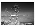
Critique By:
L B. (K:13965)
5/6/2005 11:38:33 AM
Again a wonderfull picture, good choice of b&w. Like the moon and the moody clouds. There is no trace of two picture's merged together. Really nice job, i see those frames are you're 'style' you have them in all you're pictures. I think the shadow part at the frame is wonderfull! Great job here!
Greets,
Lex.
|
| Photo By: Jeff Cartwright
(K:52046)
|
|
|
Critique By:
Rob Graziano (K:6678)
5/1/2005 1:56:06 PM
Petal,
Thanks for the compliment on my photo of the Sedona Desert! This one of yours is spectacular! Very nice! I love how you framed it up and the location is great! It is one of the places I so want to get to! Thanks Again!
|
| Photo By: Petal Wijnen
(K:50989)
|
|
|
Critique By:
Linda Imagefree (K:72276)
5/1/2005 2:07:02 PM
I love everything about this. The water, and the cows contrasted against the beautiful green grass, and then what really sets it off, for me, are the buildings poking through the trees on the horizon. This is just a fabulous shot. Linda
|
| Photo By: Ian Crean
(K:14866)
|
|
|
Critique By:
Christian Lehner (K:1247)
5/1/2005 2:10:09 PM
Hi Murat,
I love the crop here.
A litte unusual but it works fine as eyecatcher.
Could you tell me more about the lightning situation !!!???
Regarding the discussion :O)
The end of the left trouser leg looks a little "sloppy" so it's hard to make decisions regarding the cut of the trousers.
A question from a bloody beginner: The main intent of a more or less "clean" studioshot should be to show the clothes perfectly ... is that right or is it not so demanding in real professional fashion photography life ?
(I'm real interested in that !)
Thanks a lot
Chris
|
| Photo By: Murat Ozdemir
(K:800)
|
|
|
Critique By:
Roland Lacson (K:12214)
5/1/2005 2:14:40 PM
Hello Niclas, interesting perspective looking straight down to what I'm guessing is your morning brew. Like very much the pattern of the background table & the cup @ first glance makes you think is the center of the latter. Thank you so much for all your comments & I look to forward to seeing more of your images, best regards & wishes.
|
| Photo By: N M
(K:4879)
|
|
|
Critique By:
Jim Budrakey (K:24393)
4/30/2005 3:23:02 PM
You really caught the light beautifully - Outstanding. You certainly have a signature style, most impressive.
Thank you for the congratulations on my shot taking Best Color Photograph. The image itself is in my portfolio if you care to see the shot in detail.
|
| Photo By: Fadel J
(K:13974)
|
|