|
|
Critique By:
Andre Denis (K:66327)
1/4/2006 6:27:58 PM
The composition is quite good here Francesco. The image gives me the feeling that the lady in the foreground is just about to break into a full smile the same as the lady in the background. I think the DOF kind of creates this illusion of subtle human action.
Andre
|
| Photo By: Francesco Francesco
(K:8101)
|
|
|
Critique By:
John Bohner (K:8368)

12/26/2005 7:23:26 PM
As I had commented earlier before it was lost -
This image is superb - perhaps your best work to date. The use of metaphore here in combination with the tension from the various elements leaves me breathless. Then again, one flight of stairs leaves me breathless! Well posted.
JB
|
| Photo By: Phillip Cohen
(K:10561)
|
|
|
Critique By:
Roland Lacson (K:12214)
12/11/2005 4:33:52 PM
Nice capture & the choice of tone is excellent Ina. The inclusion of Mr Caruso in Rigoletto looks great in relation to the entire composition & contrast looks good. Just an opinion, I'd crop a little more off from bottom portion. Nice editing job thru PS, regards.
|
| Photo By: Ina Nicolae
(K:44481)
|
|
|
Critique By:
danilo parra (K:549)
12/7/2005 8:09:13 PM
my interpretation is that this man once was the soldier in the statue behind him and now he's just an old modest man taking a revisit down memory lane. very nice capture. i like your stuff a lot. nice webpage too
|
| Photo By: Dorota Wroblewska
(K:340)
|
|
|
Critique By:
Steve Rosenbach (K:8338)
12/7/2005 8:19:08 PM
This is really beautiful, Gayle. Yes, I see the 3 distinct patterns - the upper area of "smoother" ripples, the grasses, and the lower area of "choppy" ripples - it's amazing how you got this little microscosm - so much going on in such a small space. I really like the way the upper and lower water parts are separated nicely by the grasses. Most people would never notice the difference between the two parts, but you captured it so well.
Best regards,
SteveR
P.S. - I think your choice of sticking with color instead of B&W was a good one for this image.
|
| Photo By: Gayle's Eclectic Photos
(K:91109)
|
|
|
Critique By:
Derek Dixon (K:4948)
12/7/2005 8:20:42 PM
Excellent eye! it does look like a piano... wouldn't have seen it myself though... thanks for making us see things differently.
Even the 'nornally annoying' lamp post peering in doesn't disturb me... gives me scale of this huge musical building
|
| Photo By: Jeanette Hägglund
(K:59855)
|
|
|
Critique By:
UMUT CALISKAN (K:-52)
11/26/2005 9:49:33 AM
At first I thought that your "small boy" is the best because I felt the pain in the depths of my soul.I felt like crying. But then, "Two drops"...There is still pain but I can feel the clemency of the hands on the child's face. There is still a huge question that is not answered yet. Would that Two Drops be enough for survival?
|
| Photo By: Philip van de Graaf
(K:147)
|
|
|
Critique By:
Roberto Carli (K:13689)
11/26/2005 10:08:17 AM
Just a little complicated to explain my thought:i observed it for minutes and in conclusion i can say it's a very good shot!!!!
Like the diagonal formed by the two main shot subject(Her head and the car).
Very creative and original,perhaps could be better cropping the windows in the upper left corner........but i am not so sure......i am still thinking on the case........So put it into my favs,and sometimes comeback to see it!!!!!
Anyway ur shot takes many time to the visitors.......
Best.
|
| Photo By: Gertrud Gozner
(K:14222)
|
|
|
Critique By:
Antonella Nistri (K:21867)
11/26/2005 10:25:45 AM
This is ma masterpiece! Absolutely magnificent.
You deserve an award for it!
Can you tell me if you use a remote shutter release ( with a cord ) or if you do it simply by pushing the button? I wanted to try out my analog cameras for night photography but since they don't go over 1 second, I have to put them on B pose and count...
I would be very grateful if you explain me how you do it.
Excellent work!!!!! Favorite!!
Antonella
|
| Photo By: Florin Pavel
(K:5512)
|
|
|
Critique By:
Sam Graziano III (K:14064)
11/22/2005 2:48:34 AM
Hi Tracy,
First off....Thank you so very much for your comment on my image today. It really appreciate it very much!
If there is anything you want to learn I would be more then happy to help you out.
I have been to Paris 100's of times while I was stationed in Belgium. I really like being in Downtown, By the Arc De-Triumph and the Eiffel tower. along with the Louvre.
On this shot.....It looks like you did a lot of needed Ps work to the Arc to remove the scaffolding.
Are you learning PS?
I could give you some pointers if you would like them?
With a Shot Like this of the Arc...Remember the rule of thirds....ie. Position the Arc on the right 1/3rd of the shot. Make sure the Arc horizon line is right....Meaning, that it doesn't tilt to one side or the other.
Composition is half the battle.
Remember....When shooting a landmark...ie making the arc the subject...be sure to get the entire Arc in the shot...Now conversly...if the subject was the sculptures on the Arc....the its ok.
I can teach you how to work flow a shot...
I hope that I haven't offended you in any way...just trying to give an honest opinion.
Kind Regards
Sam III
|
| Photo By: Tracy Mortimer
(K:369)
|
|
|
Critique By:
Sebastian Zachariah (K:3382)
11/22/2005 7:40:13 AM
This one is awesome Jacek. The image has a haunting quality to it and i can see myself waking up in the night seeing this image in my dreams... amazing. Chris said something here about the black line on top and you agreed - so i shall not elaborate... Thanks for sharing this Jacek.
sabz
|
| Photo By: jacek bielarz
(K:1184)
|
|
|
Critique By:
Gerhard Reider (K:509)
11/22/2005 7:43:29 AM
Great! Your Picture shows what family is meant to be. The older ones should stand behind the younger ones to give them strength - and the younger ones sometimes can stand in front of the old to protect them.
Best wishes,
Gerhard
|
| Photo By: David Bulli
(K:641)
|
|
|
Critique By:
Riny Koopman (K:19998)
11/22/2005 9:05:48 AM
Can feel the beautiful atmosphere trought your capture, the calm water with its reflections gives an attractive and good element balance! Many thankx for all your generous commenting on my work.
My warm regards from cold -3 Holland.
Riny
|
| Photo By: Roger Williams
(K:86139)
|
|
|
Critique By:
Givenname Surname (K:-24)
11/21/2005 10:37:31 AM
Hey Patrick,
This image is fantastically composed, and the expression is very dark and mysterious, great work!
I think if you want the focus to come out sharper, you should use a small aperture, which will allow the depth in focus to extend a great deal, allowing you to achieve clear images without any real hassles.
Kindest regards, Lance.
|
| Photo By: Patrick Jacobson
(K:29151)
|
|
|
Critique By:
Margaret Sturgess (K:49403)
11/20/2005 8:16:57 PM
Again I like the lines, the compositon, the tones and the filter I think gives it a great effect. Feel I would like a bit more punch/pep, I lowered the levels a bit, I hope you don't mind me experimenting, they are just ideas to be thrown in, it is giving me ideas of how to work on my BW techniques as well
Margaret
|
| Photo By: Mireille Heirendt
(K:7258)
|
|
|
Critique By:
Jessica Dittmer (K:477)
11/20/2005 8:24:08 PM
I love this image! I followed you here today from the thread at ILP. I have a gallery here too. These images of yours are wonderful! Just like I like them! REAL, HONEST, and lovely contrast and depth!
|
| Photo By: Jan .
(K:8693)
|
|
|
Critique By:
Shereefa Ls4 (K:1412)
11/20/2005 10:03:54 PM
One of the disadventages of digital cameras is that the pale colours you get in comparison with film photoes..
The advantage is that you can overcome this problem by such adjustments..
It is still your photo and still original...
Even films undergo some adjustments during there developing...
It is your digital dark room and what you want is an eye catching photo..
Why not boosting the colours a little?? 
Hope I could convence you
|
| Photo By: Reda Danaf
(K:14309)
|
|
|
Critique By:
Kent Marcus (K:216)
11/19/2005 11:38:10 PM
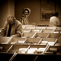
This event is always a difficult one to photgraph. As per your request, I can see two ery interesting photographs. A tight crop in the guy sitting down, and a tight crop on the guy squatting. for the latter if you were able to shoot him front of, or even onthe 45, it may be a very interesting of his face. He seems to have a very interesting expression. Was this hand heald. If so it looks great, you have a very steady hand for low light. Good eyes to see the shot.
|
| Photo By: shabking king
(K:-40)
|
|
|
Critique By:
Thilo Bayer (K:50358)
11/19/2005 3:07:16 PM
Hi Slava,
you managed to create a near film like look here with the bold contrasts, the vignetting and the strong contrasts. maybe the vignetting is a bit harsh at the edges so that the gradient is not 100% perfect. anyway, I love that subject with the bench leading to the horizon. good one!
best wishes,
Thilo
|
| Photo By: Slava Z
(K:1124)
|
|
|
Critique By:
Ann Nida (K:45248)
11/12/2005 7:09:05 AM
This makes a beautiful collection on the one image Robert. I'm probably in the minority here but I really love colour in all its tones and shades. I do like some things in B&W but for the msot part I think we (or at least my parents generation and my younger years) had to go through too many years with B&W photos and B&W TV then colour came in and WOWed the world and now that the world has digital colour to boot everyone wants to go back to B&W. It's like they got what they want and now they don't want what they got. haha Needless to say I really like the colour version here the best as a single but I also really like the Sepia and the B&W too.
Now having been so wordy and said all that I wonder if it might be an idea to change the position of them putting the sepia first then B&W then the colour on the right as though it was all going through time itself. Just a thought that passed through my head. Great shot Robert. I really like this one.
Thanks also for taking the time to view and comment on my Space Shuttle image.
Cheers - Ann
|
| Photo By: Robert Kocs
(K:89085)
|
|
|
Critique By:
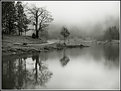
Fabio Ficola (K:10466)
11/12/2005 7:17:30 AM
A fine image, wel composed and exposed.
I've spent some minutes looking at trying to undestand why it's so special.
The place? no doubt.
But I think that the magic came out from the wise framing with the right space to water and it's reflection and the little naked tree exactly in the center breaking each rule to gain the main character role in this picture.
Best congrats. -Fabio-
|
| Photo By: baldacci baldacci
(K:412)
|
|
|
Critique By:
Gayle's Eclectic Photos (K:91109)
11/12/2005 7:40:36 AM
Old Navy would be doing well to have him promote their babywear!.....liquid eyes and the cutest mouth!.....great clarity,skintone and dof...you sure are good at capturing some darling candids of kids,Suze.....regards,gayle
Thanks for your valuable feedback on my latest card and non-card subjects...
|
| Photo By: Susie OConnor
(K:34798)
|
|
|
Critique By:
Martin . (K:24957)
11/12/2005 8:31:56 AM
Sheila,
I think you are an Artist, but how do you develope film twice?
This is a "Timeless Masterpiece" IMHO... You have done what most of us try to do, our whole lives...
I do love your style regarding the 400 ISO grain look, but do you ever choose anything with less grain?
I did my grainy thing with my self's, but that was 1600 ISO and digital is much more forgiving, than film? When I shoot film you will find that I do not go over 200 ISO with 35mm and 125 ISO in MF... Sup?
Marty
|
| Photo By: Sheila Carson
(K:5924)
|
|
|
Critique By:
Roger Williams (K:86139)
11/12/2005 10:26:24 AM
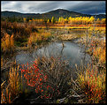
Just water and weeds, huh? Like wine is just grape juice left to ferment...? This is really gorgeous. You know I'm not too keen on highly saturated colours but they really work very well in this one. The distribution of those deep orange/yellow colours around the image couldn't be bettered. Very well captured, sir!
|
| Photo By: Tim Schumm
(K:29196)
|
|
|
Critique By:
Ann Nida (K:45248)
11/4/2005 12:49:55 AM
You should always use a tripod when taking photos of waterfalls. You will need a camera with manual settings so you can set a slow shutter speed to get the misty water effect. If you do have a camera with manual settings try a few different shutter speeds. Depending on the waterfall and available light I have found around 1/8 of a second to 1 second usually gives me a nice misty effect but that also depends on the distance I am from the water, the amount of water going over the falls and other factors that enter into the equation. It took me years to get my waterfalls misty and many missed shots. As a amtter of fact it was only recently that I took those waterfall shots and I got those with the help and advice of other people here.
Again my suggestion would be to set up your tripod and try to perfect your composition first. When you have found which focal length works best for you and which angle you think looks best to shoot your subject and what is in your actual frame then you can post it here for people to give advice on how to improve the technical aspect of your images.
I found it's always best to try to get the entire waterfall from top to bottom in the photo. A few times I've zoomed in thinking I'll get something artsy only to get home and see that my photos look like they have been cut off and I missed the top or bottom pool.
Of course each to their own but my preferred learning curve is to learn composition first then the technical side will happen all in good time.
Good luck. Ann
|
| Photo By: lauren Cornwall
(K:154)
|
|
|
Critique By:
waleed montasser (K:2569)
11/4/2005 1:42:24 AM
Extra-ordinary mood u make here and the wide angle lense helps alot 2 put the spectator inside of it , the contrast between the dark branches spreading all over the image and the bright grass on the ground gives the shot a moody feel and adds potential 2 it
1 of ur best Linda
Regards
|
| Photo By: Linda Imagefree
(K:72276)
|
|
|
Critique By:
Kelly Duntley (K:13889)
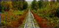
11/4/2005 1:50:11 AM
Ooh, I like this one very much. It has a great deph of field. My eyes start at the beging in the track and travel down. The landscaping on both sides of the track is beautiful and you have captured the colors and textures nicely. Well done.
Kelly
|
| Photo By: Anis Ahmed
(K:356)
|
|
|
Critique By:
John Loreaux (K:86210)
11/4/2005 2:08:35 AM
Fantastic photo Kevin!!! Love the light here!The tree silhouettes are great!Love the tones and the rays of sunlight! The gulls are beautiful! Congrats on a super photo! My best!!!...................John
7 !
|
| Photo By: KEVIN TEMPLE
(K:8657)
|
|
|
Critique By:
Gary Riedel (K:979)
11/4/2005 2:20:26 AM
Greg, I usually pass on pet pictures, but this is great! I have an equally hadnsome partner named Java and so appreciate your love of this capture. This is above the normal pet picture. Congrats to you and hope to see many more. The paws, nose, and leathery lips of felines are so beautiful and you have done a fantastic job here of promoting that fact. More...more.
|
| Photo By: Greg Scott
(K:1990)
|
|
|
Critique By:
Ann Nida (K:45248)
11/4/2005 2:59:36 AM
Nice composition there showing the guy on just the corner stretch of beach. Looks like a cold, windy day with those white caps. Makes for interesting colours and textures. I like the strip of blurred land in the background and the great clarity in the foreground. Nice relaxing image yet the waves give it some excitement too. Good shot and nice to view....ahem....if you know what I mean.  Cheers - Ann Cheers - Ann
|
| Photo By: Larry Donnelly
(K:644)
|
|