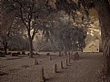
|
|
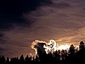
Critique By:
Kelly Duntley (K:13889)

2/10/2006 1:31:50 AM
The colors that you have gotten from the dreadful event are very beautiful. I can just feel the pending doom. Wonderful cloud and smoke formations in the sky. I like the dark outlines of the trees in the forground also. Nice work.
Kelly
|
| Photo By: Weston Dru
(K:3243)
|
|
|
Critique By:
Ann Nida (K:45248)
2/5/2006 4:54:19 PM
Great DOF used here. Even with that super sized lens I've found birds are so hard to capture as they move so fast. I think considering the light and how timid this type of bird normally is you've done a top job of getting this one. Some birds will sit there and almost pose for you while you take their photo. This isn't one of those. A very timid bird who flies away at first sense of danger and won't let anything get too close. Birds are not my forte so from where I'm sitting I think you've done well.
Thanks for dropping by my waterfall image. That image was intentionally tight. I have many of that same waterfall as it's my favourite. I've captured it in all sorts of variations.
Cheers - Ann 
|
| Photo By: Jeroen Wenting
(K:25317)
|
|
|
Critique By:
The Pilgrim (K:65058)
2/4/2006 3:49:59 PM
Do you know what you have done here Angela? You have capture an old photogrphy technique called
available light photography. That is using only the light that is available to you at the time you snap the shutter nothing added. like what it looks like here with light coming in from a window to the left. It adds much realism and truth to the photo! You have captured that very well here.
Keep up the great work, you are doing wonderful!
Paul
|
| Photo By: Angela Lynn
(K:1483)
|
|
|
Critique By:
marco "dheim" orciuoli (K:4467)
2/3/2006 6:11:44 AM
the biggest issue with landscape photography is the difficulty to give the right sense of scales and distances, in other words to force a vast and breathtaking scenery in a small frame... with this perspective, angle and light i think you succeeded. it instantly caught my eye and i almost got lost in its depth... great!
|
| Photo By: Marc Adamus
(K:805)
|
|
|
Critique By:
z z (K:7231)
2/1/2006 4:19:49 PM
I had to look pretty hard to see what mirror reflection was being commented about. I think what they are referring too is the small over hang on the left side. Too funny. It does become an optical illusion when you look at the overhang as if it is part of the main roof. The reflections are wonderful on your captured country scene! And the illussion really makes you look deep into the photo to explore.
|
| Photo By: Kathy Hillard
(K:25721)
|
|
|
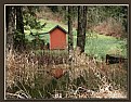
Critique By:
Gabriela Tanaka (K:16594)
2/1/2006 2:46:43 PM
This is very beautiful, Kathy, a winterish capture where colours call for attention.The dried grasses in the far background and the yellowish ones in the foreground complement one another greatly, leaving space for some green grass in between. The red of the chalet peeking in the small pond is the necessary accent giving warmth to the whole scene.Reflection is such a wonderful happening!
Gabriela
|
| Photo By: Kathy Hillard
(K:25721)
|
|
|
Critique By:
Johancharles Boers (K:4370)
2/1/2006 2:36:33 AM
A really nice photograph. When shooting in a helicopter you really need to be careful of the outside light. What you can do is meter for the outside, the use a flash to balance the light in the inside, that is if you can use a flash in the helicopter. Always check with the crew chief or the piolt.
Chuck
AKA - Johancharles
|
| Photo By: Charles Clee
(K:90)
|
|
|
Critique By:
Joel Aron (K:14920)
1/30/2006 11:01:09 PM
Possibly the best of all your self portraits There's obviously something different here from al lthe rest, and that's makes it stand out. Your DOF, and crop choice are all perfect! What would be nice.. to see this bigger! Push the usefilm limit on this one.. upload another version at max rez! You may also want to pull some the highlights up on the pearls. Because they are the center interest of the shot, your eye doesn't go there. My wandered a bit before I found the pearls.
Well done! Keep up with the B/W, and push more contrast!
best,
-Joel
|
| Photo By: kristen anderson
(K:-100)
|
|
|
Critique By:
John Williamson (K:1145)
1/26/2006 8:12:06 PM
People often times attempt to integrate people into their landscapes. Rarely does it turn out to be anything more than acward. You have accomplished it beautifully. Framing, DOF, exposure all are perfect. You truly have a great portfolio!
|
| Photo By: layil photography
(K:-234)
|
|
|
Critique By:
vanessa shakesheff (K:68840)
1/26/2006 6:47:45 PM
This is wonderful sir glen ..goregous colour and detail..love the bold red and dof.best wishes lady nessa...can you do me a favour glen have a look at my picture ..love you sweetheart and tell me if it is grey and misty or a black background.it looks different on different monitors.best wishes nessa oh 7/7
|
| Photo By: Glenn Edmiston
(K:7366)
|
|
|
Critique By:
Petal Wijnen (K:50989)
1/27/2006 9:25:30 PM
Neat colorful (and healthy... ;-D) 'combo' shot!! Fabulous colors, nice textures, like the framing and composition (of the seperate shots as well... the frame filling 'works')... well done!!! The only thing I would change is switch the Granny Smith in the lower left corner with the red/orange peppers in the pic on the right of them... so that you don't get Oranges (in the middle one) on orange but on green... get it... if not let me know... LOL!!! BTW looks like you get your daily dose of 'vits and greens'... ;-D!!
|
| Photo By: Steven vanHaaster
(K:888)
|
|
|
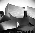
Critique By:
Mark Longo (K:12760)
1/25/2006 6:12:20 PM
Another excellent architectal. It is interesting to notice the different reflective effects created by the different types of exteriors on these two buildings. Obviously the abstract lines of the buildings are interesting as well, but I especially like the lines created by the sky against the building edges. Seen that way, it is an image of three abstract shapes: build/sky/building. You angle/perspective taken for this shot is very well chosen.
As a separate note, I have just seen your current "artist portrait", which is very well done. The style puts me in the mind of many wonderful portraits I have seen of Laurie Anderson, a tremendously gifted multi-media artist. My kudos to yourself or whomever shot that portrait. It is very very well done.
Best regards,
Mark
|
| Photo By: Jeanette Hägglund
(K:59855)
|
|
|
Critique By:
Giuseppe Guadagno (K:34002)
1/25/2006 10:25:19 PM
Sometimes the title makes the picture. But your pick has more merits: colours, composition, the usual clearness and a tridimensional feeling that comes, I suppose, from the three levels composition an the stark contrast of dark outlines and highlights on the "leaves". Is that right?
Giuseppe
|
| Photo By: Joggie van Staden
(K:41700)
|
|
|
Critique By:
Ina Nicolae (K:44481)
1/25/2006 12:02:59 AM
Your picture is a great composition with pattern and shadows, and it has that retro feel Jeanette, but the architect must walk with his chin down when walking by this creation! Maybe in a couple of decades it will be admired as "historical" - it's all relative. Ina
|
| Photo By: Jeanette Hägglund
(K:59855)
|
|
|
Critique By:
Armen Jamkotchian (K:5879)
1/23/2006 12:50:54 AM
A virtuous work of photography!
First of all the main subject - the wall of the church - is creatively separated from the harsh background by skillfully controlling the light and making the foreground lighter.
The enhanced contrast and gradually darkening background move the perception more in subconcious realm, which to me creates a very "disturbing" atmosphere of loneliness.
On the other hand the church, which probably sustained numerous destructions, embodies the supremacy and the victory of the faith and human soul over the destructive forces.
I also like the lighter clouds behind the church, which is also very symbolic.
I personally consider this a great work of photography.
Best Regards
Armen
|
| Photo By: ivan ivanovic-hagen
(K:404)
|
|
|
Critique By:
James Hager (K:6285)
1/23/2006 12:50:18 AM
Wonderful image Ann. The exposure looks good to me. I agree with Gary Dyck that taking two exposures and sandwiching them would be a good way to go if you have a problem situation in the future. I also agree with Bill Morgenstern that using a polarizing filter usually does wonders for shots like this because it takes the glare, and usually cyan cast from the reflected sky, off the wet foliage. Keep up the good work. You have a great eye for waterfall and fog shots.
|
| Photo By: Ann Nida
(K:45248)
|
|
|
Critique By:
Kevin Lanthier (K:3477)
1/21/2006 10:39:08 PM
Wow, you've definately found a very cool look here and it benefits the style of all your images, they look great so far. 89B and channel mixer, eh? Hmmm... have to remember that.
On the topic of this one, specifically, though, I think it's the least effective of all your fascinating images so far because although the lines of the graves and your horizon all lead the the church, the center of the tree on the left is a bright spot right at a compositional power point and it pulls focus and leaves this feeling like two seperate images put together. My eye doesn't know where to go and it doesn't rest right. I think there's maybe too much subject too spaced apart for one frame here.
|
| Photo By: Anson Moye
(K:3480)
|
|
|
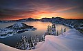
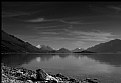
Critique By:
L B. (K:13965)
1/19/2006 8:18:43 PM
Hi Greg, i think ive seen a lot of pictures from this lake, but everytime it gets more to perfection :-) Of course there all really wonderfull in there way, but i seem to like them more and more. This b&w has a lot of dramatic elements in it wich i really like. It looks like something catastophic is going to happen. Excellent job!
cheers, Lex.
|
| Photo By: greg collins
(K:12273)
|
|
|
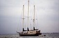
Critique By:
Chris Moore (K:5591)
1/5/2004 10:41:23 AM
Hi Isaac,
Thank you for your kind comment on my work. I see you have asked for help on this image, so I'll try to offer some ideas.
Firstly, on a purely technical note, the horizon is tilted - you've composed the ship vertically in the frame, but this has resulted in a slightly odd look asif the sea is running downhill to the left of the picture. I'd correct this, which will show the rake of the masts better etc.
Moving on, your use of high speed film on an overcast day has created quite a flat grainy look. There's nothing wrong with that if this is what you're trying to achieve, and indeed I can imagine this giving a result where the image is a very soft blue-grey coloured result, a bit like a painting, and quite serene. If this is the result you're after then you're well on the way. In that case I'd look for a day when there's more cloud contrast, perhaps shooting in black and white and increasing the contrast with filters (or digitally I guess). A slight blue or sepia tone might work nicely in that case, as might a very fast grainy film like Delta 3200 perhaps.
I see you're already at your maximum zoom, but I would consider a crop to reduce the quantity of the frame that doesn't contain the ship. Some of this area can add to the peaceful colouration of the image as above, but too much of it reduces the impact. If you use a tripod and your lenses sharpest aperture (probably f/8 to f/11) a crop shouldn't be too much of a problem unless you're really wanting massive prints. I'd crop more from the right and less from the left, giving a little space "forward" of the ship implying its ability to move (though with no sails up this is less clear).
Similarly, the tripod would allow you to use slower film if you wanted a less grainy result, good for cropping also.
The ship should provide many opportunities for good shots especially if you pass it regularly or it is nearby. I'd watch the weather forecast closely, look out for a flat calm day with some cloud but not entirely overcast, and try for a vertical composition including the reflection of the ship. On a similar day, get out there at dawn and sunset for the best light. Perhaps consider where the sun is going to come from, and whether you can get in a position to silhouette the masts and rigging against the setting/rising sun. Or look for great colours in the sky behind the ship, and colouring the sea. You'll need very still weather to get anything reflective from what looks like a wide stretch of open water, but if you're there regularly it'll work out for you sometime.
Finally, I'd try to get in touch with the owner/captain and find out sailing times then get out there ready to catch the sails up, filling with wind.
Anyway, just some ideas and opinions, feel free to discard etc. I enjoyed looking over your other images, but chose this one to comment as you specifically asked for ideas.
Best wishes,
Chris
|
| Photo By: Isaac Shaw
(K:2563)
|
|
|
Critique By:
Michael Kanemoto (K:22115)
1/18/2006 11:47:42 PM
Peta>
Extremely crisp images, I had to click on this macro since the DOF is a little bit more refined than some of the other floral shots, and I am a sucker for super macro shots.
The pistel and stamen shot is somewhat comment, but I like the fact that you put it on a diagonal and tried to show the 3D recession into space.
I really like the crisp points on the end.
I like the portfolio, a lot of shots cropped short to essenial minimum language, and a refined crispness.
|
| Photo By: p e t a .
(K:18700)
|
|
|
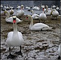
Critique By:
Del Metheny (K:25617)
1/18/2006 2:00:44 AM
Great contrast of the large and the small. You got very nice depth by including the one beautiful swan close to the camera to contrast with those further away then including the smaller ducks in the background. Nice composition. Del.
|
| Photo By: joanna ewa
(K:8061)
|
|
|
Critique By:
Giuliano Guarnieri (K:36622)
1/16/2006 11:07:33 AM
This composition is wonderful and the tones of the scene too.
I like the focusing too but it's a little bit unnatural expecially at the bottom (my personal impression) . Did you apply a filter to achieve this result? Also the vignettes... are them the limit of your lens? The result is really cool
Bye
Giuliano
|
| Photo By: Zoltán Nagy
(K:26)
|
|
|
Critique By:
Susie OConnor (K:34798)
1/15/2006 8:16:36 PM
Hi Linda,
Nice idea for a still life. This might be a good ad for the bookseller! I agree with Laura on the busyness, I think that maybe just removing the baby's breath and a little of the greenery would take care of it. Nice lighting. I can see you have a knack for still lifes. Can't wait to see the next!  ) )
Susie
|
| Photo By: Linda Mac Donald
(K:1892)
|
|
|
Critique By:
Gayle's Eclectic Photos (K:91109)
1/14/2006 11:16:18 PM
hi there,finally returning after 2 wks. of absence and have much to catch up on...makes me proud to see such a magical shot of what we Native Americans call, Mt.Tahoma,which means
"the great mountain, which gives thunder and lightning, having great unseen powers" ...the colors glow and i especially like the halo effect of the cloud formations...good perspective to take in the textural terrain and the reflections...i am not a big fan of overly saturated landscapes/sky,but i don't put this image in that category because i see the saturation level as more gentle and gives a poetic feel to the image...reminds me of the light one sees after a rain when the rainbow appears...the light is the key element here IMHO
Glad you had a great trip to my neck of the woods,Hugo......regards,gayle
|
| Photo By: Hugo de Wolf
(K:185110)
|
|
|
Critique By:
Ann Nida (K:45248)
1/13/2006 10:18:58 AM
For my tastes and in my honest opinion here's what I have for you in a nutshell Michael.
The top one has too much dark on the left side of the image.
The centre one is excellent as it shows a great wide angle and to me is a nice subject worthy of such a panorama.
The bottom one appears to have not enough sky for the large main subject. I would hjave liked to have given that great rock formation more space to breathe so a bit more sky would have worked better for me.
Having said all that I like the centre work the best.
All this coming from soneone who is jealous of such great work and who cannot do panoramas. I haven't tried this stitching of images yet but if and when I do delve into this area I hope I can do half as masterfully as you have done here. Lovely tonal depth in all these images. Beautiful work.
Cheers - Ann
|
| Photo By: Michael Kanemoto
(K:22115)
|
|
|
Critique By:
Kelly Duntley (K:13889)
1/12/2006 6:21:47 PM
Wow, what a lot of action going on here, with the boy in front with his hockey stick and the lovely couple in the foreground. Nice follow through with the path. Smartly done comming from the side and ending in the middle. Never have thougt of doing that. Work quite well.
Is that a side walk that is cover with ice and they are skating on? I'm not from those cold parts and was quite amazed at this photo. Very interesting!!!
Kelly
|
| Photo By: Dave Stacey
(K:150877)
|
|
|
Critique By:
Andre Denis (K:66327)
1/11/2006 4:01:10 PM
Thilo,
I think locked behind this vault like door will be some of the most valuable, ancient secrets that the museum has. There will be ancient objects so valuable that they can never be exposed to the light of day. Perhaps some secrets of even more importance than the Da Vinci Code!
Or, it could be where the caretaker keeps his carton of beer hidden behind the mop and bucket.
Andre
|
| Photo By: Thilo Bayer
(K:50358)
|
|
|
Critique By:
Mohammad Porooshani (K:20765)
1/10/2006 11:19:39 PM
Dear Mr. Bakhtiari,
As I said in "fructify 1" I feel some jitter in these photos, I think in this one the reason is some lack of light that makes this image having Sensor's noise effect on it. I don't know but if you use a tripod, you will gain better results even in low Lights.
Regards,
Mohammad
|
| Photo By: Kamran Bakhtiari
(K:24054)
|
|
|
Critique By:
Andrew Caldwell (K:18307)
1/9/2006 10:04:42 PM
A visual symphony! I love that you didnt do what many would--crop the bottom edge to make it a pure abstract/form study. By keeping the people--nicely caught in silhouette--you anchor it in the real, and get the best of both worlds, real and surreal.
|
| Photo By: Mark Miller
(K:370)
|
|
|
Critique By:
Dennis Hendricksen (K:4817)
1/8/2006 11:40:14 PM
A great shot with wonderful perspective and composition. I love the texture on the stonework. I wonder if the spot where the sun hits the ground is almost too bright, but this is a minor complaint. This picture gives me a sense of passing time and ancient secrets.
|
| Photo By: Vijay Kurhade
(K:10118)
|
|
")