|
|
Critique By:
Kim Culbert (K:37070)
6/10/2005 1:31:07 AM
Thanks for the option Stefan, although I think there is too much contrast in the version you uploaded... looks like there are many extremes now.
On different computers this image comes across differently... at home the original seems good, but when I go to work, our at my parent's, it looks really dark. I guess as long as the print turns out okay that all that really matters!
Thanks again!
|
| Photo By: Kim Culbert
(K:37070)
|
|
|
Critique By:
Kim Culbert (K:37070)
6/9/2005 10:36:49 PM
I like the levels of flowers that you have here... it's like a step ladder of daisies. I think by cropping a little on the top and the bottom you can clean it up a bit... the flowers that are cut off and touching the frame pull my eyes.
Just my two cents though!
The colour is nice and the sharpness of the rest of the image is great.
|
| Photo By: Henry Jalandoni
(K:140)
|
|
|
Critique By:
Kim Culbert (K:37070)
6/9/2005 10:34:32 PM
Wow, way to be in the right place at the right time! I like how the falling water frames these two gorillas, and the placement of them in the frame.
I think you could manage to crop a bit of the top off to lose the little bit of black overhang... it keeps drawing my attention to it and away from the animals.
|
| Photo By: Henry Jalandoni
(K:140)
|
|
|
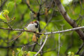
Critique By:
Kim Culbert (K:37070)
6/9/2005 6:05:09 PM
I can't see anything that you changed here... it seems seamless! Nice job, and now the bird stands out really well!
|
| Photo By: Ramiro Pérez Funes
(K:120)
|
|
|
Critique By:
Kim Culbert (K:37070)
6/9/2005 5:55:34 PM
This is a very nice (albeit different!) high key portrait... it reminds me of a Canadian TV show called Kids in the Hall as they had a character that had a cabbage for a head!
The detail is wonderfully sharp and the skin comes across beautifully.
Nice framing and use of colour!
|
| Photo By: Susann Loessin
(K:260)
|
|
|
Critique By:
Kim Culbert (K:37070)
6/9/2005 2:01:45 PM
Oohh, those are neat looking... I guess by the title "parade" I expected more recoginizeable objects... waiting for a rock giraffe now! *grin*
|
| Photo By: Stefan Engström
(K:24473)
|
|
|
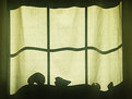
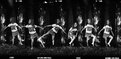
Critique By:
Kim Culbert (K:37070)
6/9/2005 4:10:41 AM
What a cool shadow parade you have here... too bad there weren't more toys that were obvious toys. The first shadow (on the left) looks like an outline of a car, but then they start to become fairly ambigious. Very well seen, and I like the light green colour of the curtain... much better than B&W!
As well, the way the shadow of the window frame is the frame of the picture is really cool.
|
| Photo By: Stefan Engström
(K:24473)
|
|
|
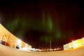
Critique By:
Kim Culbert (K:37070)
6/9/2005 2:46:46 AM
Man, if that's what they looked like in the city I can imagine the gorgeous colour that would have been exploding in the sky somewhere with less light pollution!
I am jealous that you've got so much colour there... I've really only seen the Northern Lights a handful of times and never with such strong colour.
|
| Photo By: Dan Neufeld
(K:349)
|
|
|
Critique By:
Kim Culbert (K:37070)
6/9/2005 2:45:15 AM
Nice DOF here to pull the bird away from the background. I think that getting a bit closer would have been nice as well, like you mentioned, but I also like having the surroundings too... gives a nice feel for the location.
|
| Photo By: Dan Neufeld
(K:349)
|
|
|
Critique By:
Kim Culbert (K:37070)
6/9/2005 2:44:16 AM
The lines in this image are great... the sun lights them up perfectly to let my eyes roam around. Too bad about the sun flare on the right side... I learned that it's better to shoot with a prime lens when looking directly into the sun... less flare than with a zoom. The colour is very eye catching!
|
| Photo By: Dan Neufeld
(K:349)
|
|
|
Critique By:
Kim Culbert (K:37070)
6/9/2005 2:42:53 AM
I think that the light leak would have been okay if it hadn't been right over the faces... off to one side might have given it a "glow" that would have heightened the shot.
Hope you got more than just one... they look like highly photogenic people!
|
| Photo By: Dan Neufeld
(K:349)
|
|
|
Critique By:
Kim Culbert (K:37070)
6/9/2005 2:35:01 AM
I like the abstract quality of this image... I know it's a flower, but the soft focus and dreamy colour makes it very graphic as well. Californian poppies have such great colour and petals and I think you captured this one wonderfully. I like the echo of colour in the bg as well.
|
| Photo By: Henry Jalandoni
(K:140)
|
|
|
Critique By:
Kim Culbert (K:37070)
6/9/2005 2:30:16 AM
Such a great smile... she looks as if she's a little shy!
I like the tighter focus on the face, although your wider shots are nice too to show location & atmosphere.
This is a great series!
|
| Photo By: Jose Ignacio (Nacho) Garcia Barcia
(K:96391)
|
|
|
Critique By:
Kim Culbert (K:37070)
6/9/2005 2:07:21 AM
Just because it's been bothering me that this image is so dark, I thought that I would upload the "fixed" version... brightness & contrast levels played with.
Thanks Paolo for bringing that to my attention...
And thanks to all the people who have commented so far!
|
| Photo By: Kim Culbert
(K:37070)
|
|
|
Critique By:
Kim Culbert (K:37070)
6/8/2005 5:22:54 PM
Love the expression... it looks like a very fun pizza party, even if *someone* won't stop taking pictures! hahahha
|
| Photo By: Stefan Engström
(K:24473)
|
|
|
Critique By:
Kim Culbert (K:37070)
6/7/2005 9:33:49 PM
Love the title and your "about" Very creative shot, and great use of colour!!! I can see this series hanging in Ikea!
Love the graphicness of it all... way to go!
|
| Photo By: Jeanette Hägglund
(K:59855)
|
|
|
Critique By:
Kim Culbert (K:37070)
6/7/2005 8:12:44 PM
Beautiful colours here... the greens work as an excellent backdrop for the butterfly, and the wings match the flowers so closely.
DOF is also great, since you got the entire butterfly sharp while blurry the bg. Something that I have yet to master... butterfly shots!!!
|
| Photo By: Lea Mulqueen
(K:7396)
|
|
|
Critique By:
Kim Culbert (K:37070)
6/7/2005 8:03:20 PM
It's like his shadow is walking the line as well... great graphic image.
hahaha, I scrolled down and saw that PJ saw the same thing as me....
|
Photo By: kike Calvo
(K:11291)

|
|
|
Critique By:
Kim Culbert (K:37070)
6/7/2005 8:02:13 PM
This has an infrared look to it... which gives the whole scene a rich B&W feel.
The sky gives a lot of depth to the image as well, and those building have so much character... what an amazing place to see.
Do you live close to here?
|
| Photo By: kike Calvo
(K:11291)
|
|
|
Critique By:
Kim Culbert (K:37070)
6/7/2005 7:58:37 PM
I can't believe that no one has commented on this yet... the smoke cloud is amazing. It looks like the Windsor building must have been a large one to produce such smoke!
It even looks like you managed to capture some stars in the image.. above the cloud. What a sight that must have been!
The buildings are a bit blurry, but who's really looking there anyways?
|
| Photo By: kike Calvo
(K:11291)
|
|
|
Critique By:
Kim Culbert (K:37070)
6/7/2005 7:49:27 PM
What an amazing perspective on this one, Alison! It's like the attack of the 60 ft Sculpture!
I think that the sky could have been darker, but the way you have it now it gives the image a retro feel, with the aqua sky, and the orange and greens straight out of the 60's!
You got some amazing DOF as well to keep everything in focus!
|
| Photo By: Alison DuFlon
(K:36566)
|
|
|
Critique By:
Kim Culbert (K:37070)
6/7/2005 7:44:37 PM
Beautiful skyline... the clouds have such a painterly look to them... like you used a brush and coloured the sky with watercolours.
I also like the fact that there is detail in the shadows as well.. gives an interest to the foreground too.
|
| Photo By: kike Calvo
(K:11291)
|
|
|
Critique By:
Kim Culbert (K:37070)
6/7/2005 7:41:47 PM
Excellent capture Mark... I like the layering of mountains in the background... it gives a lot of depth to the image. As well the silhouette of the gate stands out really well against the beautiful sky. Those colours sure do pop! Gotta love slide film!
The movement in the water also works really well to draw my eye back in and around to the gate.
|
| Photo By: Mark Julian
(K:36866)
|
|
|
Critique By:
Kim Culbert (K:37070)
6/7/2005 7:38:54 PM
Oooh, it is straight out of a 60's horror flick... I like the movement of the shadow across the frame... very suspenseful!
I like the fact that it's got deep shadows as it adds to the mystery.
Very unique and cool photo!
|
| Photo By: Mark Julian
(K:36866)
|
|
|
Critique By:
Kim Culbert (K:37070)
6/7/2005 6:16:16 PM
I think because this looks to be shot in the shade you picked up a blue tint... a little touch of colour correction would bring these pretty flowers back to the creamy white they should be. The whole image has a cool tone to it.
|
| Photo By: Gilberto Santa Rosa
(K:11147)
|
|
|
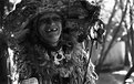
Critique By:
Kim Culbert (K:37070)
6/7/2005 6:14:23 PM
What a capture!!!! This lady has so much character... this should be the the #25 Characters Project for sure!
Her eyes do look like they've got a crazy look to them, but it all adds to the appeal of the image.
Excellent DOF to pull her costume out of the background.
|
| Photo By: Stefan Engström
(K:24473)
|
|
|
Critique By:
Kim Culbert (K:37070)
6/7/2005 4:59:11 AM
I bet this one looks amazing blown up... the eyes have so much expression and soul to them. Love the catchlights, as I think that is the main reason that the eyes stand out so well.
I notice the blur a bit more on this one, more on the top left side of the head (frame left) but it seems a natural progression into the background.
Gorgeous light, detail where it needs to be, and framing.
|
| Photo By: Martin Mora
(K:4666)
|
|
|
Critique By:
Kim Culbert (K:37070)
6/7/2005 4:55:51 AM
Congrats on the staff choice award... well deserved!
|
| Photo By: Stefan Engström
(K:24473)
|
|
|
Critique By:
Kim Culbert (K:37070)
6/6/2005 8:14:04 PM
This image seems a bit too busy to really focus on one thing. The bushes in the foreground are nice and add a great splash of vibrant red, but perhaps they need to take up more of the frame. With only the tips sticking in, and then the layering of the mountains, and then the sky it all seems to be disjointed. Something needs to tie all of it together so it flows.
Perhpas this is just my opinion, but I wonder what the other 40 people that have viewed and not commented thought?
I think the colour is well saturated and the colour in that location is amazing!
Maybe another thing to try is some different porportions... in your image half of it seems to be sky, while the other half is land... by cropping out 1/2 of the sky it makes the land become more of the focus, with its rich colour.
Either way, I think this location and even this image has potential... something about it just doesn't flow right for me. Just my two cents!
|
| Photo By: David Pereira
(K:160)
|
|
|
Critique By:
Kim Culbert (K:37070)
6/6/2005 8:08:29 PM
Wow! What a face! Those eyes stick out so amazingly!
I was hoping for a little more depth of field to have the nose in focus as well, but really, the eyes are where its at. They are super sharp and are the main point of focus, so this truly is a great capture.
I like how his body takes up the entire frame as well... all that green! How far away did you have to be with your macro lens?
|
| Photo By: David Pereira
(K:160)
|
|