|
|
Critique By:
steven carter (K:2140)
9/21/2005 3:46:24 AM
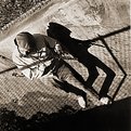
great song to go along with a unique image. the shadows just seems like a ghost is there and not a reflection, very weird but wonderful. Great eye to see this.
|
| Photo By: sammy -
(K:4108)
|
|
|
Critique By:
Ordilei Caldeira (K:2545)
9/20/2005 8:49:37 PM
Very good! i like it.
|
| Photo By: sammy -
(K:4108)
|
|
|
Critique By:
Claude Tenot (K:9960)
9/20/2005 7:30:48 PM
Superbe angle de vue et jeux d'ombres intriguants....on a l'impression que l'ombre du musicien joue sa propre partition.... seul de son côté...la photo devient ainsi enigmatique..
about my photos.....maybe something "bizarre" in my brain ? ou because i'm left hand ? ;-))
|
| Photo By: sammy -
(K:4108)
|
|
|
Critique By:
Marian Man (K:80636)

9/19/2005 1:07:26 PM
excellent perspective dear Sammy!!!! a wonderful image with fine sepia tones!!!! great use of lighting!!!!!!!
bravo!!!!
(a for the tune old but not forgotten...)
best regards and many thanks for your kind comments
Marian
|
| Photo By: sammy -
(K:4108)
|
|
|
Critique By:
Kevin H (K:22502)
9/19/2005 12:03:13 PM
Excellent shodown and great use of the lighting. I just find the angle is a little to high so you don't get to see the face very well. Keep up the good work.
|
| Photo By: sammy -
(K:4108)
|
|
|
Critique By:
Nelson Moore [Kes] - (K:20241)
9/18/2005 4:40:38 PM
Superb.
Back to back, the man and the shadow play.
|
| Photo By: sammy -
(K:4108)
|
|
|
Critique By:
Susie OConnor (K:34798)
9/18/2005 3:50:28 AM
I love the perspectives you use. Fabulous!
|
| Photo By: sammy -
(K:4108)
|
|
|
Critique By:
Branimir Fagarazzi (K:38367)
9/17/2005 8:21:11 PM
Excellent shot.7/7
|
| Photo By: sammy -
(K:4108)
|
|
|
Critique By:
Mohamed Banna (K:34237)
9/17/2005 8:18:41 PM
perfect great shadows
nice plan angle
i like it
nice tones
7
|
| Photo By: sammy -
(K:4108)
|
|
|
Critique By:
Antonia BauerleinSehnert (K:30599)
9/17/2005 7:39:42 PM
Sammy THANK YOU! This is an awesome image. Love the toning, perspective and fabulous shadow! Most of all, I love the subject. Thank you dearly for the contribution -- it gave me chills. This quilt is going to be wonderful! Antonia
|
| Photo By: sammy -
(K:4108)
|
|
|
Critique By:
gokmen aldogan (K:2067)
9/11/2005 7:49:44 PM
wonderfull graphic
|
| Photo By: sammy -
(K:4108)
|
|
|
Critique By:
murat ayral (K:2571)
9/7/2005 7:53:41 PM
Hello Sammy ,
wat an interesting image..Thanks for sharing and take your works easy ) )
Best wishes..
Murat AYRAL
PS..Also thanks 4 your comment to my photos...
|
| Photo By: sammy -
(K:4108)
|
|
|
Critique By:
since deleted (K:29)
9/3/2005 5:35:59 PM
Hello Sammy, this is obviously Eggsellent. I am glad to be the first to say that.
It really should inspire us mere mortals to try and work towards this level of photography.
Great work.
|
| Photo By: sammy -
(K:4108)
|
|
|
Critique By:
H@shim A (K:2195)
8/29/2005 8:23:51 PM
I dig this Sammy... thanks much for the context related to the photograph.
One of the best I've come across in some time.
All the best.
|
| Photo By: sammy -
(K:4108)
|
|
|
Critique By:
Endre Novak (K:12666)
8/29/2005 3:27:19 PM
Like this composition,
Cheers,
Endre
|
| Photo By: sammy -
(K:4108)
|
|
|
Critique By:
Engy Farahat (K:11591)
8/24/2005 5:13:08 PM
Very beautiful & creative idea Sammy. love the composition. it's fantastic.
and wonderful colors & textures. well done
ng..
|
| Photo By: sammy -
(K:4108)
|
|
|
Critique By:
Linda Imagefree (K:72276)
8/24/2005 5:09:00 PM
Sammy this is awesome, nice thread...I wanted to say congratulations for making the front page...well deserved...Linda
|
| Photo By: sammy -
(K:4108)
|
|
|
Critique By:
sammy - (K:4108)
8/24/2005 10:25:21 AM
Simona-
Maybe you mean the black, narrow-wale corduroy background material? I used "cord" so the eggs would stay where I put them. (I kept a steamer chest full of different colors and types of material to use for backgrounds.)
|
| Photo By: sammy -
(K:4108)
|
|
|
Critique By:
sammy - (K:4108)
8/24/2005 10:19:49 AM
Ayman-
The subject is just a little smaller than life size. The eggs are arranged on a table so the large eggs are a little higher than the small eggs but not much. Some of the eggs are simply much larger than the others. I took it from the slightly low (bottom of picture)side to make subject depth even shallower. I am standing on a chair. The Pentax, which is pointed almost straight down, is mounted on an ancient 300+lb studio camera stand.
|
| Photo By: sammy -
(K:4108)
|
|
|
Critique By:
Antonia BauerleinSehnert (K:30599)
8/24/2005 9:49:24 AM
This is phenomenal. Just finished reading the description of what you did to get the results. It is one of the more thorough explanations, which I enjoyed immensely. It is great to be able to walk through the process like that. Why not put it in your about, as many who look at the image will miss that wonderful explanation unless they happen to pan down in the comments. Congratulations on a beautiful piece of art, having so many images placed in the magazine, and now on your featured critique. BTW, I used to work in editorial at The Los Angeles Times Magazine, and would see all the artist and photographer portfolios that would march through the door. The competition is fierce, and it is quite a feather in your cap to have your work placed in the museum's publication in particular. Their standards for artistic excellence are very high. Also, we love that museum -- we've slept overnight there on the floors of the exhibit rooms twice!
|
| Photo By: sammy -
(K:4108)
|
|
|
Critique By:
Tracey MacLeod (K:3244)
8/24/2005 8:29:25 AM
very nice comp!Nice distribution of color and size. Overall very pleasing! too bad you can't chuck the white lettering! Scan turned out well...as far as I can tell But I am still partial to my microtek's! they take more screen out!
|
| Photo By: sammy -
(K:4108)
|
|
|
Critique By:
Simona Vitalini (K:69)
8/24/2005 2:42:43 AM
beautiful. I like the effect of the special paper. It seems to touch the materiality of eggs. thanks, special composition!
|
| Photo By: sammy -
(K:4108)
|
|
|
Critique By:
Roberto Arcari Farinetti (K:209486)
8/24/2005 12:23:00 AM
well fantastic idea-composition!
I like it so much!
cheers
roby
7
|
| Photo By: sammy -
(K:4108)
|
|
|
Critique By:
Ayman AlJammaz (K:485)
8/23/2005 11:39:58 PM
Simply astonishing!
I love how you organized the different sizes of the eggs in a way that make me wonder as if this photo was taken from atop of an egg mountain and the line of sight made the far away once look small in size!
just amazing!
regards,
|
| Photo By: sammy -
(K:4108)
|
|
|
Critique By:
Chris Partida (K:418)
8/23/2005 4:14:15 PM
I remember seeing this before. Great photo.
-Chris
|
| Photo By: sammy -
(K:4108)
|
|
|
Critique By:
// // (K:6081)
8/19/2005 7:38:30 PM
Top image ,realy BRAVO
Hassan
|
| Photo By: sammy -
(K:4108)
|
|
|
Critique By:
Michael Kanemoto (K:22115)
8/19/2005 5:55:06 PM
Yeah. 7. No critical opionions on improvement.
|
| Photo By: sammy -
(K:4108)
|
|
|
Critique By:
sammy - (K:4108)
8/17/2005 10:03:22 PM
Judy-
I had to shoot this and a "half dozen" inside
pictures in one day. Detail was important for
the subject so I shot 6x7. I chose speedlight
illumination to minimize effects of camera
shake, and for color temperature. With
daylight film, no cc filters would be needed.
I put an umbrella maybe ten or twelve feet
away, high (from viewer's POV) and to the
left, so the illumination was coming from a
visually comfortable direction, and somewhere
in between point source and broad source.
The distance minimized light falloff across
the scene, and provided modeling, but was
still broad enough to make soft shadows. The main light was low enough with respect to
the subject, to reveal some texture in the
rough surfaces, but still high enough to
create specular highlights which shows the amount of shine on some of the eggs. I may
have reflector-filled the shadow side
slightly, I don't remember. I chose a
black background even though tonal mergers
would be inevitable, I felt it would be
safest for me and for the graphic designer.
I put the lightest eggs farthest from the
light, just in case, to keep them from
blowing out. I knew it was for the cover
so I left some room for the masthead. I
tried to make the composition swirl around
in a circle, taking the viewer's eye up
into the masthead and back down to the
eggs, not off to the next magazine in the
rack. The subject depth was shallow so
I used a medium aperture for sharpness.
I made the exposures by turning out the
studio lights, opening the shutter, waiting
10 seconds or so, firing the strobe, and
finally closing the shutter. I bracketed
two rolls of film the same way, and sent
one in for processing, keeping the other
in a safe for backup. Time was running
out so I ripped through the inside shots
with a Nikon F, Kodachrome, the speedlight
and a couple pieces of foam core.
They ended up using eight pictures inside,
three of them full page. The 35mm
Kodachrome held sharpness well.
There's a lot of "I"s in there, sorry,
it's the easiest way for me to try and
keep this as brief as possible.
Maybe a table top shooter will find a
useful idea in it...........
|
| Photo By: sammy -
(K:4108)
|
|
|
Critique By:
Judy Bodden (K:1694)
8/17/2005 6:26:17 PM
Wow, Sammy, the clarity is phenominal.
|
| Photo By: sammy -
(K:4108)
|
|
|
Critique By:
sammy - (K:4108)
8/1/2005 1:06:34 AM
Adriana-
Yes. I worked at the museum,
not the magazine,
many years ago.
Love your "my shadow II"
|
| Photo By: sammy -
(K:4108)
|
|


")