|
|
Critique By:
Bright Red (K:81)
7/22/2006 10:12:12 PM
Nice...
|
| Photo By: Jacqui
(K:1283)
|
|
|
Critique By:
Mark Julian (K:36866)

7/13/2006 12:22:34 PM
I like how you can take a very simple thing and make it artistic. The very shallow DOF works very well here. You have a very good eye my dear. Keep on shooting and if you have the right attitude I'm sure you'll get somewhere (a career in Photography). You have the talent so keep at it...... I'm rootin' for you....Mark
|
| Photo By: Jacqui
(K:1283)
|
|
|
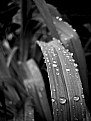
Critique By:
Mark Julian (K:36866)
7/13/2006 11:59:42 AM
Beautiful shot. The only thing I would change (very minor) is crop off the thickness of your pinky (sideways) on the right and a bit more off the bottom. I think you have to make the right leaf a bit more insignificant by giving the left leaf a little more take over space. Does that make sense? I ALWAYS pay attention to where the eye goes to first, second, third (I don't think more than 3 points of strong interest is usually a good idea - confuses the viewer too much IMHO). On this one the larger leaf didn't quite pull me in enough (visually dominate - but not too much, it's a delicate balance) so you have to make the other one less eye catching, or less significant. A great shot though - one for your future book... Don't laugh, might happen.......
|
| Photo By: Jacqui
(K:1283)
|
|
|
Critique By:
deniz cesmeci (K:5726)
7/13/2006 11:40:29 AM
realy nice but it needs a crop i thing
great shot
congrs,
best regards
thanks
have a nice day
waiting for comments
see you
deniz cesmeci
|
| Photo By: Jacqui
(K:1283)
|
|
|
Critique By:
Mark Julian (K:36866)
7/13/2006 11:36:57 AM
You took a very normal shot and really made something out of it. I think the B/W looks great. Maybe one of those big warehouse floors will be your Photography Studio/Loft someday. It's places like this that catch on and become the new SOHO's....You never know.......
|
| Photo By: Jacqui
(K:1283)
|
|
|
Critique By:
Mark Julian (K:36866)
7/13/2006 11:29:36 AM
Fantastic work - perfect shot !! Looks like it's straight out of a Photography book....VERY nice, Mark
|
| Photo By: Jacqui
(K:1283)
|
|
|
Critique By:
Mark Julian (K:36866)
7/13/2006 11:21:17 AM
This is such a creative SP. I love the concept of the whole disjointed nature thing going on here. Really high quality work !! Good job, Mark PS. Not that it matters but good title, like it mucho.....
|
| Photo By: Jacqui
(K:1283)
|
|
|
Critique By:
Jo T (K:2305)
6/24/2006 9:52:42 PM
Lighting is first class - Looking at your note I'd say it's the flourescent light cover, hide it with your thumb and you'll see what a difference it makes
|
| Photo By: Jacqui
(K:1283)
|
|
|
Critique By:
Miladin Mare (K:3384)
6/24/2006 9:26:32 PM
Beautiful moment and great contrast!
|
| Photo By: Jacqui
(K:1283)
|
|
|
Critique By:
Jacqui (K:1283)
6/15/2006 11:53:35 PM
this was the original.
the sharpness in both these pictures (for some reason)has lessened because I had to down size them.
|
| Photo By: Jacqui
(K:1283)
|
|
|
Critique By:
Danuta B. (K:426)
6/6/2006 10:36:10 PM
refreshing...nice vivid colors and contrast
|
| Photo By: Jacqui
(K:1283)
|
|
|
Critique By:
Anouch VOSSOUGHI (K:488)
6/6/2006 10:18:05 PM
nice photo. great colors and details
|
| Photo By: Jacqui
(K:1283)
|
|
|
Critique By:
Roland Lacson (K:12214)
6/6/2006 10:01:22 PM
Aside from the simplicity of the composition what really grabbed my attention are the tones, it's absolutely perfect. Well captured & seen Jacqui.
|
| Photo By: Jacqui
(K:1283)
|
|
|
Critique By:
Jacqui (K:1283)
6/6/2006 9:48:21 PM
thank you!
|
| Photo By: Jacqui
(K:1283)
|
|
|
Critique By:
jude . (K:14625)
6/6/2006 7:06:17 PM
I like this Jacqui...a lot.
|
| Photo By: Jacqui
(K:1283)
|
|
|
Critique By:
jude . (K:14625)
6/5/2006 5:14:47 PM
Beautiful clarity and DoF, Jacqui...very nicely done.
|
| Photo By: Jacqui
(K:1283)
|
|
|
Critique By:
jude . (K:14625)
6/5/2006 5:02:46 PM
MMMmmmmmm...this image is delicious, Jacqui. Beautifully mysterious, gorgeous detail and lighting. In a word, Wonderful.
|
| Photo By: Jacqui
(K:1283)
|
|
|
Critique By:
Jose Ignacio (Nacho) Garcia Barcia (K:96391)
6/2/2006 11:56:30 PM
marvelous abstrac. great details. fantastic.
|
| Photo By: Jacqui
(K:1283)
|
|
|
Critique By:
Glenda Perry (K:67)
6/2/2006 2:04:04 PM
Alright, I've looked at this twice and I really love it! I have a 18' monitor and had to step away to really enjoy the light and details, and the fact you used no PS, is great, not to say that is not one of the greatest tools for Digital Photography today, but keeping it real, keeps your skills just as sharp as this photograph! Can't say I would change anything.
|
| Photo By: Jacqui
(K:1283)
|
|
|
Critique By:
D e b (K:9399)
6/2/2006 6:33:15 AM
Hi Jackie..!!!
This is a good shot..!!personally i like BnW.... and when I saw this.. it instantly caught my eyes..!!!
good use of light and good amount of details too..!!
I have a humble profile in UF too.. please visit and comment if you feel like..!!
Rgds,
Deb
|
| Photo By: Jacqui
(K:1283)
|
|
|
Critique By:
mariagrazia amico (K:37)
5/28/2006 8:26:18 PM
bella la resa della profondità, riesce a rendere molto bene l'idea di tridimensionalità
|
| Photo By: Jacqui
(K:1283)
|
|
|
Critique By:
gianna piano (K:15530)
5/28/2006 5:50:18 PM
I like the use of DOF and b/w. Great details.
gianna
|
| Photo By: Jacqui
(K:1283)
|
|
|
Critique By:
Karina Brys (K:16541)
5/28/2006 4:32:12 PM
Good portrait, a bit more contrast maybe, but nice.
|
| Photo By: Jacqui
(K:1283)
|
|
|
Critique By:
Chris Nichols (K:7068)
5/26/2006 6:06:44 PM
Lovely. Very nice self portrait!
|
| Photo By: Jacqui
(K:1283)
|
|
|
Critique By:
Greg Scott (K:1990)
5/19/2006 1:56:12 AM
Yes, you should definitely invest in a tripod. But, cliche or not, this is the kind of simple beauty that you excel at presenting.
|
| Photo By: Jacqui
(K:1283)
|
|
|
Critique By:
Greg Scott (K:1990)
5/19/2006 1:53:28 AM
I like it - the smile is contagious.
|
| Photo By: Jacqui
(K:1283)
|
|
|
Critique By:
Kareem Afifi (K:5968)
5/14/2006 9:06:07 PM
ha !!
simpley done
simpley great job
i do like it .. it looks original
keep it up
|
| Photo By: Jacqui
(K:1283)
|
|
|
Critique By:
Jaci Barnett (K:314)
5/14/2006 3:24:50 AM
How pretty! I would crop out the top right, it's a little distracting and bright. Otherwise I like this, nice sepia toning.
|
| Photo By: Jacqui
(K:1283)
|
|
|
Critique By:
Randee Armstrong (K:-820)
5/14/2006 1:13:20 AM
HAHA, you don't look weird. I like this, you did a great job.. you look happy!
|
| Photo By: Jacqui
(K:1283)
|
|
|
Critique By:
Jacqui (K:1283)
5/8/2006 2:28:51 AM
Thank you all very much!
I agree, I may of used a little too much contrast
|
| Photo By: Jacqui
(K:1283)
|
|