|
|
Critique By:
Christopher Grant (K:405)
11/25/2005 6:04:15 AM
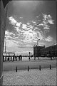
When I initially thumbed through your gallery, this was my first stop. A real nice moment that devloped into a dream from the choices you made. Jelaous! I believe the contrast is fine and perhaps my only thoughts for improvement would be a different crop along the right side of the photo, but that's just me!
|
| Photo By: Tim Long
(K:9228)
|
|
|
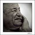
Critique By:
Christopher Grant (K:405)
11/25/2005 5:53:42 AM
Nice strong tight image. I couldn't think of anything to make this any better really. If I had to explore? Perhaps a soft focus, but this doesn't seem to work with your intentions.... nice one!
|
| Photo By: Vancea Dorin
(K:164)
|
|
|
Critique By:
Christopher Grant (K:405)
11/25/2005 5:52:25 AM
Nice one Oleg! Only thing I could possibly say of this image was perhaps a slightly different crop, providing perhaps a little straightening and/or blacks around the dancer. Nice!
|
| Photo By: ol an
(K:-248)
|
|
|
Critique By:
Christopher Grant (K:405)
11/25/2005 5:51:09 AM
The tones were obviously well thought out on this very commercial image. Nice one!
|
| Photo By: Alex Pieroni
(K:15506)
|
|
|
Critique By:
Christopher Grant (K:405)
11/25/2005 5:47:16 AM
An interesting subject choice and composition caught my eye here. Although for some reason the shades seem to have been posterized a bit. Still though, nice one!
|
| Photo By: David Mihoci
(K:450)
|
|
|
Critique By:
Christopher Grant (K:405)
11/25/2005 5:45:59 AM
Nice capture and thought behind this shot! Two thumbs up! If I had to choose something I didn't like (and it's hard), I'd say slightly more DOF for the ring and remove the artificial borders and signature, let the photo stand for itself. But that's just me! Nice one!
|
| Photo By: Alex Pieroni
(K:15506)
|
|
|
Critique By:
Christopher Grant (K:405)
11/25/2005 5:43:00 AM
Nice capture! I was at first unconvinced the f4 version of that lens could produce the right background blurs for some portraits but you've managed it quite well here. Enjoyed the basic but strong composition as well!
|
| Photo By: Alex Pieroni
(K:15506)
|
|
|
Critique By:
Christopher Grant (K:405)
11/25/2005 5:41:25 AM
Nice capture, but admittedly wanted just a bit more contrast and slightly more detail in the blown whites. Though as it stands, I can see why you made your choices, nice!
|
| Photo By: Vancea Dorin
(K:164)
|
|
|
Critique By:
Christopher Grant (K:405)
11/25/2005 5:37:15 AM
Hi Joe! Great capture, strong tones and a good subject I think! If I had to find something? Perhaps a slightly different POV or crop and would recommend removing your name from the photo, but that's just me! Nice image!
|
| Photo By: Joe Stewart
(K:1908)
|
|
|
Critique By:
Christopher Grant (K:405)
11/25/2005 5:35:08 AM
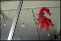
Great fun photo here. I really have to nitpick to find anything that doesn't agree! But if I did I'd say perhaps there's a slight color wash which could benefit from a little more contrast and the crop for some reason seems off. Either way, this is a great photo and I only mention these things to try and find something helpful for you! Great capture!
|
| Photo By: Bhaskar A. V.
(K:1246)
|
|
|
Critique By:
Christopher Grant (K:405)
11/25/2005 5:32:45 AM
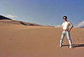
Looks like you had a little fun on the daily commute! Nice capture!
|
| Photo By: Matthew P Shultz
(K:116)
|
|
|
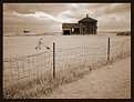
Critique By:
Christopher Grant (K:405)
11/25/2005 5:25:35 AM
Thanks all. Good comments! As for the lower portion of the photo, dodging and burning was purposely used to help remove most detail from the shadows.
|
| Photo By: Christopher Grant
(K:405)
|
|
|
Critique By:
Christopher Grant (K:405)
11/24/2005 8:18:33 AM
Interesting composition, but the 3 panels are slightly hidden but the very light colors. Nice commercial possibilty though!
|
Photo By: Stace Walker
(K:4175)

|
|
|
Critique By:
Christopher Grant (K:405)
11/24/2005 8:17:31 AM
Very nice capture. Wanted perhaps a little more darks and less blow outs but that's just a personal preference I think. Two thumbs up!
|
| Photo By: Guido Steenkamp
(K:183)
|
|
|
Critique By:
Christopher Grant (K:405)
11/24/2005 8:16:25 AM
Very nice capture, took some time no? Colors are great and give the impression of a monochromatic shot where this is none, excellent! I bet this would look wonderful in print.
|
| Photo By: pratya sanchorn
(K:12)
|
|
|
Critique By:
Christopher Grant (K:405)
11/24/2005 8:14:27 AM
Sweet image, but admittedly there was far too much pixelization/noise and a little lesss DOF would've been really great here! Still, nice moment!
|
| Photo By: Billy Houck
(K:2725)
|
|
|
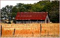
Critique By:
Christopher Grant (K:405)
11/24/2005 8:13:31 AM
Nice simple shot! I might've used a little less DOF but am unsure if that's possible on your camera model :-) Good stuff though!
|
| Photo By: Sophie King
(K:3250)
|
|
|
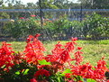
Critique By:
Christopher Grant (K:405)
11/24/2005 8:12:33 AM
Great tones, but admittedly the lower foreground distracted me a bit. Perhaps a bit more crop or an alternate shot? Still groovy though!
|
| Photo By: Robert Waddingham
(K:3389)
|
|
|
Critique By:
Christopher Grant (K:405)
11/24/2005 8:11:37 AM
Nice composition, but perhaps the tonality got a little over contrasted in the sky :-) Nice shot though!
|
| Photo By: Greg Scott
(K:1990)
|
|
|
Critique By:
Christopher Grant (K:405)
5/31/2005 1:01:08 PM
Understandable! Either way though, it looks like you succeeded, at it feels that way when I view it, nice!
|
| Photo By: Rui Filipe Rebelo Prego
(K:1213)
|
|
|
Critique By:
Christopher Grant (K:405)
5/31/2005 11:58:14 AM
This looked like it had some real potential! I'd love to see the same imagine in a slightly different perspective, possible!
Nice!
|
| Photo By: D W
(K:2560)
|
|
|
Critique By:
Christopher Grant (K:405)
5/31/2005 11:57:00 AM
Nice techniques here! I enjoyed the use of some design elements to bring out your image, but admittedly wanted just a slightly larger DOF. :-)
|
| Photo By: Kristy O'Connor
(K:40)
|
|
|
Critique By:
Christopher Grant (K:405)
5/31/2005 11:55:55 AM
Loved this image. Quite beatiful in many respects and it shows you were paying attention to detail. From lines to a great polarized sky, this image was something I wouldn't mind having on my walls at home.
If anything, I would wonder about the bleach white walls but in many respects this seems to add character to the image.
|
| Photo By: SORRENTE Patrick
(K:3307)
|
|
|
Critique By:
Christopher Grant (K:405)
5/31/2005 11:53:53 AM
Curious image. I can't decide if I really like it or really hate it, which means, I most likely really love it! :-)
Only wish was for a slighter clearer sun reflecion towards the top of the image.
|
| Photo By: Rui Filipe Rebelo Prego
(K:1213)
|
|
|
Critique By:
Christopher Grant (K:405)
5/31/2005 11:51:45 AM
Nice Image!
I enjoyed the vanishing lines and easy black and white, although admittedly wondered if it was a litle under developed perhaps? Good stuff!
|
| Photo By: Katleen Waterplas
(K:207)
|
|
|
Critique By:
Christopher Grant (K:405)
5/31/2005 10:33:48 AM
Skins tones were quite nice as well as coloring. Usually prefer no harsh shadows but oddly for me it kinda works here too! :-)
|
| Photo By: huan duong
(K:17)
|
|
|
Critique By:
Christopher Grant (K:405)
5/31/2005 10:32:58 AM
Cool Beans :-)
|
| Photo By: Len Webster
(K:25714)
|
|
|
Critique By:
Christopher Grant (K:405)
5/31/2005 7:39:07 AM
Great and well composed shot! Would love to see this shot in a larger resolution though and as a result, felt this was the major downside to the photo.
|
| Photo By: Royce Emley
(K:84)
|
|
|
Critique By:
Christopher Grant (K:405)
5/31/2005 7:37:31 AM
Hi Len!
It's a nice little shot you have here but admittedly the knowledge that there was a sunset happening here makes me wonder why you didn't capture this shot at a diffferent time? :-) Also, would love to have a subject to focus my eyes on a little more, but like your shot nevertheless!
|
| Photo By: Len Webster
(K:25714)
|
|
|
Critique By:
Christopher Grant (K:405)
5/31/2005 7:34:13 AM
It's a simple and pretty shot, but admittedly wanted either to see more of the plane, or perhaps some other element in the frame t help with dynamics.
Good stuff though!
|
| Photo By: Peter Carucci
(K:1672)
|
|