|
|
Critique By:
Lea Mulqueen (K:7396)
7/10/2005 10:01:58 AM
Interesting effect. I think the top the 2/3's looks pretty good...but it didn't work as well on the bottom part (the trees).
It is relaxing and fun to play with filters, etc in PS, isn't it? ;- )
|
Photo By: Joe Ciccone
(K:3684)

|
|
|
Critique By:
Lea Mulqueen (K:7396)
7/10/2005 9:57:21 AM
Congratulations on your well deserved awards.
Lots of interesting things to look at in this well composed image.
|
| Photo By: Haris Calkic
(K:4908)
|
|
|
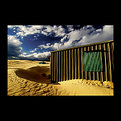
Critique By:
Lea Mulqueen (K:7396)
7/10/2005 9:53:47 AM
Georgous sky, nice color and composition.
I bet it's awfully hot in those tin shacks.
|
| Photo By: Heath Bennett
(K:427)
|
|
|
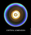
Critique By:
Lea Mulqueen (K:7396)
7/9/2005 11:31:48 PM
Pretty neat image! You sure seem to have fun with your CD's!
I do think it would be even better if you removed the dust/sctrach marks.
|
| Photo By: AJ Miller
(K:49168)
|
|
|
Critique By:
Lea Mulqueen (K:7396)
7/9/2005 11:28:56 PM
A lovely winter scene.
|
| Photo By: Hooshang Nahrvar
(K:1939)
|
|
|
Critique By:
Lea Mulqueen (K:7396)
7/9/2005 11:23:13 PM
Beautiful bird, shown off to great advantage by the pose and the excellent DOF. Well done. Congratulatuins on your award.
|
| Photo By: Darlene Boucher
(K:15739)
|
|
|
Critique By:
Lea Mulqueen (K:7396)
7/9/2005 5:05:00 PM
Congratulations! Great shot, tack sharp.
|
| Photo By: James Bambery
(K:13421)
|
|
|
Critique By:
Lea Mulqueen (K:7396)
7/7/2005 10:15:49 PM
John, You have a point...the green wasn't the best choice.
|
| Photo By: Lea Mulqueen
(K:7396)
|
|
|
Critique By:
Lea Mulqueen (K:7396)
7/7/2005 10:14:17 PM
It's not often being lazy pays off! Thanks, John.
|
| Photo By: Lea Mulqueen
(K:7396)
|
|
|
Critique By:
Lea Mulqueen (K:7396)
7/7/2005 10:11:33 AM
Thanks, Paul, I think it was 1/120 of a second at f8.
|
| Photo By: Lea Mulqueen
(K:7396)
|
|
|
Critique By:
Lea Mulqueen (K:7396)
7/7/2005 12:18:41 AM
Nice. I like the sense of activity and motion.
|
| Photo By: drilan P drilan
(K:12030)
|
|
|
Critique By:
Lea Mulqueen (K:7396)
7/6/2005 11:52:29 PM
Nice shot. The bright yellow sunflower in front of the blurred blue sky...it really works!
|
| Photo By: Dino Lupani
(K:15142)
|
|
|
Critique By:
Lea Mulqueen (K:7396)
7/6/2005 11:51:06 PM
That is so cute! I love the determined look on her face.
|
| Photo By: Louise Vessey
(K:13862)
|
|
|
Critique By:
Lea Mulqueen (K:7396)
7/6/2005 11:49:00 PM
Super picture! I love his pose and expression.
|
| Photo By: Mari Mar
(K:11469)
|
|
|
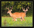
Critique By:
Lea Mulqueen (K:7396)
7/6/2005 11:39:20 PM
Oh wow! Best deer photo I've seen in ages! Can't wait to see more!
|
| Photo By: James Bambery
(K:13421)
|
|
|
Critique By:
Lea Mulqueen (K:7396)
7/6/2005 11:36:37 PM
Thanks, James. I was WAY too lazy to carry a tripod and do it the conventional way!
|
| Photo By: Lea Mulqueen
(K:7396)
|
|
|
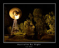
Critique By:
Lea Mulqueen (K:7396)
7/6/2005 11:34:54 PM
Really REALLY nice, Judy. I love the look of the windmill in motion and the lights in the trees. You also did a terrific job of keeping detail in the shadow areas.
|
| Photo By: Judi Liosatos
(K:34047)
|
|
|
Critique By:
Lea Mulqueen (K:7396)
7/6/2005 11:00:43 PM
John, I'm sure you are right...there are other ways to make bubbles...but, my time is limited, I use Elements, not full PS and the filter is free, easy to use and it took only a couple of minutes to add the bubbles, move them about, size them, etc. And, frankly, it was fun!!!!
|
| Photo By: Lea Mulqueen
(K:7396)
|
|
|
Critique By:
Lea Mulqueen (K:7396)
7/6/2005 2:44:14 PM
Very beautiful. To me, the best one yet.
|
| Photo By: Merete Westerdahl
(K:11079)
|
|
|
Critique By:
Lea Mulqueen (K:7396)
7/6/2005 2:42:32 PM
I love the reflection. Fractured reflections are always appealing to me!
I would suggest that if your have the software to it you might want to straighten the edge of the building (left side of image).
|
| Photo By: Kevin Crawmer
(K:152)
|
|
|
Critique By:
Lea Mulqueen (K:7396)
7/6/2005 10:31:13 AM
Hi Kevin. I would highly reccomend Adobe Photoshop Elements 3. It's under $100 and very powerful.
|
| Photo By: Kevin Settles
(K:638)
|
|
|
Critique By:
Lea Mulqueen (K:7396)
7/6/2005 12:43:06 AM
Kevin, this is a very nice portrait of a cat. The problems here are easily fixable. It looks soft (not sharp) and lacking in contrast. The contrast was fixed using levels in PSElements and the image sharpened with unsharp mask. I also cropped it just a little.
I noticed that it was not properly sized, which may account for the soft, flat look. Your origingal is 200dpi and just 2 or so inches long. Try sizing at 72 dpi and 700-800 pixels wide. That should give better results for web viewing.
|
| Photo By: Kevin Settles
(K:638)
|
|
|
Critique By:
Lea Mulqueen (K:7396)
7/6/2005 12:29:46 AM
The problem with the bubbles is (now I'm critiqueing my own work) the reflections don't reflect the way bubbles really would...the bubbles in back of her still reflect the front...have to figure out a way to get around that problem!
|
| Photo By: Lea Mulqueen
(K:7396)
|
|
|
Critique By:
Lea Mulqueen (K:7396)
7/6/2005 12:17:54 AM
Wow! What a sunset! Gorgeous color and nice foreground interest.
|
| Photo By: Steve Eaton
(K:232)
|
|
|
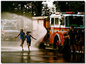
Critique By:
Lea Mulqueen (K:7396)
7/6/2005 12:15:51 AM
Very nice. The happy kids, the bored fireman make a good contrast. I also like the color and the reflections.
|
| Photo By: Rachel Leah
(K:26110)
|
|
|
Critique By:
Lea Mulqueen (K:7396)
7/6/2005 12:12:39 AM
Looks good!
|
| Photo By: Peter Carucci
(K:1672)
|
|
|
Critique By:
Lea Mulqueen (K:7396)
7/5/2005 11:53:48 PM
Thanks, Jim. I never thought of using a pol. for that...will have to try it sometime!
|
| Photo By: James Bambery
(K:13421)
|
|
|
Critique By:
Lea Mulqueen (K:7396)
7/5/2005 9:52:46 PM
It would be better if cropped to remove everything above the side of the building. The top is much to white and completely throws the image off balance.
|
| Photo By: lion grrl
(K:52)
|
|
|
Critique By:
Lea Mulqueen (K:7396)
7/5/2005 9:49:18 PM
A lovely, peaceful scene.
Question: Why the polorizer? What did it do for the scene? I have alwys been told a polarizer is not useful when the sun is that low in the sky, so I've never tried it and would like to know what the advantage is.
|
| Photo By: James Bambery
(K:13421)
|
|
|
Critique By:
Lea Mulqueen (K:7396)
7/4/2005 11:51:09 AM
That's a beauty John. Gorgeous color and composition.
|
| Photo By: John Loreaux
(K:86210)
|
|