|
|
Critique By:
Lyza Perrenoud (K:111)
8/23/2002 11:03:08 AM
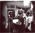
Thanks Marty!
Yes,you are so right, I had no control over the lighting.
As far as cropping it is originally like that..so I am assuming he was totally in my face/camera.
This image has been published in URB magazine already (issue #97). The place was so packed with people outside the Dj'sbooth that I just kept shooting. 'Was a lot of fun.
lyza
|
| Photo By: Lyza Perrenoud
(K:111)
|
|
|
Critique By:
Lyza Perrenoud (K:111)
6/24/2002 11:49:13 PM
Well with both comments said..
that's why you do those hallmark cards...
|
| Photo By: William R Eastman III
(K:2141)
|
|
|
Critique By:
Lyza Perrenoud (K:111)
6/24/2002 2:22:20 PM
Hello Terry,
Amazing image.
WOuld be perfect ad for a sensual place to be.
Great composition.
Lyza
|
Photo By: Terry Drymon
(K:154)

|
|
|
Critique By:
Lyza Perrenoud (K:111)
6/7/2002 12:32:19 AM
HI Stephen,
I'm a fan of Holga and their images they capture.
This one's one of them. very nice.
Lyza
|
| Photo By: Steve Cubbage
(K:452)
|
|
|
Critique By:
Lyza Perrenoud (K:111)
6/7/2002 12:30:28 AM
Hi Marcus,
It's kinda interesting.
Fetishy...would be my description for it.
cool.
Lyza
|
| Photo By: Markus A. Nixon
(K:2)
|
|
|
Critique By:
Lyza Perrenoud (K:111)
6/5/2002 9:54:54 PM
Hello Terrence ,
I like this a lot. Very eye-catching.
At first it seems like a fence then something else then looking hard I see the steps. They are steps correct?
ANyway..like it a lot.
Lyza
|
| Photo By: Terrence Kent
(K:7023)
|
|
|
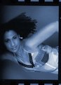
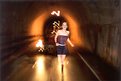
Critique By:
Lyza Perrenoud (K:111)
5/30/2002 8:47:11 PM
Hello,
Thanks for the comments you guys..
I had to tighten the crop on the sides 'coz she actually has a cigarette on her right hand (taking a break and I caught this shot ). ANd yes, a little fill may have been better.
I appreciate the all comments.
Lyza
|
| Photo By: Lyza Perrenoud
(K:111)
|
|
|
Critique By:
Lyza Perrenoud (K:111)
5/29/2002 2:18:08 PM
Hello,
I just wanted to say I think your stuff is great!
This especially is so "MOD" in a fashion sense.
I also like your illussive reality ones.
Very good artistic compositions.
Lyza
|
| Photo By: dimitris theocharis
(K:-276)
|
|
|
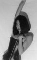
Critique By:
Lyza Perrenoud (K:111)
4/29/2002 12:31:25 AM
Hello,
Nice composition.
Looks inviting.
NICE!
Lyza Perrenoud
|
| Photo By: Marcus Edwards
(K:19)
|
|
|
Critique By:
Lyza Perrenoud (K:111)
4/23/2002 9:44:38 PM
Hi Tony,
I ,too agree on all points of your comments.
I'd love to see her with wilder hair.
Thanks.
Lyza
|
| Photo By: Lyza Perrenoud
(K:111)
|
|
|
Critique By:
Lyza Perrenoud (K:111)
4/23/2002 4:10:47 PM
Hi there,
Captivating image.
Perfect for it's project name.
I like it a lot.
Lyza
|
| Photo By: Suzana Rodriguez
(K:0)
|
|
|
Critique By:
Lyza Perrenoud (K:111)
4/23/2002 4:07:20 PM
thanks for the comment Moayad.
The client picked the blue since they are going to do some re-touching of sorts.
It would've been green if not the blue so they can add a diff. background.
|
| Photo By: Lyza Perrenoud
(K:111)
|
|
|
Critique By:
Lyza Perrenoud (K:111)
4/22/2002 11:55:43 PM
took the teal border out...
I'm still not too pleased with the border...oh well,...
Lyza
|
| Photo By: Lyza Perrenoud
(K:111)
|
|
|
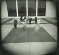
Critique By:
Lyza Perrenoud (K:111)
4/15/2002 3:56:11 AM
hello,
I agree that the pic is a little quite underexposed.
BUT...gues what?..for art's sake..It's a great compositiopn ..(IMHO). Maybe crop a little of the floor/tile that is in front of them. But all in all very real.
I like it.
Lyza
|
| Photo By: Halid Izzet
(K:373)
|
|
|
Critique By:
Lyza Perrenoud (K:111)
4/3/2002 11:18:04 AM
Hi Guys,
Thanks for the comments.
I posted another one of her too.
|
| Photo By: Lyza Perrenoud
(K:111)
|
|
|
Critique By:
Lyza Perrenoud (K:111)
4/3/2002 11:13:26 AM
Hello Suzanne,
I think this is a very nice image. Soft.
ANd she looks good also. re: w/o the flash....try it see how it comes out. Probably nice and moody.
|
| Photo By: Suzanne Strenk
(K:98)
|
|
|
Critique By:
Lyza Perrenoud (K:111)
3/25/2002 4:47:31 PM
hello Terrence,
Thanks for the comments.
It was exactly my intentions to post this photo the way you describe it.
As this is from a contact sheet. I wanted it more artsy (IMHO) looking than technically anything. I wanted the frames to show the negs.
Your opinion is appreciated, though.
Lyza P.
|
| Photo By: Lyza Perrenoud
(K:111)
|
|
|
Critique By:
Lyza Perrenoud (K:111)
3/23/2002 6:22:31 AM
Hello Phillip,
I agree with Jeff..
YOu seemed to have got your lighting in great control.
The lighting is good..nothing dramatic but I could say ...perfect balance(?)...
|
| Photo By: Phillip Filtz
(K:1792)
|
|
|
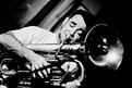
Critique By:
Lyza Perrenoud (K:111)
3/23/2002 6:00:56 AM
hello RENE,
Good Photo.
I like this image because it leaves the viewer to a certain imagination. Up or down?
I especially like the blues/grays in it. That could be a postcard for an event or a mystical/mysterious thing..
Well, that's my vibe on it.
what film was used for this?
Lyza P
|
| Photo By: Rene Asmussen
(K:138)
|
|
|
Critique By:
Lyza Perrenoud (K:111)
3/23/2002 5:47:55 AM
HI kevin...
I like it...very Francois Nars image ( make up and stylist for versace).That's how I perceive it to be.
It looks like studio/ a studio shot considering you shot this outside w/ available light. WHat time did you shoot this? Those kodak portas are some nice films, too.
The pic denotes..freshness to me. SInce as I am looking at it in a beauty/makeup perspective.
Just my 2cents.
Lyza P
|
| Photo By: Kevin D Connery
(K:0)
|
|
|
Critique By:
Lyza Perrenoud (K:111)
3/18/2002 5:52:53 PM
Hello Chris,
Humor! One of the great things we have in the world.
ANd this evokes that.
I like it a lot. It's so artsy ...to me anyway.
Lyza
|
| Photo By: Chris Blaszczyk
(K:610)
|
|
|
Critique By:
Lyza Perrenoud (K:111)
3/11/2002 1:20:21 AM
Hello Chor,
I agree with Marty.
I had to do a double take on this image very interesting shape and color.
Very nice.
-Lyza
|
| Photo By: Chor Wong
(K:0)
|
|
|
Critique By:
Lyza Perrenoud (K:111)
3/11/2002 1:09:42 AM
Hi Alisa,
Thanks so much.
I do enjoy this little camera and don't really feel like it is a toy (as others perceive it to be) 
Yeah, if you can one it can be quite addicting to use it.
Take care.
Lyza
|
| Photo By: Lyza Perrenoud
(K:111)
|
|
|
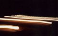
Critique By:
Lyza Perrenoud (K:111)
2/18/2002 1:00:37 AM
Hi Chris,
I think this is so interesting . Especially how the lamp posts are curved.
Did you tone this in anyway?
In any case...it's great.
Lyza P.
|
| Photo By: Chris Blaszczyk
(K:610)
|
|
|
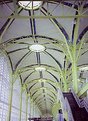
Critique By:
Lyza Perrenoud (K:111)
12/4/2001 10:18:50 PM
Thanks Nanette.
Yes, I may need more DOF , but it is a LOMO I am using here.
I actually have a copy of this which has been cropped at the bottom part to show more of the image as an abstract.
But I preferred to show it as the architecture of the DC airport in a different light and for some reason the yellow showed more that afternoon.
Lyza P.
|
| Photo By: Lyza Perrenoud
(K:111)
|
|
|
Critique By:
Lyza Perrenoud (K:111)
12/4/2001 3:36:04 PM
Hi Jason,
I like this that it speaks to me in a fashion sense.
I don't know if that was what you are aiming for but it is GREAT!
Lyza Perrenoud
|
| Photo By: Jason Bennett
(K:213)
|
|
|
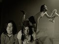
Critique By:
Lyza Perrenoud (K:111)
11/9/2001 3:33:56 PM
Nanette and Detlef,
Thanks very much for the comments.
I also like the pose , unfortunately that's what I filled the frame in so it is kind of cut off ( her hands, thighs and hips). I might have to educate myself more on my scanner
as it has blurred the image. Also I actually put a diffuser filter on the camera lens.
It was actually my intention to do this. To do a hard look and show a come-hither soft aspect.
Hoping I make sense.
thanks again.
Lyza P
|
| Photo By: Lyza Perrenoud
(K:111)
|
|
|
Critique By:
Lyza Perrenoud (K:111)
11/9/2001 3:09:29 PM
Hello Ninfa,
I like this image a lot.
First, I too like how the vignettes show on the holga.
The sky shows the clouds nicely and the shadows and contrasts in the whole image is very nice.
Great shot.
That goes for the other one titled Oviedo.
Lyza Perrenoud
|
| Photo By: Ninfa Z. Bito
(K:245)
|
|
|
Critique By:
Lyza Perrenoud (K:111)
10/10/2001 11:28:14 PM
Hi Jason,
Great image.
I like a lot of black and whites.
Also writing to thank you for comments and compliments you send me about the "nude" I posted b4 it's deletion to this site.
Yes...it was meant as "fetishy " shot. I,too had "issues" with her face lacking some light. I should've metered.
I am always experimenting and that was one of those times.
BTW she was leaning on a wall. I actually had to crop the image.
But thanks again.
|
| Photo By: Jason Bennett
(K:213)
|
|
|
Critique By:
Lyza Perrenoud (K:111)
10/9/2001 1:48:27 PM
Detlef,
Thanks for the compliment.
|
| Photo By: Lyza Perrenoud
(K:111)
|
|