|
|
Critique By:
Alex Solich (K:139)
5/12/2006 6:58:40 PM
To imitate the classics, I think you should use the shallowest DOF possible. Or a Medium or large format camera. DOF is important in creating the athmosphere.
Those pics were not perfect, but those had much more dynamics than in this pic.
|
| Photo By: Katleen Waterplas
(K:207)
|
|
|
Critique By:
Alex Solich (K:139)
5/11/2006 12:52:40 PM
It is a good pic, but flawed by dusts and scratches. Maybe it is consciuos decision, but to me it seems that you just did not take the time and retouche the image.
Unfortunately, the film you used is not exactly made for landscape photos, the colors are a bit off, it would be better if you have had used some positive film, like velvia or provia.
|
| Photo By: Giuliano Colliva
(K:1580)
|
|
|
Critique By:
Alex Solich (K:139)
5/11/2006 12:43:38 PM
Thanks!
|
| Photo By: Alex Solich
(K:139)
|
|
|
Critique By:
Alex Solich (K:139)
5/11/2006 12:42:49 PM
Thank You Fabio. Great to read these words.
|
| Photo By: Alex Solich
(K:139)
|
|
|
Critique By:
Alex Solich (K:139)
5/11/2006 11:46:27 AM
I think you made a mistake when decided to use this crop, in depicting musicians during work I think that the human and the instrument is equally important, and here you couldn't decide which and how to show. I would like to see both hands, and the expression on her face.
|
| Photo By: Christopher Perrin
(K:1007)
|
|
|
Critique By:
Alex Solich (K:139)
5/10/2006 3:46:52 PM
Excellent pic. Maybe the best picture i've seen here today. Comes close to those of magnumphotos.
I like your style.
|
| Photo By: Satori 77
(K:713)
|
|
|
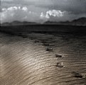
Critique By:
Alex Solich (K:139)
5/10/2006 3:44:53 PM
Good journalistic pic, albeit a bit soft, but it is ok.
I wish to see some more pics, very good eye.
|
| Photo By: Ramakanta Dey
(K:293)
|
|
|
Critique By:
Alex Solich (K:139)
5/10/2006 3:43:22 PM
Good one, but I see some hesitation, the smile the face the colors are great. But you should emphasize the head or the robe, so which one is important?
Good pic anyway
|
| Photo By: Jim Murray
(K:738)
|
|
|
Critique By:
Alex Solich (K:139)
5/10/2006 3:41:15 PM
Very good pic, though it would be better with a decent lens, maybe with a fix 85. But the facial expression perfect. Kudos
|
| Photo By: okan can
(K:354)
|
|
|
Critique By:
Alex Solich (K:139)
5/10/2006 3:39:10 PM
Methinks, it's a good basic picture, but some things should be improved, 2 major concerns - lighting, exposure. It seems you overexposed the pic a bit, maybe it is a concious decision but I cannot see the meaning, the other thing is the room in which the girl resides, Í would show a little more space, and from a different angle, maybe shoot from a lower angle.
Greets
|
| Photo By: Katleen Waterplas
(K:207)
|
|
|
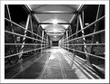
Critique By:
Alex Solich (K:139)
5/10/2006 3:34:07 PM
I like this brave minimal composition, though i think the picture should contain more grain or it should be silky. Moreover I think the frame is more complicated than the picture itself that confuses me.
Greets
|
| Photo By: Pawel Rubaj
(K:801)
|
|
|
Critique By:
Alex Solich (K:139)
5/10/2006 10:15:03 AM
Thanks
|
| Photo By: Alex Solich
(K:139)
|
|
|
Critique By:
Alex Solich (K:139)
9/19/2004 10:10:43 AM
A very Nice BW landscape.
Excellent
|
| Photo By: Xunilek
(K:717)
|
|
|
Critique By:
Alex Solich (K:139)
9/3/2004 10:02:59 PM
Just perfect
|
| Photo By: josep ribas
(K:549)
|
|
|
Critique By:
Alex Solich (K:139)
8/31/2004 8:57:05 AM
Excellent shot, even details in the shade are good exposed.
Good angle
|
| Photo By: Melanie Peters
(K:2248)
|
|
|
Critique By:
Alex Solich (K:139)
8/31/2004 7:36:16 AM
Thanks for the comments. I cropped that bush 
|
| Photo By: Alex Solich
(K:139)
|
|
|
Critique By:
Alex Solich (K:139)
8/29/2004 8:32:53 PM
Good image, good perspective. I like it
|
| Photo By: Jose Julio
(K:123)
|
|
|
Critique By:
Alex Solich (K:139)
8/29/2004 8:25:30 PM
Very nice texture photo.
Good colors.
Regards Alex
|
| Photo By: Fern
(K:2509)
|
|
|
Critique By:
Alex Solich (K:139)
8/29/2004 8:24:51 PM
OK. Detailed Macro. But it is to airy in the upper side. I think it needs a little cut.
|
| Photo By: Albert Clair
(K:445)
|
|
|
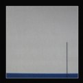
Critique By:
Alex Solich (K:139)
8/29/2004 8:22:43 PM
I think it'll be better if you stand just in the middle, the line in the middle suppose to be in the middle.
Regards
|
| Photo By: Gerry
(K:330)
|
|
|
Critique By:
Alex Solich (K:139)
8/29/2004 8:21:02 PM
Good Image good composition. A little flaw that the girls head is cut just under the chin.
|
| Photo By: Castillion .
(K:1570)
|
|
|
Critique By:
Alex Solich (K:139)
8/29/2004 8:19:40 PM
Very Nice. Congrat.
|
| Photo By: dariusz piekarz
(K:126)
|
|