|
|
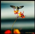
Critique By:
Candace Elyse (K:338)

12/15/2010 10:47:32 PM
very surreal, nice work Alberto
|
| Photo By: Alberto Di Gangi
(K:2375)
|
|
|
Critique By:
Candace Elyse (K:338)
12/15/2010 10:45:00 PM
Grazie, Alberto :)
|
| Photo By: Candace Elyse
(K:338)
|
|
|
Critique By:
Candace Elyse (K:338)
12/15/2010 9:14:50 PM
Love this, it's something I would hang in my bedroom :)
|
| Photo By: H. Q
(K:716)
|
|
|
Critique By:
Candace Elyse (K:338)
12/15/2010 9:12:19 PM
Very neat shot!
|
| Photo By: siamak jafari
(K:20075)
|
|
|
Critique By:
Candace Elyse (K:338)
11/16/2010 4:14:45 PM
Thank you Shirley!
|
| Photo By: Candace Elyse
(K:338)
|
|
|
Critique By:
Candace Elyse (K:338)
11/9/2010 6:13:45 PM
No I haven't taken pictures there but I do know where it is! Thank you Rick
|
| Photo By: Candace Elyse
(K:338)
|
|
|
Critique By:
Candace Elyse (K:338)
11/9/2010 6:12:13 PM
Thanks everyone! I shot two pictures of this little guy and it just so happened that the second one was this perfect.
|
| Photo By: Candace Elyse
(K:338)
|
|
|
Critique By:
Candace Elyse (K:338)
11/9/2010 2:24:11 AM
Thank you Dave! (:
|
| Photo By: Candace Elyse
(K:338)
|
|
|
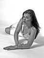
Critique By:
Candace Elyse (K:338)
11/14/2004 5:03:52 PM
what you should of done instead of cloning her was make her look down at an angle so that in the reflection so that it looks like she is looking down at her reflection and her reflection is looking at the camera...
|
| Photo By: John Fiore
(K:1077)
|
|
|
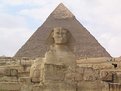
Critique By:
Candace Elyse (K:338)
11/14/2004 5:00:16 PM
Wow! Nice Job! I realized the pyramid is uneven with the statue but other than that and cropping it wonderful!
|
| Photo By: Kamran
(K:3526)
|
|
|
Critique By:
Candace Elyse (K:338)
11/11/2004 2:54:22 PM
You could of cropped in a little tighter like this
Candace
|
| Photo By: Greg E.
(K:183)
|
|
|
Critique By:
Candace Elyse (K:338)
11/11/2004 2:48:22 PM
I would of gave it some highlights in color balance with some gren and blue maybe...heres what im thinking
Candace
|
| Photo By: Wayne Harridge
(K:18292)
|
|
|
Critique By:
Candace Elyse (K:338)
11/11/2004 2:38:38 PM
This has too much extra space for just a headshot I would say this would probably owrk also.
candace
|
| Photo By: Simon Jarvis
(K:489)
|
|
|
Critique By:
Candace Elyse (K:338)
11/11/2004 2:28:29 PM
John, she looks too posed and too edited I would say next time change you opacity to 30 and dont try and straighten her hair out because I dont know anyone with that kind of hair that has no split ends!
candace
|
| Photo By: John Fiore
(K:1077)
|
|
|
Critique By:
Candace Elyse (K:338)
10/19/2004 9:28:16 PM
Very pretty for no editing...I agree with Jeff it does look a little like shes a little pregnant :-D but I knowshe isnt
|
| Photo By: Carol Cefalu
(K:8388)
|
|
|
Critique By:
Candace Elyse (K:338)
10/19/2004 9:17:38 PM
Jeff,
Her finger is out too much on her left hand
other than that great pose!
Candace
|
| Photo By: Jeff Fiore
(K:11277)
|
|
|
Critique By:
Candace Elyse (K:338)
10/16/2004 9:50:55 AM
pretty
|
| Photo By: Carol Cefalu
(K:8388)
|
|
|
Critique By:
Candace Elyse (K:338)
10/12/2004 3:07:12 AM
I would of putten in a black border...and taken the shadow out...
Candace
|
| Photo By: Jeff Fiore
(K:11277)
|
|
|
Critique By:
Candace Elyse (K:338)
10/12/2004 3:05:38 AM
Pretty cat though I would like to see the cats face and put a border around it so that the white doesnt bleed off the page and havbe lines where the cats chin is so that it shows the oicture the only thing i see here is a white blob with 2 eyes and a pink nose!
Candace
|
| Photo By: Gabriella Carta
(K:22879)
|
|
|
Critique By:
Candace Elyse (K:338)
9/30/2004 5:17:58 AM
I would of shown more of her face and legs because it looks as if her nose blends in with the background and her hand is coming out from no where!
Candace
|
| Photo By: Jeff Fiore
(K:11277)
|
|
|
Critique By:
Candace Elyse (K:338)
9/30/2004 5:16:48 AM
Where shes grabbing her foot it look kinda odd... maybe thats just me!
Candace
|
| Photo By: Jeff Fiore
(K:11277)
|
|
|
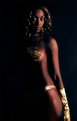
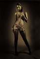
Critique By:
Candace Elyse (K:338)
9/30/2004 5:15:14 AM
The Black background doesnt go well with the all black she kinda blends in...Great pose!
Candace
|
| Photo By: Jeff Fiore
(K:11277)
|
|
|
Critique By:
Candace Elyse (K:338)
9/30/2004 5:14:03 AM
Glove sticks out like a sore thumb!!!
Nice Work Jeff!
Candace
|
| Photo By: Jeff Fiore
(K:11277)
|
|
|
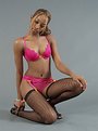
Critique By:
Candace Elyse (K:338)
9/30/2004 5:12:36 AM
Underwear is distracting also
Candace
|
| Photo By: Jeff Fiore
(K:11277)
|
|
|
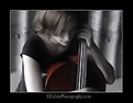
Critique By:
Candace Elyse (K:338)
9/30/2004 5:11:47 AM
Very Nice Pose And Model! I like how you have it in b&w and made the cello color stick out!
Beautiful! This one deserves a 7+++++++
Candace
|
| Photo By: Carol Cefalu
(K:8388)
|
|
|
Critique By:
Candace Elyse (K:338)
9/30/2004 5:09:49 AM
The Heel being off the ground is distracting but other than that its Great!
Candace
|
| Photo By: Jeff Fiore
(K:11277)
|
|
|
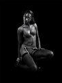
Critique By:
Candace Elyse (K:338)
9/30/2004 5:08:44 AM
Again Im Not sure about the pose it makes it look like there is more stomach than there needs to be because she is in an odd position and it makes her stomach look fatter.
Candace
|
| Photo By: Jeff Fiore
(K:11277)
|
|
|
Critique By:
Candace Elyse (K:338)
9/30/2004 5:07:39 AM
I agree with Patrick about the pose...Very Nice Jeff!
|
| Photo By: Jeff Fiore
(K:11277)
|
|
|
Critique By:
Candace Elyse (K:338)
9/30/2004 5:03:52 AM
I would put a black border around it because the white on her sleeve is kind of fading away onto the page
|
| Photo By: Jeff Fiore
(K:11277)
|
|
|
Critique By:
Candace Elyse (K:338)
8/26/2004 12:44:15 AM
ok...
interesting...
Candace
|
| Photo By: PhilCB 1973
(K:1894)
|
|