|
|
Critique By:
Bill Krul (K:5597)

3/20/2002 12:26:47 PM
Dario: Photographic quality is excellent. Try moving the center of focus to one side or the other. It's too balanced or static on my opinon.
|
| Photo By: Darío Puente
(K:83)
|
|
|
Critique By:
Darío Puente (K:83)
3/14/2002 1:11:55 AM
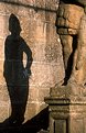
The statue on the foreground is the one that casts the shadow. And yes, I agree with you that the photo would have been better with more of the statue in the frame but with the 50mm lens I had at the moment this was te best composition I could think of.
Thanks for your comment.
|
| Photo By: Darío Puente
(K:83)
|
|
|
Critique By:
John Doe (K:170)
3/13/2002 8:51:21 PM
Neat shot. Is the statue in the foreground not the statue producing the shadow? If not, I would also like to see a version with more of the statue.
|
| Photo By: Darío Puente
(K:83)
|
|
|
Critique By:
Kristupa Saragih (K:1031)
3/5/2002 12:23:59 AM
I think it's better in vertical frame
|
| Photo By: Darío Puente
(K:83)
|
|
|
Critique By:
Samuel Downs (K:7290)
3/4/2002 5:54:28 PM
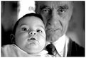
Dario, I find this image very enjoyable. I like the expressions and the awkward look on the child's face. Well done.
|
| Photo By: Darío Puente
(K:83)
|
|
|
Critique By:
Darío Puente (K:83)
2/20/2002 1:51:57 PM
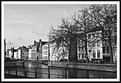
Thanks for your correction. I wasn't sure of the name in English and was too lazy to look it up in an Atlas. Finally I've titled the photo with the spanish name (Brujaswithches!)
|
| Photo By: Darío Puente
(K:83)
|
|
|
Critique By:
Alain Mijngheer (K:11733)
2/20/2002 12:07:03 PM
Like your style of pictures, but it is" Brugge Belgium "
|
| Photo By: Darío Puente
(K:83)
|
|
|
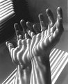
Critique By:
Chris Semel (K:8)
2/7/2002 3:57:13 PM
Awsome shot.The sahdes of light and dark are excilent.
|
| Photo By: Darío Puente
(K:83)
|
|
|
Critique By:
al shaikh (K:15790)
1/25/2002 8:59:37 PM
Dario your email is bouncing, please edit your profile and fix it to a working email address.
Moderator.
|
| Photo By: Darío Puente
(K:83)
|
|
|
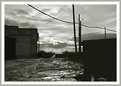
Critique By:
Jasper Davis (K:165)
1/25/2002 8:34:59 PM
I like it, but I wonder what that small building on the right looks like. I'm just a beginner, but would a fill flash work here? Let's see what others have to say. I really like what you are trying to do here. A sense of danger on the horizon.
|
| Photo By: Darío Puente
(K:83)
|
|
|
Critique By:
Chris Lawrence (K:124)
10/30/2001 3:22:46 PM
Simple yet interesting. Nice use of lines and shadows, the image really captures the eye.
|
| Photo By: Darío Puente
(K:83)
|
|
|
Critique By:
luis javier cota (K:273)
10/24/2001 7:14:45 AM
I really like these colors and the texture, but I am struggling to deal with the space in between the shoes. Perhaps if they were oriented in a Left Shoe - Right Shoe pattern, and slightly closer, it would make more sense. I don't know, maybe I just like symmetry.
But still, love the texture and colors, especially the green.
|
| Photo By: Darío Puente
(K:83)
|
|