|
|
Critique By:
Alper Tecer (K:7007)
12/24/2006 7:18:56 PM
Killer of clean clothes. ;)
|
| Photo By: Long Tran
(K:107)
|
|
|
Critique By:
Long Tran (K:107)
5/17/2005 8:29:24 PM
Ah, I assumed Odawara was part of Tokyo since I was able to get there using the JR Line. You're right though. It took me 2 hours to get there from Shinjuku Station. :-). The color version actually wasn't that bad (Semi-blue skies). I took the picture on a sunny day during Golden Week. I just liked the Sepia shot better :-)
|
| Photo By: Long Tran
(K:107)
|
|
|
Critique By:
Reza Fakhrai (K:3014)
5/16/2005 5:51:02 PM
Wow! Impressive clarity and clean sepia tones. This picture is distinctly digital!
|
| Photo By: Long Tran
(K:107)
|
|
|
Critique By:
Roger Williams (K:86139)

5/16/2005 6:18:25 AM
Fine sepia rendering of this famous castle. But it's not in Tokyo--an hour and a half or even two hours away by train! Our bland "white" skies make B&W a useful fallback when the colour would look unimpressive.
|
| Photo By: Long Tran
(K:107)
|
|
|
Critique By:
So Cal Photograhper (K:15529)
5/15/2005 6:30:34 AM
Thank you so much Long. I tried the technique that you stated and it worked. My first attempt (not bad - easy one to do) is posted if you care to take a look at it in my portfolio. Thanks again.
|
| Photo By: Long Tran
(K:107)
|
|
|
Critique By:
Long Tran (K:107)
5/15/2005 4:28:09 AM
Hi Lisa, it takes a bit of time, but you can do it in Photoshop by using the wand selection tool to select the object you want (in my case, the 3 girls) and then Inverse the selection so that it selects everything but the 3 girls, and then use the Remove Color option in "Enhance -> Adjust Color -> Remove Color".
The selection part is what takes a while though. You may have to use the Lasso Tool (while holding Shift or Alt) to add or remove from the current selection. Just Play around with it and you get the hang of it.
|
| Photo By: Long Tran
(K:107)
|
|
|
Critique By:
So Cal Photograhper (K:15529)
5/15/2005 3:36:34 AM
Fantasic image of these three girls. I love the B & W photo with the girl colorized. I've been wanting to learn how to do this myself and have no idea. I also have the Canon 20D with Adobe Photoshop Elements 2.0 - was this achived with the software provided with the camera. If not can you tell me what you used and how you achieved this image. Thank you! Lisa
|
| Photo By: Long Tran
(K:107)
|
|
|
Critique By:
Long Tran (K:107)
1/29/2005 8:26:08 PM
Okay, I've tried to remove the lens flare. It's a good thing this wasn't any complex clone else I wouldn't be able to do it. I just ended up using the eye-dropper and the paintbrush tool.
|
| Photo By: Long Tran
(K:107)
|
|
|
Critique By:
Long Tran (K:107)
1/25/2005 5:14:00 PM
Hey Philip, I didn't even notice that 3rd lens flare until you pointed it out :-), nor the Horizon line though that horizon line looks almost slightly curved... I don't know if I can do anything about the Horizon line, but I'm gonna try cloning out the lens flare as Rebecca suggested and post it up at a later date (probably this weekend).
|
| Photo By: Long Tran
(K:107)
|
|
|
Critique By:
Long Tran (K:107)
1/25/2005 5:08:49 PM
Yeah, I do agree, that lens flare is a bit distracting. I've never cloned anything out of a picture before. I'll give it a try this weekend and attach it to a comment.
|
| Photo By: Long Tran
(K:107)
|
|
|
Critique By:
Philip Lindsay (K:1748)
1/24/2005 8:09:00 AM
Unfortunately the horizon is not as level as it could be, also a lot of movement in the wave. the flair (there are three of them) can be appealing at times but not in this instance. oh, but by the way i do like it.
|
| Photo By: Long Tran
(K:107)
|
|
|
Critique By:
Rebecca Raybon (K:26654)
1/24/2005 4:03:21 AM
Beautiful seascape. IS that the moon or a lens flare? I think I'd have cloned that out. The image would be just as beautiful or more so, without it, IMHO.
|
| Photo By: Long Tran
(K:107)
|
|
|
Critique By:
Faye-Linh Nguyen (K:129)
12/31/2004 6:42:11 AM
composition and subject looks great...but why the distorted effect? How does it look in it's original state I wonder...
|
| Photo By: Long Tran
(K:107)
|
|
|
Critique By:
Kathy Hwang (K:142)
12/7/2004 11:28:25 PM
Nice Angle but try focusing on one tool or painttube. The lack of focus seems distracting.
|
| Photo By: Long Tran
(K:107)
|
|
|
Critique By:
Regina Rianelli (K:24147)
12/7/2004 4:29:47 PM
Cheers!
superb capture, Long!
my Best,
Regina
Rio de Janeiro, Brazil
|
| Photo By: Long Tran
(K:107)
|
|
|
Critique By:
Adriana Rabbit (K:3233)
12/7/2004 3:55:43 AM
Excelent idea,it?s a pitty that the man?s arm is in the middle of it! I like the focus area on the brush, right hand and pallete! ~:-)
|
| Photo By: Long Tran
(K:107)
|
|
|
Critique By:
Paolo Unger Dvorchik (K:77)
12/6/2004 8:08:04 PM
I like the concept, but i would have chosen more viberant colors (like Alizarin Crimson) for the paint.
Making the pallet larger would also make the image more powerful, as long as it doesn't drown out the man's form.
|
| Photo By: Long Tran
(K:107)
|
|
|
Critique By:
Gendrix (K:42)
12/6/2004 1:18:01 PM
not crazy about the lighting and focus but a good shot nonetheless
|
| Photo By: Long Tran
(K:107)
|
|
|
Critique By:
Shehabeldin Mostafa (K:1163)
12/6/2004 1:01:53 PM
Very good composition and simple matching title. I just have a comment on the DOF...I believe the shot would have been much better if all the fruits were in focus...all in all well done
|
| Photo By: Long Tran
(K:107)
|
|
|
Critique By:
Cheryl Ogle (K:24494)
12/3/2004 3:28:29 AM
Im dizzy. Great use of lines and horizon. I like this a lot.
|
| Photo By: Long Tran
(K:107)
|
|
|
Critique By:
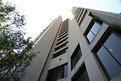
Rose Martin (K:4696)
12/2/2004 9:29:48 PM
Unusual building. I love the lines. Your choice of view is excellent.
Rose
|
| Photo By: Long Tran
(K:107)
|
|
|
Critique By:
Gabriella Carta (K:22879)
12/1/2004 12:03:37 PM
gnamm gnamm, che bontà!! bella foto, bravo
|
| Photo By: Long Tran
(K:107)
|
|
|
Critique By:
Adriana Rabbit (K:3233)
12/1/2004 3:38:48 AM
That?s a beautiful picture for a restaurant advertisement! ~:-) You can make one hungry looking at this! Like it! ~;-)
|
| Photo By: Long Tran
(K:107)
|
|
|
Critique By:
Titia Geertman (K:5582)
12/1/2004 2:11:26 AM
Beautiful B&W and I like the use of spotlight here very much.
Great shot!
Titia
|
| Photo By: Long Tran
(K:107)
|
|
|
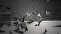
Critique By:
Bikramadittya G. Roy (K:7202)
11/30/2004 7:51:53 PM
Ooh! what an assortment of geese, gulls and pigeons. Anything else there? Cheers
|
| Photo By: Long Tran
(K:107)
|
|
|
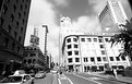
Critique By:
Wenceslaus Fernandez (K:87)
11/23/2004 6:16:24 PM
Nice composition... The street lamp has it own characters in this photo eventhough it only a small part of this...
|
| Photo By: Long Tran
(K:107)
|
|
|
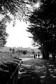
Critique By:
Mark Mellen (K:1970)
11/21/2004 8:31:39 PM
Long Tran.. Your image has a good Depth of Field and clarity. The bulkhead on the left side of the picture should of been shot in such a way it would lead you into the Image from Left to right. Or right to left. As presented it leads ones eye down the left side of the frame... Nice fall seen tho'.......Mark
|
| Photo By: Long Tran
(K:107)
|
|
|
Critique By:
Long Tran (K:107)
11/14/2004 4:23:14 PM
Hi Ray, thanks for the critique. I've noticed that many of my pictures have the same issue - no obvious subjects. I think it's because as I'm walking around, I'm just taking shots of how things look without giving much thought to what it is I'm photographing :-). While I'll probably still do that for memory's sake, I'll try to remember to add more of a focal element to shots as well :-D.
|
| Photo By: Long Tran
(K:107)
|
|
|
Critique By:
Long Tran (K:107)
11/14/2004 4:10:07 PM
Hi Kevin, I actually tried to crop out the cars initialy, but I ended up chopping off so much of the image that I put it back it :-).
|
| Photo By: Long Tran
(K:107)
|
|
|
Critique By:
Long Tran (K:107)
11/14/2004 4:00:17 PM
Thanks for the kind words! I felt luck had a lot to play in this this shot as I was riding a cable car and took the shot as we were driving up the sreet.
|
| Photo By: Long Tran
(K:107)
|
|