|
|
Critique By:
Laura Gariano (K:3309)
10/18/2004 9:20:33 PM
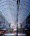
What a wonderful effect and how great of you to share it right off the bat. I love the symmetry here and the pattern of the chandeliers going down the hall. This effect gives such a warm feeling and glow but still retains so much detail, especially seen in the chains on the chandeliers. It has almost monochomatic feel to it and I like the hint of green from the palm fronds peeking out into the hall. I kind of wish those people weren't there but I love it all the same. Wonderful.
|
| Photo By: Andy Pollard
(K:1359)
|
|
|
Critique By:
Roberto Arcari Farinetti (K:209486)

10/18/2004 9:47:28 AM
TERRIFIC... start to flight..
So Andy..
perfect capture.. with the blocking of "number 2" to earth you have stopped one great action! you have developed the power of the jet!... ... the composition much simple one not only is of effect!!
see you soon
roby
7
|
| Photo By: Andy Pollard
(K:1359)
|
|
|
Critique By:
Stephen R. Pellerine (K:2370)
10/18/2004 8:41:16 AM
Superb Catch
|
| Photo By: Andy Pollard
(K:1359)
|
|
|
Critique By:
Warren B (K:7272)
10/17/2004 6:09:18 AM
Good shot, I like the composition. Well done.
|
| Photo By: Andy Pollard
(K:1359)
|
|
|
Critique By:
Dave Stacey (K:150877)

10/17/2004 5:14:31 AM
Excellent catch, Andy! Looks like you're getting used to the Pro 1!
Dave.
|
| Photo By: Andy Pollard
(K:1359)
|
|
|
Critique By:
Brian Rueger (K:7341)

10/17/2004 3:13:17 AM
Grat shot, Andy.
|
| Photo By: Andy Pollard
(K:1359)
|
|
|
Critique By:
John Beavin (K:4477)
10/16/2004 10:33:52 AM
Accidents always put a dampner on air shows,however the show must go on, You managed a classic shot here, congratulations Andy.
|
| Photo By: Andy Pollard
(K:1359)
|
|
|
Critique By:
Carol Cefalu (K:8388)

10/14/2004 4:16:00 AM
Amazing!!!!!!!!
|
| Photo By: Andy Pollard
(K:1359)
|
|
|
Critique By:
Carol Cefalu (K:8388)

10/14/2004 4:15:39 AM
Beautiful detail and I love the lighting!
|
| Photo By: Andy Pollard
(K:1359)
|
|
|
Critique By:
Carol Cefalu (K:8388)

10/14/2004 4:14:48 AM
YES..very fun! thank you for sharing!
|
| Photo By: Andy Pollard
(K:1359)
|
|
|
Critique By:
Carol Cefalu (K:8388)

10/14/2004 4:14:09 AM
Wow..very cool framing and chpice of Sepia effect is just perfect!
|
| Photo By: Andy Pollard
(K:1359)
|
|
|
Critique By:
Mihir Shah (K:837)
10/13/2004 2:58:22 PM
what car....niiice model.
|
| Photo By: Andy Pollard
(K:1359)
|
|
|
Critique By:
gary spillane (K:1617)
10/12/2004 2:14:35 PM
nice image with great contrast and tones, very clear and focused, cute model also!
|
| Photo By: Andy Pollard
(K:1359)
|
|
|
Critique By:
Debarshi Duttagupta (K:26815)
10/12/2004 8:53:33 AM
Beautiful composition and excellent camera work.
|
| Photo By: Andy Pollard
(K:1359)
|
|
|
Critique By:
Neil Niamh White (K:9165)
10/12/2004 7:11:09 AM
Congratulations to the first artist who created some more interesting street art than normal, and to the second artist (you) for capturing it in such an intersting way.
|
| Photo By: Andy Pollard
(K:1359)
|
|
|
Critique By:
Long Nguyen (K:3)
10/12/2004 5:29:21 AM
Great Picture
|
| Photo By: Andy Pollard
(K:1359)
|
|
|
Critique By:
Raul Garcia (K:670)

10/12/2004 1:58:46 AM
Looks like you take care of all the details.
|
| Photo By: Andy Pollard
(K:1359)
|
|
|
Critique By:
Roberto Arcari Farinetti (K:209486)

10/11/2004 7:39:19 AM
nice moment in sepia tones..
roby
|
| Photo By: Andy Pollard
(K:1359)
|
|
|
Critique By:
Maya Bylina (K:5925)
10/10/2004 8:17:56 PM
Very interesting composition!
|
| Photo By: Andy Pollard
(K:1359)
|
|
|
Critique By:
Clifton Jones (K:10688)

10/7/2004 11:25:25 PM
Great eye...very nice contrast and tone quality...I like the futuristic composition...
Clifton....
|
| Photo By: Andy Pollard
(K:1359)
|
|
|
Critique By:
John Griep (K:2521)
10/7/2004 12:57:27 PM
Strong picture Andy!
Very modern composition.
John
|
| Photo By: Andy Pollard
(K:1359)
|
|
|
Critique By:
Lou Dina (K:12194)
10/7/2004 10:07:50 AM
Love the design, Andy. It is very futuristinc looking. Lou
|
| Photo By: Andy Pollard
(K:1359)
|
|
|
Critique By:
Frank Goroszko (K:809)
10/7/2004 7:18:38 AM
It sure does look futuristic. Good job.
|
| Photo By: Andy Pollard
(K:1359)
|
|
|
Critique By:
Aleksandra Zvonar (K:4623)
10/7/2004 6:16:49 AM
oh wow, very nice idea. Looks great.
A.
|
| Photo By: Andy Pollard
(K:1359)
|
|
|
Critique By:
bren sheehan (K:1359)
10/7/2004 4:32:32 AM
Excellent alternative view and abstract study. I love it!
|
| Photo By: Andy Pollard
(K:1359)
|
|
|
Critique By:
Mari Mar (K:11469)
10/7/2004 4:20:58 AM
Genial, Andy, great idea!
|
| Photo By: Andy Pollard
(K:1359)
|
|
|
Critique By:
marta boro (K:3245)
10/7/2004 4:05:47 AM
Awesome abstract work Andy.I love it. The perspective,the mouvement,the sharpness,Amazing!
|
| Photo By: Andy Pollard
(K:1359)
|
|
|
Critique By:
BILL MAHLER (K:5882)

10/4/2004 4:02:26 AM
Masterful Andy........Great composition... color and detail. .... love a great boat shot.
~~~~~~~~~~~~~~ Regards ...... Bill
|
| Photo By: Andy Pollard
(K:1359)
|
|
|
Critique By:
BILL MAHLER (K:5882)

10/4/2004 3:56:27 AM
Excellent Image ..... for first time studio type lighting Andy..... Skin tones are great.. hand and nails are very graceful. ...... Hair sparkles and background is perfect. . Not bad Andy.
~~~~~~~~~~~~~~ Regards ...... Bill
|
| Photo By: Andy Pollard
(K:1359)
|
|
|
Critique By:
Maria Grazia Rapisarda (K:15898)
10/2/2004 12:11:36 PM
Excellent!! great composition,very splendid the light!!Superb B&W!!
Congrats the BIP!!
|
| Photo By: Andy Pollard
(K:1359)
|
|


