|
|
Critique By:
Kobi Eshun (K:62)
8/20/2003 12:49:20 AM
Cute idea -- shame about the background. Too late to blur the building, but maybe a tighter crop could help?
|
Photo By: Francesco Martini
(K:12249)

|
|
|
Critique By:
Kobi Eshun (K:62)
8/20/2003 12:41:09 AM
Clever presentation.
|
| Photo By: leandro ribeiro
(K:45)
|
|
|
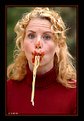
Critique By:
Kobi Eshun (K:62)
8/19/2003 11:34:39 PM
Very entertaining and engaging picture. I think it would work better in B/W, because the reds clash with the background, with her hair,a and especially with each other.
|
| Photo By: Shalom Bar Tal
(K:139)
|
|
|
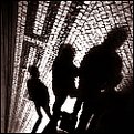
Critique By:
Kobi Eshun (K:62)
8/13/2003 10:28:29 AM
Great color and light. Nice variation on the "shadow self-portrait" theme, too.
|
| Photo By: Luis Vieira
(K:1772)
|
|
|
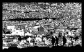
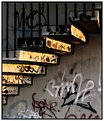
Critique By:
Kobi Eshun (K:62)
8/13/2003 10:23:31 AM
This is interesting -- the harsh contrast conveys a sense of dense detail, even when the image is scaled to a thumbnail. Nice shot/presentation.
|
| Photo By: Luis Vieira
(K:1772)
|
|
|
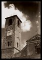
Critique By:
Kobi Eshun (K:62)
8/13/2003 10:16:53 AM
The dark sky above the cloud detracts from this image. But you captured the sense of dilapidation well.
Just curious BTW, where was this taken?
|
| Photo By: Andrea Giudice
(K:298)
|
|
|
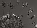
Critique By:
Kobi Eshun (K:62)
8/13/2003 2:03:06 AM
Fantastic timing!
|
| Photo By: Bahadir k
(K:8825)
|
|
|
Critique By:
Kobi Eshun (K:62)
8/11/2003 9:49:58 AM
Nice sharpness and contrast. And, amazingly, an original angle on such a familiar icon.
|
| Photo By: Marcel Laurens
(K:3654)
|
|
|
Critique By:
Kobi Eshun (K:62)
8/9/2003 10:46:05 PM
Cool visual, even if I don't really get the title.
|
| Photo By: Jouni Hyppyrä
(K:141)
|
|
|
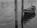
Critique By:
Kobi Eshun (K:62)
8/9/2003 9:13:09 AM
Very tranquil. I'd crop maybe 3mm from the top to get rid of two distracting marks at the top right.
|
| Photo By: Joa Kim
(K:1743)
|
|
|
Critique By:
Kobi Eshun (K:62)
8/7/2003 6:58:13 PM
Very dramatic and dynamic. Helps alot that this is very sharp and has good contrast. Shame about the "thing" in the bottom right corner. What's a "fixed zoom", BTW?
|
| Photo By: Ron Browne
(K:1282)
|
|
|
Critique By:
Kobi Eshun (K:62)
8/6/2003 9:58:43 AM
Great light! There seems to be some odd blocking happening with the image (maybe from your processing?) that's a bit distracting.
|
| Photo By: Gábor Koscsó
(K:-229)
|
|