|
|
Critique By:
Bee Arthur (K:2259)
1/14/2004 9:52:11 AM
This is a great shot. That building must be spectacular, as it appears so just through the top section. The green plays well against the blue sky. Great crop, and angle. You are rifht, the title is wonderful. Very intrigueing.
|
| Photo By: Nuno Murias
(K:5323)
|
|
|
Critique By:
Bee Arthur (K:2259)
1/12/2004 9:33:01 AM
Nice shot. The composition is cool. I like the pale blue playing off the hot reds and yellows. Also, the picture is still very clean for shooting way up at ISO 800.
|
| Photo By: Elaine Collins
(K:1575)
|
|
|
Critique By:
Bee Arthur (K:2259)
1/12/2004 9:30:19 AM
Neat shot. I really like the use of the painted wall at the bottom, that truly feels like the ground and adds some good depth. Also, great use of the angles of the buildings, that really play well intersecting with eachother and what not. I wish there was more in the sky, or atleast a more peppy one. Maybe try the picture at night, or in more dramatic lighting. I think you'll find it becomes something from another world. GOOD WORK. 
|
| Photo By: Elaine Collins
(K:1575)
|
|
|
Critique By:
Bee Arthur (K:2259)
1/12/2004 9:25:30 AM
What a great moment. A lot of beautiful colors are seen. I think it would benefit you to take the picture from a lower angle to capture their faces more, and have a more natural feel. Also if you crop tighter on their faces you could get rid of some of the distractions near the edge of the frame.
|
| Photo By: Shiv Kumar Surya
(K:17362)
|
|
|
Critique By:
Bee Arthur (K:2259)
1/12/2004 9:19:55 AM
What a good subject. You seem to have a really good eye for those photographic moments. I thought that is could be a little better though. If you tightened up the composistion by cropping in on the girl, and added a little bit of depth of field, to make the space seem deeper. I did a little photoshop work, just to show you. But still an excellent job. Nice work.
|
| Photo By: Shiv Kumar Surya
(K:17362)
|
|
|
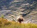
Critique By:
Bee Arthur (K:2259)
1/5/2004 8:30:20 PM
You really have a good eye. I love the composition and using the hill as the backdrop. I think it could be improved though. It would be nice to see more saturation (less haze) between the fore and backgrounds, I just feel they have to much seperation. Shooting at different times of the day might work, if the subject is around, and you may find a time with less harsh light works better too. Also I see a bit of red in the farmer, and if he were closer I think that red more present would play well against the background.
These are just thoughts, I really enjoy the piece, Keep on shooting, you do great work. Cheers
|
| Photo By: Shiv Kumar Surya
(K:17362)
|
|
|
Critique By:
Bee Arthur (K:2259)
1/5/2004 8:25:12 PM
What a neat shot. I think you hit the composition right on, such a strong POV makes for an interesting image. Not the typical view of the the Arch thats for sure. My only concern is the technical stuff. It must be impossible to battle the sun shooting straight up, but you might consider shooting late or early in the day. You might getsome interesting shadow detail, and you can get an even clear exposure much easier. Just a thought, dont know if you have the chance to go back, but it works well anyway. KEEP IT UP!!! Cheers
|
| Photo By: Elaine Collins
(K:1575)
|
|
|
Critique By:
Bee Arthur (K:2259)
1/4/2004 7:31:55 PM
A great shot sir... I really love the composition, the shapes have a nice abstract and nature organic feel. The colors are great, the variation plays well. I love the lighting, and you should keep on shooting.
|
| Photo By: micky waby
(K:9141)
|
|
|
Critique By:
Bee Arthur (K:2259)
1/4/2004 7:25:39 PM
A very nice shot, this is a great piece. She is very pretty, and I think you captured her very naturally. My only gripe is with the lighting, her face could use more depth, with more shadowing. But it can be hard to get any decent ligting outside during the day.
|
| Photo By: Shiv Kumar Surya
(K:17362)
|
|
|
Critique By:
Bee Arthur (K:2259)
1/4/2004 7:15:40 PM
What a wonderful shot, I really enjoy it. It is in my eyes a great ambigious potrait, because it represents many people to me. Everyone knows an old man, and everyone sees a different old man in this picture, in the jesture and in the quality of the skin. It has both a gentle and a strong statement. I really enjoy it. Technically its sound, so keep up the good work. Cheers
|
| Photo By: Tamar Matsafi
(K:875)
|
|
|
Critique By:
Bee Arthur (K:2259)
1/4/2004 7:06:23 PM
Well, what a coincedence.... I saw this picture on the random picture side banner and was like, I've seen that cat before. And sure enough, his name was dave like I suspected. And sure enough you take picture in minneapolis just like I do. And sure enough you listen to hardcore just like i do.
Well, now that thats out of the way, I really enjoyed looking through your portfolio. You have a very cool, new style. Not that im getting married soon, but Id definately use you as my photographer because you seem to capture an amazing truth in your shots, not the typical "stage-happiness" of traditional wedding shots. I plan to give your name to a coworker of mine whos getting hitched in June, so look for a call on that one. Keep up the good work, and Id love to hear back from you...
|
| Photo By: Elizabeth van Hulst
(K:283)
|
|
|
Critique By:
Bee Arthur (K:2259)
1/3/2004 10:13:32 PM
**** The band is a local Minneapolis melodic hardcore band: A False Notion ****
Just some kids having a good time, nothing to serious. I think its humorous what can be suggested by the expression and tone of these pictures. They are actually really upbeat guys, and there music has a heavier tone, but is very melodic and fun. I will post the funny ones tomorrow, which should lighten the mood, and give there real personalities. Thanks for the comments.
|
| Photo By: Bee Arthur
(K:2259)
|
|
|
Critique By:
Bee Arthur (K:2259)
1/3/2004 10:01:46 PM
Very nice picture. I really like the play of the shapes coming in on different planes, and interacting. It makes for a strong composition to have such strong perspective. I like the detail that is there, but I feel like the lighting is a little weak. There is a lack of shadows, probablly because of the time of day it was taken. It would be interesting to take the picture early morning of late evening when the light casts really nice shadown, because I think the piece would gain a lot of depth, and interest. Even a night shot would be cool, becuase you may find that the area is hit with many lights creating an even more elaborate light scheme. Great job either way, it is apparent you have a good eye. Cheers
|
| Photo By: adam pate
(K:282)
|
|
|
Critique By:
Bee Arthur (K:2259)
9/26/2003 9:56:39 PM
I really like this shot, the arc of the stars is very nice, and nicely positioned. I agree with eric, to be weary of your composition, since the trees arent not that nice to look at, just keep it in mind I guess. Im not sure what you were saying with the ships, but if they are slow moving, it might be intereting to try and include the ships and the stars, that way you would have two different light motions, im not sure if thats possible but you could check. Anyway, I ramble. Nice start.
|
| Photo By: Megan Forbes
(K:4617)
|
|
|
Critique By:
Bee Arthur (K:2259)
9/17/2003 9:48:16 PM
Great piece. I think it speaks tons for your creativity, as the simplicity of the piece gives it that much more meaning and areas of interpretation. Nice work, sir.
|
| Photo By: lowell whipple girbes
(K:13151)
|
|
|
Critique By:
Bee Arthur (K:2259)
9/17/2003 9:43:13 PM
Wow, this is a very nice shot. I really think it one of the strongest pieces you've posted to date. It has alot of emotion, and alot of story to tell. The cropping/composition is superb. You dont include the persons head, because they are of lesser importance, and the inclusion of the candle creates some good depth. Also, the subject or focus (the elderly woman) is nicely position as to were the camera focus and the table lines and movement lead you to her, and essential to the meaning of the piece "contemplation"
Very nice work, I hope these comments help you understand why this piece is great, so you can apply it to more of your work. Thanks for looking at my work too.
|
| Photo By: Jocelyne A
(K:1974)
|
|
|
Critique By:
Bee Arthur (K:2259)
9/17/2003 9:38:25 PM
Neat shot Jocelyne. At first I thought it was a fruit, or an abstract, so it looks like you nailed the assignment "The Creative Flower." My only suggestion would be the focus you chose. If possible, get a larger depth of field so that the whole image is clearly focused. I think that would add to the piece. The movement created by the natural colors is amazing, great eye. Keep up the good work.
|
| Photo By: Jocelyne A
(K:1974)
|
|
|
Critique By:
Bee Arthur (K:2259)
9/17/2003 9:35:48 PM
This is very nice Gabry. I really like the frozen/stopped time you created. One pointer, the colors all seem to be very similar, so maybe having the model wear a contrasting bathing suit would add some depth to this shot. Also, try working with the composition, as a center subject can make a shot fairly static, and plain. I really like the idea, and the frame is a nice touch. Thanks for the comments.
|
| Photo By: Gabriella Carta
(K:22879)
|
|
|
Critique By:
Bee Arthur (K:2259)
9/15/2003 10:31:55 PM
great color
|
| Photo By: Jose Ignacio (Nacho) Garcia Barcia
(K:96391)
|
|
|
Critique By:
Bee Arthur (K:2259)
9/15/2003 10:31:10 PM
Wonderful. I apologize for the 'sir' comment, I apparently read your name to fast and thought it said 'Alexandar.'
Anyway. I really like the colors in the background of this shot. And the subject seems to have a good top to bottom balance. Keep shooting. You have a great thing going on.
Also, Minneapolis is still here. But thats about it. Nothing real fancy ever happens here, but some might say thats for the better. You just have to search for the goings-on. Thanks for the comments.
|
| Photo By: Aleksandra Zvonar
(K:4623)
|
|
|
Critique By:
Bee Arthur (K:2259)
9/15/2003 10:03:00 PM
What can I say that hasnt been said. This is a beautiful moment, captured perfectly by a great photographer no less. I think silohuettes hold a beauty of their own because they are a simple and precise way of expressing a moment, with out the need to get too detailed. Great eye. :0
|
| Photo By: Burak A
(K:2022)
|
|
|
Critique By:
Bee Arthur (K:2259)
9/15/2003 10:01:09 PM
A great shot sir. I think its an excellent capture, for just a test on a wim. I really enjoy the yellowish reflection in the rippling water. It appears as fire, which contrasts the watery canvas very well. I also think it has a very nice, natural look to it, that doesnt appear forced or overdone. Great capture.
|
| Photo By: Aleksandra Zvonar
(K:4623)
|
|
|
Critique By:
Bee Arthur (K:2259)
9/15/2003 9:57:35 PM
A very nice capture. This one has some very nice, natural color, and elements to it. I think you have a very good eye for capturing the beauty in everyday life. Thanks for sharing it with the rest of us.
|
| Photo By: Jose Ignacio (Nacho) Garcia Barcia
(K:96391)
|
|
|
Critique By:
Bee Arthur (K:2259)
9/14/2003 10:14:40 PM
Great shot. I think the minimal DOF is a great addition to it, and yeah, there is nothing wrong with breaking out the old work. I think it may help you see how far you've come, or what has changed in your perseption of photography. I think the the subject is great too, because it has such a repetitous nature, but they are not placed in a pattern. It has a nice humanistic feeling then, while continueing to have abstract traits. Nice job, thanks for sharing it.
|
Photo By: Phillip Cohen
(K:10561)

|
|
|
Critique By:
Bee Arthur (K:2259)
9/14/2003 10:11:08 PM
Incredible. I really want to get into architecture exploration, and this is why. Such extrordinary composition. I really like the limited tonal range, and the fact that the majority of it is a nuetral gray. This seems to place a strong focus on the abstract nature of the shapes alone. And then at the same time, you know it is a physical space so you explor the photo to find human/manmade objects that give the shapes context. This is exactly what I want to create. Great work. Thanks for sharing it.
|
| Photo By: Rose Hooper
(K:899)
|
|
|
Critique By:
Bee Arthur (K:2259)
9/14/2003 10:05:39 PM
What a nice moment. I can see by your portfolio that you have a very nice eye for the simple yet amazing things in life. This is clearly one of those, and the moment is amazingly captured. I really enjoy the colors, subtle, and not unrealistic like some outdoor shots, and the pink plays off the blue perfectly. I definately prefer the composition without the relection, but I might have like it if the girl in the foreground was even closer and more prodominate, and the DOF was shortened so that the other people were fuzzier. I think this would have given the same mood and setting, but really isolates her as a explorer whom isnt concerned with who else is there, but what is in her hand.
I did a quick PS cut, but nothing beats the true camera technique. You have a very nice portfolio, and its always nice to see Amatuer enthusiests, like myself, whom put so much into their work. Please feel free to share with me, you seem to have fun with photography, and thats what I want to do.
|
| Photo By: Kristina Kohut
(K:49990)
|
|
|
Critique By:
Bee Arthur (K:2259)
9/14/2003 9:51:14 PM
This is a very nice shot. You did an excellent job of creating a still image, excellent composition. I would like to see the action from closer up though, maybe next time? Thanks for the comments.
|
| Photo By: Shiv Kumar Surya
(K:17362)
|
|
|
Critique By:
Bee Arthur (K:2259)
9/13/2003 8:50:50 AM
Interesting
|
| Photo By: Amancio Couto
(K:15720)
|
|
|
Critique By:
Bee Arthur (K:2259)
9/13/2003 8:46:19 AM
This is a different side of you that we dont see much. I think it has such nice color contrast, and an excellent composition. Thanks for all your feedback.
|
| Photo By: T Glow
(K:14955)
|
|
|
Critique By:
Bee Arthur (K:2259)
9/13/2003 8:43:39 AM
Stupore. Ciò è prova che i photographers oggi ancora hanno un occhio per composizione e le situazioni interessanti nella vita everday. Ringraziamenti per la compartecipazione del questo è molto beautigul.
|
| Photo By: luisa vassallo
(K:28230)
|
|