|
|
Critique By:
Miles Herbert (K:1947)
8/14/2006 7:08:21 PM
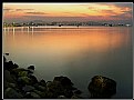
Personally I don't feel that the centred horizon really works for you here. The lines in the sand are good, and I reckon that getting the camera down lower and maybe a little closer to the boat, keeping the boat on a "third" would have worked a little better, keeping the horizon along the bottom third horizontal line...
|
| Photo By: David M Roberts
(K:914)
|
|
|
Critique By:
Miles Herbert (K:1947)
8/14/2006 7:05:13 PM
A striking image, the wide angle and the dark sky really make this, as does the lean of the tree. The horizon does appear to be awkward, but you can't really control the lie of the land!
|
| Photo By: Moises Levy
(K:782)
|
|
|
Critique By:
Miles Herbert (K:1947)
8/14/2006 7:01:41 PM
I'm not going to fault it either, nice soft warm colours, nice details in the rock and city lights... I like it. One little thing, I'd have probably got rid of the white plastic bag (?) in there amoungst the rocks...
|
| Photo By: Eduardo. B
(K:330)
|
|
|
Critique By:
Miles Herbert (K:1947)
8/14/2006 6:57:57 PM
As with the others I think I would prefer a greater depth of field, with the nose detail sharp as well...
|
| Photo By: Patrick Ziegler
(K:21797)
|
|
|
Critique By:
Miles Herbert (K:1947)
8/14/2006 11:13:03 AM
Thank you for your kind comments.
|
| Photo By: Miles Herbert
(K:1947)
|
|
|
Critique By:
Miles Herbert (K:1947)
8/13/2006 9:49:57 AM
Lovely light and colours, though maybe just a little over noisey in the rocks there, especially in the shadows.
|
| Photo By: Nuno Milheiro
(K:453)
|
|
|
Critique By:
Miles Herbert (K:1947)
8/13/2006 9:48:27 AM
Looks very summery! Fluffy clouds and the sweep of the bay make this work pretty well. As you say, just down the road!
|
| Photo By: Roderick Lewis
(K:135)
|
|
|
Critique By:
Miles Herbert (K:1947)
8/13/2006 9:46:20 AM
Nice simple shot, I like the back lighting and the silhouette in the V of the hills.
|
| Photo By: Roderick Lewis
(K:135)
|
|
|
Critique By:
Miles Herbert (K:1947)
8/13/2006 8:48:33 AM
Nice dramatic sky, and good use of wide angle to emphasise it. Highlights look just a little too bright to me, easily fixed in PS... and dust spots in the sky spoil this for me, 5 seconds with a clone tool would get rid of those...
|
| Photo By: Paolo Cardone
(K:1161)
|
|
|
Critique By:
Miles Herbert (K:1947)
8/13/2006 8:46:13 AM
For me a little too dark, a little reflected light or fill in flash on the face would have given a little more colour and detail to her eyes.
|
| Photo By: Gordon Granger
(K:257)
|
|
|
Critique By:
Miles Herbert (K:1947)
8/13/2006 8:39:02 AM
Very nice, well cropped, well composed image, good warm colours and an interesting silhouette to look at. Works really well.
|
| Photo By: Hassan Ahmed
(K:2995)
|
|
|
Critique By:
Miles Herbert (K:1947)
8/13/2006 8:32:06 AM
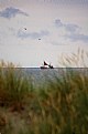
Nicely caught in the gap in the grass dunes, the seagulls balance out the boat quite well... BUT... the image is much too "noisey" (the coloured speckles all over the image) which is often caused by using high ISO settings. There are software programs out there that can remove some of this noise, ie Neat Image from www.neatimage.com, though the best way around it is to use lower ISO settings and a tripod if neccessary.
Have you tried converting this to black and white? Have a feeling that with more contrast and maybe a grad grey filter across the sky to add a stormy mood it would look pretty good.
|
| Photo By: Henrik Hanselmann
(K:658)
|
|
|
Critique By:
Miles Herbert (K:1947)
8/4/2006 7:47:18 AM
I like this, the tones make it really effective.
|
| Photo By: Kshitiz Anand
(K:4848)
|
|
|
Critique By:
Miles Herbert (K:1947)
8/4/2006 7:46:30 AM
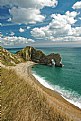
nice image, you could really make this shine using Photoshop to brighten the cliff and beach up a little in "curves" and layers. Like the lines in this.
|
| Photo By: delete my account delete my account
(K:305)
|
|
|
Critique By:
Miles Herbert (K:1947)
8/4/2006 6:40:20 AM
Eye contact is good through the glasses, expression is good, she looks kind of smug about something that keeps the viewer guessing. Exposure and lighting are ok. For me the only suggestion that I would make is that that it may look better with the hand bag strap more complete at the bottom to show it fixed to the bag.
|
Photo By: Roberta Elena Dragan
(K:345)

|
|
|
Critique By:
Miles Herbert (K:1947)
8/4/2006 6:33:56 AM
Nice colours and textures
|
| Photo By: Salvatore Rossignolo
(K:13559)
|
|
|
Critique By:
Miles Herbert (K:1947)
8/4/2006 6:31:37 AM
Nice, but what happened to the tip of the top right wing?
|
| Photo By: Alan Orr
(K:9671)
|
|
|
Critique By:
Miles Herbert (K:1947)
8/4/2006 6:30:10 AM
Nice moody sky, my sort of picture...
|
| Photo By: Edward Ghoti
(K:5514)
|
|
|
Critique By:
Miles Herbert (K:1947)
7/29/2006 11:02:56 AM
Thank you for all the comments. No, no tripod was used for this.
|
| Photo By: Miles Herbert
(K:1947)
|
|
|
Critique By:
Miles Herbert (K:1947)
7/18/2006 6:13:24 PM
Agree that the corrected version definately looks better ...

|
| Photo By: Dr. Rafael Springmann
(K:89517)
|
|
|
Critique By:
Miles Herbert (K:1947)
7/17/2006 5:45:07 PM
Thank you for your comments.
No civilians were harmed during the making of this image.
|
| Photo By: Miles Herbert
(K:1947)
|
|
|
Critique By:
Miles Herbert (K:1947)
7/17/2006 4:51:58 PM
For me personally I feel the bottom is just much too dark and lacking in detail. Good filtering with some ND Grad filters would have sorted this out, retaining the sky detail whilst allowing the bottom section to have detail...
|
| Photo By: Dr. Rafael Springmann
(K:89517)
|
|
|
Critique By:
Miles Herbert (K:1947)
7/17/2006 4:48:08 PM
Nice simple study of textures and shape... I like it.
|
| Photo By: Tony Hunter
(K:4647)
|
|
|
Critique By:
Miles Herbert (K:1947)
7/17/2006 4:45:41 PM
Good idea, and a nice clean image. I can't help feeling it would look better if taken from a little further down the beach to the left to get a bit more of the palm trees in. It would also be interesting to see it without the people, though in a way they do add a sense of scale to the image. I like this...
|
| Photo By: Roberto Okamura
(K:22851)
|
|
|
Critique By:
Miles Herbert (K:1947)
7/17/2006 4:43:06 PM
To me this is over exposed and over sharpened. There is no subtlety of texture or light, and the burned out highlight areas really distract me. Sorry....
|
| Photo By: Kshitiz Anand
(K:4848)
|
|
|
Critique By:
Miles Herbert (K:1947)
7/17/2006 4:39:10 PM
Nice almost abstract shot, the vivid colours manage to hold their own without the inclusion of much else. Yep, I like it...
|
| Photo By: Neil Duffy
(K:110)
|
|
|
Critique By:
Miles Herbert (K:1947)
7/17/2006 4:34:58 PM
Nice snap of a cute dog. From a photographic point of view a little fill flash would have lit up the foreground a bit better, and given some "catchlights" in the dog's eyes. The direct sunlight on the side has caused a loss of detail where it's burned out the exposure on that patch. Perhaps shading that area before the shot would have helped.
|
| Photo By: Steven vanHaaster
(K:888)
|
|
|
Critique By:
Miles Herbert (K:1947)
7/17/2006 4:31:45 PM
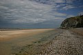
Nice light on an often photographed location. The hotspot in the centre distracts me a little, as does the softness of the rock that sticks into the frame on the extreme left and the rocks on the floor. I don't know if you used a tripod, but a smaller aperture would have sorted out the blurred rock, at the expense of shutterspeed. About -1/3rd EV would have probably helped with the hotspot.
|
| Photo By: Wayne Pinkston
(K:360)
|
|
|
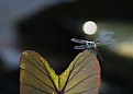
Critique By:
Miles Herbert (K:1947)
7/13/2006 7:36:06 AM
To me this is one of those "so near but so far" shots. As it stands, the shot doesn't work for me, the main reasons are that it is too soft on the key area, the dragonfly, and that there is just too much wasted space around the insect. To me the obvious shot here would be much tighter in on the dragonfly using the bright reflected spot above it as a further point of interest...almost like a sun behind it. Just an idea...
|
| Photo By: John-Eric Lemieux
(K:3045)
|
|
|
Critique By:
Miles Herbert (K:1947)
7/13/2006 7:30:03 AM
Nice colours and details, especially the little bug on the main flower and the one on the left side. I think for impact I would have cloned out the half hidden plants, and the bubbles, leaving just the main plant with a bit of negative space to emphasise the bright colours
|
| Photo By: Giuseppe Guadagno
(K:34002)
|
|