|
|
Critique By:
Nigel Cliff (K:1560)
3/16/2005 7:20:24 PM
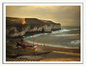
Clever bit of work Chris and a loveley English chocolate box scene,maybe a bit less contrast would have helped but otherwise an excellent shot of its type (Photoshopped or not)
|
| Photo By: Chris Spracklen
(K:32552)
|
|
|
Critique By:
Nigel Cliff (K:1560)
3/16/2005 7:14:59 PM
The idea is good and the colours bright and vibrant but for a shot like this to work you need at least part of the image really pin sharp and this lacks that element.
|
| Photo By: Teunis Haveman
(K:37426)
|
|
|
Critique By:
Nigel Cliff (K:1560)
3/16/2005 4:27:21 PM
Yo0u are correct Den I must have been having a brainstorm when I posted this.Slapped wrist and more concentration next time.PS if you want to see some more from the Gala before I post then on Usefilm have a look at http://nigel.cliff.fotopic.net/c460976.html
|
| Photo By: Nigel Cliff
(K:1560)
|
|
|
Critique By:
Nigel Cliff (K:1560)
3/16/2005 4:20:16 PM
Plenty of action Bruce with good sharpness and bright colours.Pity about the obtrusive yellow jackets in the background but otherwise an excellent shot from a good portfolio.
|
| Photo By: Bruce Elliott
(K:2434)
|
|
|
Critique By:
Nigel Cliff (K:1560)
3/12/2005 9:26:49 PM
About 30 more shots AJ and hopefully a few more when I go for the second day of the Gala tomorrow.I will post some here but also a lot more at
http://nigel.cliff.fotopic.net/
if you want to take a look in a few days
|
| Photo By: Nigel Cliff
(K:1560)
|
|
|
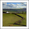
Critique By:
Nigel Cliff (K:1560)
3/12/2005 8:44:24 PM
This is the 6 days a week you have off as you only work Sundays is it Chris.
Anyhow this is a really nice quintisentially English landscape well composed and exposed,I particularly like the way the hedge leads the eye through the shot and also the way you have captured the dappled light across the fields.
|
| Photo By: Chris Spracklen
(K:32552)
|
|
|
Critique By:
Nigel Cliff (K:1560)
3/12/2005 8:38:07 PM
I was desperate to get a train shot in the snow and failedcv miserably so I am really jealous of the conditions you have here.It is a record shot but texchnically it is spot on and a pleasant composition.
|
| Photo By: John Glibota
(K:310)
|
|
|
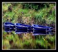
Critique By:
Nigel Cliff (K:1560)
3/12/2005 8:35:16 PM
Nice depth of field and the indigo blue of the boats contrast well with the green of the vegetation.I would though have cropped much tighter at the top to concentrate the eye on the boats more.
|
| Photo By: Mark Evans
(K:17428)
|
|
|
Critique By:
Nigel Cliff (K:1560)
3/12/2005 7:49:06 PM
Superb colours with a really nice contrast between the oranges in the sky and the blue of the water.In addition the DOF and sharpness is spot on.
|
| Photo By: Ian Sharp
(K:1762)
|
|
|
Critique By:
Nigel Cliff (K:1560)
3/11/2005 7:21:59 PM
Ok so technically it leaves a lot to be desired but this is your photo of sporting history,one of the greatest drivers and cars ever and you saw them and photographed them.I would have given my eye teeth for the oppurtunity although it would have been the JPS Lotus and the late great Ronnie Peterson that I would have gone for.
|
| Photo By: bill worthington
(K:378)
|
|
|
Critique By:
Nigel Cliff (K:1560)
3/11/2005 7:11:56 PM
The lighting is gorgeous and the contrast between the tatty old shack at the bottom and the beautiful villa at the top works really well.Pity about the wires on the poles but there is little you could do about that
L'illuminazione è gorgeous ed il contrasto fra il vecchio shack tatty alla parte inferiore e la villa bella agli impianti superiori realmente well.Pity circa i legare sui pali ma ci è piccolo che potrte fare a tale proposito
|
| Photo By: Di Ciuccio Maurizio
(K:57398)
|
|
|
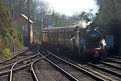
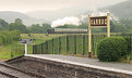
Critique By:
Nigel Cliff (K:1560)
3/11/2005 7:02:06 PM
Its a good low angle to emphasize the size of the engine and the sky looks really good.I would have liked to have seen a touch more exposure to give some detail at the bottom of the engine and also under the canopies
|
| Photo By: Agust Agustsson
(K:881)
|
|
|
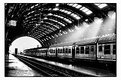
Critique By:
Nigel Cliff (K:1560)
3/9/2005 12:33:14 PM
Maybe a touch to must contrast but a very evocative mono shot with a feel of those 1950's films like the Third Man
|
| Photo By: Paolo Barthelemy
(K:25552)
|
|
|
Critique By:
Nigel Cliff (K:1560)
3/7/2005 1:01:16 PM
Loveley deep colours and a well balanced composition although a pity about the red ball on the boat hat is a touch distracting.
Out of interest is this a morning or evening shot because I am working in Scarborough for a couple of months and looking for good photo locations in the area after a hard days work.
|
| Photo By: lyne edeson
(K:107)
|
|
|
Critique By:
Nigel Cliff (K:1560)
3/7/2005 12:44:25 PM
A totlly english cuntry village scene with loveley rich colours.Not sure if t was possible but I would have preferred a wider angle
|
| Photo By: Chris Spracklen
(K:32552)
|
|
|
Critique By:
Nigel Cliff (K:1560)
3/7/2005 12:42:55 PM
Well Chris if you will buy these Nikons wht can you expect,anyhow re the shot its a good mix of colours with nice saturation.I really like the way you have framed the obelisk with the standing stones.Dont know if the obelisk has any christian conetations but if so then you have the combination of the pagan and christian traditions of this part of the world in the same shot.If not then I'm just being a pretentious wally as my vicar tells me mst sunday mornings
|
| Photo By: Chris Spracklen
(K:32552)
|
|
|
Critique By:
Nigel Cliff (K:1560)
3/7/2005 9:20:42 AM
I deliberateley added some contrast just to please you Chris but you are a hard taskmaster
|
| Photo By: Nigel Cliff
(K:1560)
|
|
|
Critique By:
Nigel Cliff (K:1560)
3/6/2005 7:21:52 PM
If you remember Mary Poppins you know the song Feed The Birds and this is so evocative of that song.I love the technical qulity the look on the old lady's face and the offset composition. All that I would change is that I would crop in the gap between the pigeons on the left to stop any of them being cut off.
|
| Photo By: Bulent Ahiskal
(K:1251)
|
|
|
Critique By:
Nigel Cliff (K:1560)
3/6/2005 9:16:36 AM
A lot of potential with the low angle and the red and blues contrasting well.However the dark area on the right is rather distracting and I feel the colours are rather to saturated and therby unatural
|
| Photo By: Luquésio Melo
(K:565)
|
|
|
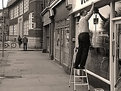
Critique By:
Nigel Cliff (K:1560)
3/6/2005 9:11:05 AM
Technically spot on with superb sharpness and a great range of tones.The composition though for me is rather messy,I would have come a bit further to the right to include all of the washing bucket and cropped tighter on the left to exclude the mwessy signs and bike rack.
|
| Photo By: Ferdinand
(K:3516)
|
|
|
Critique By:
Nigel Cliff (K:1560)
3/6/2005 9:07:25 AM
A loveley composition with the smile on the girls face illuminating the shot and contrasting with Grandma's scowl.Technically though I feel it vcould be better with a touch more sharpness and increased cintrast to improve the overall definition.
|
| Photo By: Ken Alexander
(K:3905)
|
|
|
Critique By:
Nigel Cliff (K:1560)
3/6/2005 9:03:47 AM
Its a loveley graphic shape and the contrast between the blue sky and the golden sand works really well,however that large swathe of dense black across the centre of the shot is rather distracting for me.
|
| Photo By: Khalid Shahin
(K:1091)
|
|
|
Critique By:
Nigel Cliff (K:1560)
3/6/2005 9:02:01 AM
A good composition and a nice range of tones,I do feel however that these Venetian shots are so full of vibrant colour that the mono treatment however good does not really do them justice.
|
| Photo By: Davide Contestabile
(K:4091)
|
|
|
Critique By:
Nigel Cliff (K:1560)
3/6/2005 8:59:45 AM
Its an excellent composition but technically being very grainy and also lacking sharp focus it leaves a lot to be desired
|
| Photo By: Fernando Tasca
(K:1995)
|
|
|
Critique By:
Nigel Cliff (K:1560)
2/27/2005 9:12:32 AM
I need to work on getting the size larger Chris and not sure what I am doing wrong because I get large shots on another site beginning with P that only takes a slightly larger file size than here.
|
| Photo By: Nigel Cliff
(K:1560)
|
|
|
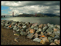
Critique By:
Nigel Cliff (K:1560)
2/26/2005 3:56:18 PM
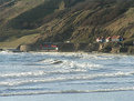
I really like the angle with the rocks in the foreground adding real depth and the sky looks really good.Despite the overcast conditions though I feel maybe half a touch more exposure would work better to bring out some of the shadow detail.
|
| Photo By: Gaja Snover
(K:4462)
|
|
|
Critique By:
Nigel Cliff (K:1560)
2/26/2005 3:51:09 PM
A stunning shot of this most beautiful of birds,technically it is spot on and I love the hunched pose of the Owl and the way the feathers are sticking up at the back.
|
| Photo By: Vadim Onishchenko
(K:5)
|
|
|
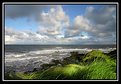
Critique By:
Nigel Cliff (K:1560)
2/26/2005 3:46:34 PM
Nice angle goos bright colours and the sky looks really good,pity that there was not a yacht sailing by to give some more interest to the overall shot.
|
| Photo By: Mark Evans
(K:17428)
|
|
|
Critique By:
Nigel Cliff (K:1560)
2/26/2005 3:44:45 PM
Clever idea and you have put the cone at a good angle,the sky creates a nice background but I feel the grain and lack of pin sharpness lets it down.
|
| Photo By: Tim Courlas
(K:486)
|
|
|
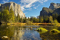
Critique By:
Nigel Cliff (K:1560)
2/25/2005 12:39:56 PM
We all know how beautiful Yosemite is and this proves it,gorgeous composition and exposure and really rich colours.
|
Photo By: Rob Graziano
(K:6678)

|
|