|
|
Critique By:
Khaled Rabie (K:368)
7/8/2003 11:26:51 AM
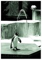
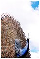
nice shot, regards.
|
| Photo By: Mohamed Azmy -
(K:74)
|
|
|
Critique By:
Sarah Moustafa (K:4456)
6/22/2003 3:05:18 AM
No doubt that the colors is so powerful and pure, the composition is not palanced needs to be croped from the right side.
|
| Photo By: Mohamed Azmy -
(K:74)
|
|
|
Critique By:
Sarah Moustafa (K:4456)
6/22/2003 3:02:31 AM
Good tone and nice capture, again i don't agree with Aiman cause the composition is distracted.
|
| Photo By: Mohamed Azmy -
(K:74)
|
|
|
Critique By:
Sarah Moustafa (K:4456)
6/22/2003 3:00:55 AM
waw, nice view , so fresh.
|
| Photo By: Mohamed Azmy -
(K:74)
|
|
|
Critique By:
Sarah Moustafa (K:4456)
6/22/2003 3:00:06 AM
Wonderful shot, i like the angle of view. and the colors of buldings, i don't agree with Aiman Nassar in crop, it's perfect like that.
|
| Photo By: Mohamed Azmy -
(K:74)
|
|
|
Critique By:
Sarah Moustafa (K:4456)
6/22/2003 2:52:58 AM
Good composition, tone, and good choice of black and white.
|
| Photo By: Mohamed Azmy -
(K:74)
|
|
|
Critique By:
Sarah Moustafa (K:4456)
6/22/2003 2:49:09 AM
Nice crop and lighting.
|
| Photo By: Mohamed Azmy -
(K:74)
|
|
|
Critique By:
Richard Thornton (K:26442)
6/6/2003 12:08:08 PM
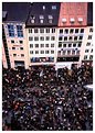
Good colors and information. If you could have made the dividing line between buildings/people either up or down from its halfway position it might eliminate the static tendencies of the picture.
|
| Photo By: Mohamed Azmy -
(K:74)
|
|
|
Critique By:
Aiman Nassar (K:11961)
5/24/2003 5:33:08 AM
Beautiful work Mohamed... very good composition and colors.http://www.usefilm.com/showphoto.php?id=142213#
|
| Photo By: Mohamed Azmy -
(K:74)
|
|
|
Critique By:
Aiman Nassar (K:11961)
5/22/2003 3:05:29 AM
Excellent capture Mohamed... I love the composition... the way my eyes move inside the frame.. tones are beautiful also... very good work
regards
a
|
| Photo By: Mohamed Azmy -
(K:74)
|
|
|
Critique By:
Onur Aydin (K:9815)
5/22/2003 1:33:11 AM
Great composition  Very well done ! Very well done !
|
| Photo By: Mohamed Azmy -
(K:74)
|
|
|
Critique By:
Hazem Hammad (K:67)
5/21/2003 7:19:17 AM
Very very nice composition Mohammed, Congratulations..
|
| Photo By: Mohamed Azmy -
(K:74)
|
|
|
Critique By:
Aiman Nassar (K:11961)
5/21/2003 7:07:38 AM
Very good work Mohamed!
|
| Photo By: Mohamed Azmy -
(K:74)
|
|
|
Critique By:
Hazem Hammad (K:67)
5/21/2003 7:05:02 AM
Nice shot, great composition and colors Mohammed.
|
| Photo By: Mohamed Azmy -
(K:74)
|
|
|
Critique By:
Ronald Allen (K:2934)
5/21/2003 4:41:24 AM
it's nice, but i don't understand why it's abstract. good work here, though. good choice of tones...
-Ronald
|
| Photo By: Mohamed Azmy -
(K:74)
|
|
|
Critique By:
Britt Park (K:2210)
5/19/2003 10:06:41 AM
This is fantastic. The little extension of cloud seems to be reaching for the top of whatever it is. First class and funny. Thanks for posting it.
|
| Photo By: Mohamed Azmy -
(K:74)
|
|
|
Critique By:
Aiman Nassar (K:11961)
5/19/2003 7:29:13 AM
Beautiful work Mohamed!
|
| Photo By: Mohamed Azmy -
(K:74)
|
|
|
Critique By:
luisa vassallo (K:28230)
5/19/2003 6:58:17 AM
uno splendido blu poco astratto e molto vero!
|
| Photo By: Mohamed Azmy -
(K:74)
|
|
|
Critique By:
Aiman Nassar (K:11961)
5/18/2003 7:10:53 AM
Very nice composition Mohamed... and beautiful colors... over exposed a bit... but very nice work though.
|
| Photo By: Mohamed Azmy -
(K:74)
|
|
|
Critique By:
Antonio Trincone (K:23167)
5/18/2003 7:06:23 AM
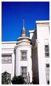
nice; the sky should be less white
|
| Photo By: Mohamed Azmy -
(K:74)
|
|
|
Critique By:
rami rami (K:2201)
5/18/2003 6:48:30 AM
what a point of view!!!!
|
| Photo By: Mohamed Azmy -
(K:74)
|
|
|
Critique By:
Aiman Nassar (K:11961)
5/17/2003 6:59:55 AM
Agree with Onur on the black and white option Mohamed.. good angle though.
you may call it "reaching for the stars" may be!
regrads
a
|
| Photo By: Mohamed Azmy -
(K:74)
|
|
|
Critique By:
Luis Costa - Lucaz (K:9205)
5/17/2003 5:58:33 AM
Very nice work, regards!
|
| Photo By: Mohamed Azmy -
(K:74)
|
|
|
Critique By:
Onur Aydin (K:9815)
5/17/2003 5:05:52 AM
Give a title !
Nice idea surely, beautiful outcome as well. But maybe working on black&white would be better on this one ?
|
| Photo By: Mohamed Azmy -
(K:74)
|
|
|
Critique By:
Peter Mills (K:151)
5/16/2003 2:40:36 AM
I like the composition, nice shot.
|
| Photo By: Mohamed Azmy -
(K:74)
|
|
|
Critique By:
Aiman Nassar (K:11961)
5/16/2003 1:54:51 AM
Very beautiful Mohamed
|
| Photo By: Mohamed Azmy -
(K:74)
|
|
|
Critique By:
Aiman Nassar (K:11961)
5/16/2003 1:36:59 AM
Good eye Mohamed, what do you think of this picture in Black and white, and correcting the tad tilted vertical lines...
I have a good link for you, could be helpful for you: http://www.kodak.com/eknec/PageQuerier.jhtml;jsessionid=IRT EQIEW3XGB5QHIO3JHWGI?pq-path=332&pq-locale=en_US&_requestid =106118
Regards
a
|
| Photo By: Mohamed Azmy -
(K:74)
|
|
|
Critique By:
Hazem Hammad (K:67)
5/15/2003 6:00:02 AM
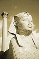
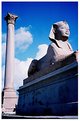
Excellent composition between the Verticals and horizontals, but as for the lighting I think the column needs to be a little bit less lightened from the left side, or try to give more contrast..
|
| Photo By: Mohamed Azmy -
(K:74)
|
|
|
Critique By:
Hazem Hammad (K:67)
5/15/2003 5:43:55 AM
Dear Mohamed, well done, I completely agree with what Aiman said, in addition, if I were you, I would not crop the composition from the bottom as you did.. I mean somthing like the attached image..
|
| Photo By: Mohamed Azmy -
(K:74)
|
|
|
Critique By:
Jose Rasquinho (K:12128)
5/13/2003 3:34:58 AM
Good colours.Nice picture.
|
| Photo By: Mohamed Azmy -
(K:74)
|
|