|
|
Critique By:
Marie. H. Raletz (K:833)
5/6/2003 4:57:13 AM
This is what I call a REAL close-up, Marco!
I like the unconventional crop.
Very nice dreamy expression...
Excellent quality of sharpness and detail.
Is the CP 5700 a 5 millon pixels camera?
;-)) MH
|
| Photo By: marco biancardi
(K:10582)
|
|
|
Critique By:
Marie. H. Raletz (K:833)
5/6/2003 4:52:26 AM
Excellent portrait, Ronny!
This man seems to be a "larger than life" character!
I don't think he's actually asleep, is he?
... Daydreaming, meditating, or simply enjoying the sun?
Incredibly bushy beard!
The beret is a very nice touch!
;-)) MH
|
| Photo By: Ronny Van Eeckhoutte
(K:12734)
|
|
|
Critique By:
Marie. H. Raletz (K:833)
5/4/2003 8:58:51 AM
A strong image, Rob, aptly titled.
An excellent choice of framing/cropping, dynamic lines and perspective.
The glare of the sun is quite spectacular.
I wonder how you managed to capture it this way?
The lens flare below is only a minor distraction (I wonder is this could have been avoided?)
Interesting study on tones.
The metallic reflection on the rails is quite blinding, almost phosphorescent.
I think a different colour of border (you can view my suggestion here) could possibly enhance the depth of field and lighting contrast in a more dramatic way (IMHO).
;-)) MH
|
| Photo By: Rob Davies
(K:168)
|
|
|
Critique By:
Marie. H. Raletz (K:833)
5/3/2003 12:27:30 PM
LOL!!!!
|
| Photo By: Rob Davies
(K:168)
|
|
|
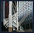
Critique By:
Marie. H. Raletz (K:833)
5/3/2003 10:17:15 AM
An unconventional subject, Rob, with an abstract quality.
Interesting geometry.
Your choice of angle and framing/cropping heightens the dynamism of the diagonals and verticals.
Great variety of shapes, textures and tones.
Your image reminds me of Metropolis, the Fritz Lang film...
It also has an Orwellian atmosphere...
Creative composition.
;-)) MH
|
| Photo By: Rob Davies
(K:168)
|
|
|
Critique By:
Marie. H. Raletz (K:833)
5/3/2003 9:49:29 AM
John,
Very attractive image.
The sepia toning gives it a timeless atmosphere.
The crop is a bit tight at the top, it would have been nice to have a little more space above the streetlamp, IMO.
The buildings in the background are somewhat distracting.
Maybe a shorter depth of field could have helped (I'm not very experienced in this, my own camera does not allow me to select DOF)
Your style of framing reminds me of someone (*wink*. I enclose my suggestion here...
;-)) MH
|
| Photo By: John Hatziemmanouil
(K:40580)
|
|
|
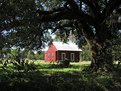
Critique By:
Marie. H. Raletz (K:833)
5/1/2003 11:33:34 AM
Very attractive natural framing, excellent depth of field and perspective.
Interesting exposure contrast (a touch of overexposure on the roof, though...)
A delighful view, Russell...
;-)) MH
|
| Photo By: Russell Becnel
(K:564)
|
|
|
Critique By:
Marie. H. Raletz (K:833)
5/1/2003 7:12:05 AM
Eye-catching composition, Marta!
Attractive tonal range, interestting subject...
(the horizon is slightly tilted to the left...)
;-)) MH
|
| Photo By: Marta Franco
(K:311)
|
|
|
Critique By:
Marie. H. Raletz (K:833)
5/1/2003 6:55:50 AM
Good tones and attitude, Margus!
I like the unconventional angle and crop.;-)) MH
|
| Photo By: margus u
(K:11)
|
|
|
Critique By:
Marie. H. Raletz (K:833)
5/1/2003 6:53:36 AM
Very sharp and colourful, Rory!
The "guest" is very discreet... LOL
;-)) MH
|
| Photo By: rory rory
(K:1840)
|
|
|
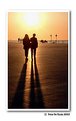
Critique By:
Marie. H. Raletz (K:833)
5/1/2003 6:51:13 AM
Walking together into the light...
Very romantic image, Peter!
Superb lighting and dynamic shadows...
;-)) MH
|
Photo By: Peter De Rycke
(K:41212)

|
|
|
Critique By:
Marie. H. Raletz (K:833)
5/1/2003 6:49:09 AM
Very peaceful mood, Ileana...
Classical and elegant composition, with subtle tones.
;-)) MH
|
| Photo By: ileana barigelletti
(K:3571)
|
|
|
Critique By:
Marie. H. Raletz (K:833)
5/1/2003 6:43:25 AM
Joli miroir aux oiseaux, Attila!
Capture intéressante, dynamique et colorée...
;-)) MH
|
| Photo By: Attila Nemeth
(K:419)
|
|
|
Critique By:
Marie. H. Raletz (K:833)
5/1/2003 6:41:29 AM
Excellent capture d'atmosphère, Antonio!
Le noir et blanc sied bien aux cieux orageux...
;-)) MH
|
| Photo By: Antonio Martins
(K:401)
|
|
|
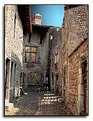
Critique By:
Marie. H. Raletz (K:833)
5/1/2003 6:36:27 AM
Ce bon vieux Pérouges!
Quel suberbe village, aux allures médiévales!
Super textures et lumière, mais le ciel n'est pas "raccord" (désolée!)
;-)) MH
|
| Photo By: Jean Luc LERY
(K:4975)
|
|
|
Critique By:
Marie. H. Raletz (K:833)
5/1/2003 6:31:16 AM
Interesting architectural image, Eleni, with nice pastel colours!
;-)) MH
|
| Photo By: Eleni A
(K:798)
|
|
|
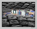
Critique By:
Marie. H. Raletz (K:833)
4/28/2003 2:28:41 AM
Reflections are very fascinating, Luigi.
Your creative presentation adds an artistic dimension to your image.
The selective use of colours and black and white is perfectly suited to this kind of subject.
It emphasises its "abstract" quality.
The cobblestones add depth of field and perspective.
I like the detail of the decorated drain plug!
Interesting composition.
;-)) MH
Le riflessioni sono molto affascinanti, Luigi.
La tua presentazione creativa aggiunge una dimensione artistica alla tua immagine.
L'uso selettivo dei colori e del nero e del bianco è adatto perfettamente a questo genere di oggetto.
Dà risalto alla relativa qualità "astratta".
lastricatiI aggiungono la profondità del campo e della prospettiva.
Mi piace il particolare della spina di scolo decorata!
Composizione interessante.
;-)) MH
|
| Photo By: Luigi Scuderi
(K:4407)
|
|
|
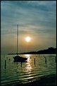
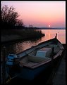
Critique By:
Marie. H. Raletz (K:833)
4/28/2003 2:06:05 AM
Wonderful light and tonal range, Kaj!
The dark exposure sets the perfect sunset mood, and a very serene atmosphere.
Nice choice of format, excellent framing/cropping.
The horizon is perfectly straight!
I really like your angle, and the way only the top of the boat is outlined (a good thing the motor has not a prominent position in the image!).
Superb vegetation silhouettes, and I like the colourful reflection of the setting sun on the water.
I might have been tempted to clone out the buoys, though?
Beautiful composition.
;-)) MH
|
| Photo By: Kaj Nielsen
(K:15279)
|
|
|
Critique By:
Marie. H. Raletz (K:833)
4/27/2003 11:48:39 PM
Idyllic image, Ranae!
Outstanding framing...
Excellent use of the depth of field.
Wonderful lighting, and delightful colours...
I love the detail of the rings in the water around the duck (well, I gather it's a duck! LOL)
Lovely presentation, conveying a mood of perfect happiness to me...
;-)) MH
|
| Photo By: Ranae Fitzgerald
(K:1093)
|
|
|
Critique By:
Marie. H. Raletz (K:833)
4/27/2003 11:30:30 AM
Beautiful presentation, very colourful, Rob!
The composition is excellent, the goose is perfectly positioned in the frame.
She is remarkably well set off against the grassy background... the depth of field is amazing!
The diagonal of the pond, very attractively bordered with tall weeds, adds further depth to the picture.
Superb clarity and detail.
The sunny exposure, the lushness of the grass, the little white flowers, everything speaks about Spring...
This goose looks very clever...and has a lot of CHARISMA!!!
Is it a Welsh Goose???
;-)) MH
|
| Photo By: Rob Davies
(K:168)
|
|
|
Critique By:
Marie. H. Raletz (K:833)
4/27/2003 5:52:18 AM
Lovely textures, John! Interesting architectture...
I wonder whether the horizontal bar on the top arch, and the vertical ones below, are a later addition to the building?
The bright green of the tree foliage blends quite harmoniously with the unique lavender tone of the old church, and the grey stones circling it...
The overall exposure seems a little dark, but the little church seems to be encased in a very shady area.
Creative presentation.
I might have chosen another colour for the line around the frame (you can view my suggestion below, but we all know frames are a matter of personal taste!
Original subject.
;-)) MH
|
| Photo By: John Hatziemmanouil
(K:40580)
|
|
|
Critique By:
Marie. H. Raletz (K:833)
4/27/2003 4:00:16 AM
Hi Rob!!!
A "Goose Tree"??? LOL ... What's that?????
;-)) MH
|
| Photo By: Rob Davies
(K:168)
|
|
|
Critique By:
Marie. H. Raletz (K:833)
4/26/2003 10:38:48 PM
Rob, the colour is outstanding here!
(and your presentation enhances it further...)
The composition is excellent, with a good angle.
Creative framing/cropping.
The tree in the forefront emphasises the perspective.
The lightly leaning tower adds an element of interest.
This castle must be very old...Is the water we see a moat circling it?
I like the detail of the moss-covered walls, and the delicate foliage of the tree (what kind of tree is this?)
An incredibly sunny view, with a cloudless sky!!!
;-)) MH
|
| Photo By: Rob Davies
(K:168)
|
|
|
Critique By:
Marie. H. Raletz (K:833)
4/26/2003 4:33:36 AM
Très intéressante abstraction, JN!
Je pense qu'il doit s'agit de sièges rabattables dans un endroit public? (un stade?)
Composition originale et colorée.
Cadrage soigné.
J'aime beaucoup le dégradé de lumière.
Fascinante perspective..
;-)) MH
|
| Photo By: Jean-Noël Fargier
(K:258)
|
|
|
Critique By:
Marie. H. Raletz (K:833)
4/26/2003 12:37:48 AM
Retrato animal magnífico, Juan.
Perfil muy aseado.
Grandes agudeza y claridad.
Profundidad del campo excelente, con un tema fijado idealmente apagado contra el fondo.
Colores naturales.
;-)) MH
|
| Photo By: Juan Sánchez
(K:5441)
|
|
|
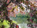
Critique By:
Marie. H. Raletz (K:833)
4/26/2003 12:32:45 AM
Immagine deliziosa, Luisa!
Mi piace lo sguardo sognate della ragazza piccola.
Buona scelta di disposizione e framing/cropping.
Una selezione differente di profondità del campo, in modo da entrare il cigno nel fuoco, ha potuto essere una scelta migliore, comunque.
I colori pastelli belli e l'atmosfera nebbiosa generano un umore morbido e pacifico.
Una scena commevente.
;-)) MH
|
| Photo By: luisa vassallo
(K:28230)
|
|
|
Critique By:
Marie. H. Raletz (K:833)
4/26/2003 12:21:47 AM
Wonderful play of light and shadows, Kaj!
I love the snug atmosphere...
Very skilful framing/cropping.
Including the table in the picture was an excellent compositional choice.
It increases the depth of field, and the shadow pattern heithens the sunny mood.
The lace curtains are a nice touch.
I personnally had been tempted to clone out the chair (?) on the left... (only a very minor detail indeed..)
The exposure contrast makes the appeal of this image, IMO.
;-)) MH
|
| Photo By: Kaj Nielsen
(K:15279)
|
|
|
Critique By:
Marie. H. Raletz (K:833)
4/25/2003 5:32:38 AM
Jean-Luc, j'ai un faible pour les présentations verticales?
Celle-ci est superbe d'exotisme et d'originalité?
Ces pans de murs (des ruines) donnent un cachet tout particulier à ces jardins.
En revanche, je m'interroge sur les causes de l'inclinaison à droite très nette?
Joli contraste de tons et de textures entre ces vieilles pierres et les fleurs incroyablement colorées.
Je pense que j'aurais aimé voir la totalité du palmier, mais bon?
Beaucoup de dynamisme dans cette composition.
;-)) MH
|
| Photo By: Jean Luc LERY
(K:4975)
|
|
|
Critique By:
Marie. H. Raletz (K:833)
4/24/2003 10:17:28 AM
J'aime beaucoup le style "graphique" de cette photo, Jean-Luc!
L'angle et la perspective sont remarquables, l'architecture superbe.
J'ignore s'il s'agit ou non d'un effet d'optique, mais j'ai l'impression que l'image est penchée à droite, à moins que les lampadaires ne soient pas soumis à la loi de la gravitation universelle? J'avoue que c'est un peu troublant...
Je vois une partie floue dans le coin en bas à droite, je me demande d'où çà vient...
Oui, je sais, je pinaille! LOL
Mais franchament, j'aime beaucoup, et je trouve le contraste tonal créatif, élégant et particulièrement réussi.
;-)) MH
|
| Photo By: Jean Luc LERY
(K:4975)
|
|
|
Critique By:
Marie. H. Raletz (K:833)
4/23/2003 11:13:42 PM
I love this trio, Chelsea!!!
Very good capture...
I like the vertical format, perfectly suited to the positioning of the pelicans in the frame, and emphasised by your choice of a tight crop on the bird in the forefront.
As mentioned in other comments, this image could have benefitted from a different choice of aperture, to get the three birds into focus.
Very attractive tonal range. A touch of colour saturation could give it further visual impact (IMO).
The "top" pelican looks as if he's having a "bad hair day"!!! LOL
;-)) MH
|
| Photo By: Chelsea Burke
(K:5750)
|
|