|
|
Critique By:
Matt Hardy (K:474)
2/12/2003 10:20:12 AM
This image brings a smile to my face. Good capture.
|
| Photo By: stephen chong
(K:519)
|
|
|
Critique By:
AJ Haselwood (K:2148)
2/11/2003 12:05:32 PM
Stephen,
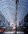
By flat I mean washed out. If there was a little more contrast the colors might really jump out.
aj
|
| Photo By: stephen chong
(K:519)
|
|
|
Critique By:
stephen chong (K:519)
2/11/2003 7:12:01 AM
hey AJ, would like to know what do u mean by "flat".
|
| Photo By: stephen chong
(K:519)
|
|
|
Critique By:
AJ Haselwood (K:2148)
2/11/2003 5:28:08 AM
Great perspective but it is flat.
aj
|
| Photo By: stephen chong
(K:519)
|
|
|
Critique By:
Megan Forbes (K:4617)
2/7/2003 11:10:18 PM
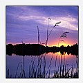
Lovely light capture, beautiful kids!
|
| Photo By: stephen chong
(K:519)
|
|
|
Critique By:
heather martino (K:3648)
2/5/2003 6:11:53 AM
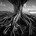
Now I see why they call it The Durian - it was hard to see on the other pic.
I like this as an abstract.
H
|
| Photo By: stephen chong
(K:519)
|
|
|
Critique By:
Jim Gamble (K:12164)

2/5/2003 4:47:01 AM
I have to agree with everything that Andy said but, I have one nit pic. Its that thing in the right corner, its very distracting and keeps pulling my eye back to it.
|
| Photo By: stephen chong
(K:519)
|
|
|
Critique By:
Andy Eulass (K:13435)
2/5/2003 4:17:31 AM
I like the abstraction you composed here. The lighting at the time looks like it was just perfect for enhancing the qualities of this dome. I really like how the light cleanly reflects off the surfaces of those little pyramids. Nice work.
|
| Photo By: stephen chong
(K:519)
|
|
