|
|
Critique By:
Grayce Dillon (K:161)
6/24/2006 1:25:27 PM
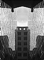
Awesome! Really cool!
|
| Photo By: Nesreen Edrees
(K:738)
|
|
|
Critique By:
Grayce Dillon (K:161)
6/24/2006 1:11:08 PM
Tony, I like this strong, graphic silhouette. Love the yellow and overall nice picture.
|
| Photo By: Tony Marcel
(K:385)
|
|
|
Critique By:
Grayce Dillon (K:161)
3/23/2005 2:36:07 AM
Very nice Craig. It lends it's self well to black and white.
|
Photo By: Craig Nisnewitz
(K:625)

|
|
|
Critique By:
Grayce Dillon (K:161)
3/23/2005 2:27:48 AM
Awwwwwwwww, what a little cutie! Likes to pose too, I see. How wonderful that you have such a willing model. You probably had to grab the moment, and steadying the camera on a tripod wasn't an option. What you could try, which I do, is hold the camera strap, somewhat taut around the back of my neck, while holding the camera forward with two hands. This forms a sort of "tripod." It would be sharper if you did this, probably.
Just for fun, consider removing colour in all but the eyes. with just the saturated eyes it would be intriguing.

|
| Photo By: Laurie Gould
(K:11942)
|
|
|
Critique By:
Grayce Dillon (K:161)
3/23/2005 2:15:09 AM
Steve, I like your attitude! It's so easy for all of us to overlook certain details in our own work. We may have some emotional attachment to the picture, having actually been present in the captured moment. That's what's so great about critique, we get to read the opinions of how other's see our work. It's a great learning tool.
|
| Photo By: Steve Williams
(K:1341)
|
|
|
Critique By:
Grayce Dillon (K:161)
3/22/2005 2:04:11 PM
Thank you very much!
|
| Photo By: Grayce Dillon
(K:161)
|
|
|
Critique By:
Grayce Dillon (K:161)
3/22/2005 6:10:09 AM
I like your use of the flash to hightlight the sea oats. Dramatic skies appeal to me and this is one. I'd like to see a bit more light dodged in.
|
| Photo By: W. Paul Rosenberry
(K:1729)
|
|
|
Critique By:
Grayce Dillon (K:161)
3/22/2005 6:08:40 AM
On my monitor, this is very pixelated. The sky you captured does look quite dramatic. The mountains provide a nice scene too. It's too bad the quality fails here though.
|
| Photo By: John Eckhardt
(K:0)
|
|
|
Critique By:
Grayce Dillon (K:161)
3/22/2005 6:06:34 AM
Your lighting here really rocks! Nice warm glow, and some interesting texture.
|
| Photo By: Robert Vanelli
(K:72)
|
|
|
Critique By:
Grayce Dillon (K:161)
3/22/2005 6:03:56 AM
Nice position, and nice colouring. The bg is somewhat distracting with the man. It looks like balloons are growing either out of him or the dancer.
It would have been good to include her hands in the composition.
You captured a very nice expression on her face. Good!
|
| Photo By: Carla Sie
(K:2057)
|
|
|
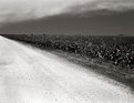
Critique By:
Grayce Dillon (K:161)
3/22/2005 6:01:19 AM
You captured quite an attractive sky! The foreground is not bright enough for seeing any detail, but takes up a lot of room, while placing the horizon into the no no zone, the center. Of course there are always exceptions. It's a guideline, not a law. However, if you cropped most of the foreground out, you'd eliminate the distraction, and reposition the horizon.
ON the other hand, if you want to include the foreground, consider painting in a little light with the dodge tool.
The mountains are very nice, and so is the sky.
|
| Photo By: Steve Williams
(K:1341)
|
|
|
Critique By:
Grayce Dillon (K:161)
3/22/2005 5:56:22 AM
I love the golden hue, and the architecture is appealing. The clock tower point, almost made it in to the picture. It's unfortunate that it was cut off. Also the part of the tree way over to our left, should be outta there. Not enough of it is in the frame to add virtue to the image.
I really like the sky. Reminds me a bit of "Starry Night" by Picasso. Over all still appealing.
|
| Photo By: Harvinder Dildar
(K:3)
|
|
|
Critique By:
Grayce Dillon (K:161)
1/21/2004 9:32:05 PM
Nice abstract kind of shot Carol. I thought it was a scrub brush...I really like pics that make me examine closer...thus pulling me in. Very nice colour too.
About your question...Actually, I feel like I'm missing out IF I don't have my camera. It's funny, I feel so...so...NAKED without it. :-)
Again...I like your picture.
|
| Photo By: Carol Watson
(K:5185)
|
|
|
Critique By:
Grayce Dillon (K:161)
1/21/2004 9:27:27 PM
Ryan, I like the texture of this. The lighting highlights it. It looks old yet still useful. Subjects like that appeal to me. Nice job!
|
| Photo By: Ryan Torres
(K:411)
|
|
|
Critique By:
Grayce Dillon (K:161)
8/23/2003 6:38:28 AM
This is a fantastic subject, with emotional appeal. The lighting is vg too. The composition makes me want to see a little more though.
Regards,
Grayce
|
| Photo By: Marie Billing
(K:1620)
|
|
|
Critique By:
Grayce Dillon (K:161)
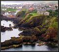
8/13/2003 5:29:59 AM
This is charming! I especially like the lovely green cushioning the rugged shoreline.
|
| Photo By: Maurizio Savini
(K:2174)
|
|
|
Critique By:
Grayce Dillon (K:161)
8/12/2003 9:15:42 PM
Interesting image. Black and white is a good choice here.
|
| Photo By: Carol Watson
(K:5185)
|
|
|
Critique By:
Grayce Dillon (K:161)
6/27/2003 6:28:44 PM
This is the miracle of life, and birth. Fantastic. Doesn't get more real than this. How precious. It's in-your-face natural. Great job!
|
| Photo By: Bob Whorton
(K:2740)
|
|
|
Critique By:
Grayce Dillon (K:161)
6/27/2003 6:01:01 PM
I like the perspective you chose to use. The lovely pink goes so well with the sky blue and of course the green foliage. Nice shadows in the Peonies.
Regards,
Grayce
|
| Photo By: Paul Ross sandilands
(K:13)
|
|
|
Critique By:
Grayce Dillon (K:161)
6/27/2003 5:09:16 PM
Darrin, I wish I took this photograph. The lighting is my favorite element, but composition is also superb.
Excellent overall!
|
| Photo By: Darrin James
(K:3944)
|
|