|
|
Critique By:
Antonio Trincone (K:23167)
6/20/2003 9:40:43 AM
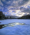
nice capturing here with good lighting; it is not easy to obtain it
|
| Photo By: Polly Towle
(K:122)
|
|
|
Critique By:
Jose Ignacio (Nacho) Garcia Barcia (K:96391)
5/29/2003 9:56:46 AM
simply cool and beautiful.cong.
|
| Photo By: Polly Towle
(K:122)
|
|
|
Critique By:
Trevor Tollefsbol (K:2458)
4/4/2003 11:26:01 AM
Great contrast/composition. Interesting subject. Nice shot!
|
| Photo By: Polly Towle
(K:122)
|
|
|
Critique By:
Trevor Tollefsbol (K:2458)
4/4/2003 11:24:09 AM
I like the colors. Maybe taken as a horizontal and framed without the sky could work too? Nice shot, though.
|
| Photo By: Polly Towle
(K:122)
|
|
|
Critique By:
Dave Atwood (K:253)
4/4/2003 10:43:44 AM
I like the sublety here. The red contrasts well with the rest of the image. Any brighter and it would look false. Great work!
|
| Photo By: Polly Towle
(K:122)
|
|
|
Critique By:
Cary Shaffer (K:9269)
4/4/2003 9:19:19 AM
Nice shot, the soft red ferns offset the tall hard trees
|
| Photo By: Polly Towle
(K:122)
|
|
|
Critique By:
C S (K:1528)
4/4/2003 7:54:59 AM
Good shot...
|
| Photo By: Polly Towle
(K:122)
|
|
|
Critique By:
Molly Walters (K:1284)
3/26/2003 8:55:52 PM
the bright source of ligt has a tendency to darken the objects in the foreground and alot of detailcan be lost,next time you might want to try a fill in flash.
|
| Photo By: Polly Towle
(K:122)
|
|
|
Critique By:
Molly Walters (K:1284)
3/26/2003 8:51:42 PM
Very cool ! from the thumbnail I was thinking it was a little dark, but now that I have opened the image up Wow!! excellent keep up the good work. So are you going to share your secret ?
|
| Photo By: Polly Towle
(K:122)
|
|
|
Critique By:
Jessica Towle (K:42)
3/13/2003 11:03:57 AM
I like the use of shadow keep up the good work.
|
| Photo By: Polly Towle
(K:122)
|
|
|
Critique By:
Jessica Towle (K:42)
3/13/2003 11:02:15 AM
I like the colors. It would be interesting to see it with the rose a little more in focus so there is a stronger focal point.
|
| Photo By: Polly Towle
(K:122)
|
|
|
Critique By:
Jessica Towle (K:42)
3/13/2003 10:59:18 AM
I like the way the light fades from the light to the dark.
|
| Photo By: Polly Towle
(K:122)
|
|
|
Critique By:
Jessica Towle (K:42)
3/13/2003 10:53:14 AM
I like the originality of this shot and the background is nice. It's hard to see and facial features maybe next time no hat.
|
| Photo By: Polly Towle
(K:122)
|
|
|
Critique By:
Sue O'S (K:12878)
2/10/2003 9:21:55 AM
Hi, Polly,
Welcome to Usefilm!
It's a neat image and I like the use of DOF to help isolate it from the background. Personally, I would have either shot this in a vertical format or cropped the sides away. Shooting in a vertical format would have allowed you to get even closer, filling the frame with the Indian Pipe.
|
| Photo By: Polly Towle
(K:122)
|
|
|
Critique By:
bruce richardson (K:95)
2/10/2003 5:48:47 AM
Here is michigan we call it indian pipe
|
| Photo By: Polly Towle
(K:122)
|
|
|
Critique By:
Molly Walters (K:1284)
2/9/2003 10:33:37 PM
WOW ! that is so very cool I really like your choice for keeping the backround greenery in the image, good choice, that has an effect for showing the delicateness of the mushroom keep up the good work!,
|
| Photo By: Polly Towle
(K:122)
|
|


