|
|
Critique By:
Carlo Arcenal (K:72)
9/9/2003 12:47:54 AM
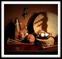
Pictures like these show the power of the black and white format. Well done, Shawn!
|
| Photo By: Shawn Eaton
(K:-104)
|
|
|
Critique By:
luisa vassallo (K:28230)
9/9/2003 12:12:34 AM
great light!
|
| Photo By: Shawn Eaton
(K:-104)
|
|
|
Critique By:
Todd Wedgworth (K:3433)
8/27/2003 11:39:59 PM
i like this.
|
| Photo By: Shawn Eaton
(K:-104)
|
|
|
Critique By:
Mostafa Abulezz (K:4849)
8/25/2003 11:28:34 PM
Very nice photo ,Great composition and lighting.
|
| Photo By: Shawn Eaton
(K:-104)
|
|
|
Critique By:
Jennifer Littler (K:32)
1/6/2003 4:45:48 AM
I love the way you have captured the light on Major's nose!
Sweet dreams Major!
|
| Photo By: Shawn Eaton
(K:-104)
|
|
|
Critique By:
Kim Culbert (K:37070)
1/1/2003 10:54:05 AM
I always have to look at the dog photos, especially when they are of goldens! I like the tight framing on this one as it has avery initmate feeling. Since this was going to be a long exposure anyways, I think that you could have sacrificed another second or two in order to get a better depth of field. The nose being out of focus is a little distracting, as it's in such a major part of the photo. Next time try stablizing the camera on a book to get the right height and place the apt. at f11 or so to get most of his face in focus. A cable release has been one of the best investments for me.... it makes such a huge difference for images like this. Here is a picture that I took of one of our goldens on the couch. It was a 3 sec exposure, with tripod and cable release. http://www.usefilm.com/showphoto.php?id=18249
(Hopefully that link works!)
All the best for the new year, and I look forward to more pictures of Major! Handsome dog!
|
| Photo By: Shawn Eaton
(K:-104)
|
|
|
Critique By:
Shawn Eaton (K:-104)
12/26/2002 1:52:57 PM
Alex, Your right on about the grain. At full size this image would not fit on this page, so I rezized it and the grain suffered.
Shawn
|
| Photo By: Shawn Eaton
(K:-104)
|
|
|
Critique By:
Alex Avilov (K:634)
12/26/2002 9:06:12 AM
I hope that grain is the result of scan/jpeg compression, as it doesn't add (IMO) anything to that otherwise beutiful picture.
|
| Photo By: Shawn Eaton
(K:-104)
|
|
|
Critique By:
Kyle Blair (K:1542)
12/26/2002 8:26:22 AM
awesome
|
| Photo By: Shawn Eaton
(K:-104)
|
|
|
Critique By:
Terrence Kent (K:7023)
12/17/2002 3:13:18 AM
Wow - this* is good
|
| Photo By: Shawn Eaton
(K:-104)
|
|
|
Critique By:
Molly Walters (K:1284)
12/17/2002 1:32:09 AM
great shot! looks like it is going to bolt at any second.
|
| Photo By: Shawn Eaton
(K:-104)
|
|
|
Critique By:
Mark Scheuern (K:1428)
12/4/2002 6:43:25 AM
Very funny! The road disappearing in the distance is a nice touch. More detail in the sky would have been nice (more like what's reflected in the window), but that would have been difficult. I agree with your comment. A very fine picture under the circumstances and it would have been a shame not to have gotten it at all.
|
| Photo By: Shawn Eaton
(K:-104)
|
|
|
Critique By:
Shawn Eaton (K:-104)
12/3/2002 7:31:17 PM
Carlos, I did not crop this Photo. But, the little spot of dark grey in the upper left of the photo is from the mirror.
Thank you for your comment.
|
| Photo By: Shawn Eaton
(K:-104)
|
|
|
Critique By:
a s (K:-8)
12/3/2002 6:55:20 PM
Funny. I would even dare to say... Hilarious. It would have been cool if you included the frame of the mirror.
I'm out. Carlos.
|
| Photo By: Shawn Eaton
(K:-104)
|
|
|
Critique By:
Lori Pleasant (K:222)
12/3/2002 11:18:21 AM
Oh, how cute! I love it when dogs do this. Great that you captured it. I only wish his adorable face was a bit more focused.
|
| Photo By: Shawn Eaton
(K:-104)
|
|
|
Critique By:
Kyle Blair (K:1542)
12/3/2002 9:18:45 AM
This shot is great. Made me smile. I always like driving down the road and seeing someone's dog sticking their head out the window. The only thing I would nit pick is the little spot on the top right corner.
|
| Photo By: Shawn Eaton
(K:-104)
|
|
|
Critique By:
Andy Eulass (K:13435)
12/2/2002 8:39:10 PM
I like what you are trying to capture here. I think a tighter crop might work a little better and if possible a lighten of the boot and the immediate area around it might bring out a bit more detail on the left side.
|
| Photo By: Shawn Eaton
(K:-104)
|
|
|
Critique By:
Marc Gougenheim (K:5398)
11/30/2002 8:47:22 AM
Are the highlights really blown on the film ? Or is there some details left ? If you have details, I suggest you tart burning to bring them out, and it could be good in the end. As it is, I like the contrast, but the highlights are too much for me. Maybe another version...? Best regards.
|
| Photo By: Shawn Eaton
(K:-104)
|
|


