| |
|
Featured Critiques by Photographer
1
|
|
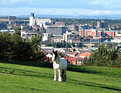
Critique By:
Becky V (K:9699)
10/16/2005 2:58:43 AM
This is a really cool shot . . . I love how there's three elements to the photo: the rural, the urban and the suburban (it's great that the hill slopes away, otherwise the suburban may have remained hidden). I also like how three definitive colours (blue sky, red rooves and green grass) interact to make this unique photo even more bold.
Is the horse tethered? There seems to be a thin rope hanging from its head . . . you could try to clone it out just to remove the (very slight) distraction or make it appear that the horse is roaming free. You may also have been able to get away with irising down one more stop in order to mitigate the sun shining off all the white objects, but overall, I love this intriguing shot. 
|
| Photo By: Colin Cartwright
(K:15699)
|
|
|
Critique By:
Becky V (K:9699)
9/25/2004 5:46:55 PM
Hey Kim, nice to see you submitting again (like *I* should talk *L*)!
I agree with Stefan as well. For me, it's the fact that the effect makes your background look pixelated. While the rendering on your foreground flowers look natural, the background looks like there's something "wrong" with it . . . like the computer compressed the photo oddly.
Instead of using filters, try using brushes on the photo. If your painting-with-a-mouse skills are good, the smudge tool can create a nice effect. Blurring and/or darkening the background might work as well. Anyway, you have to whole weekend to play around with it. Good luck!
|
| Photo By: Kim Culbert
(K:37070)
|
|
|
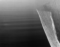
Critique By:
Becky V (K:9699)
3/27/2004 9:23:32 AM
Having lived in similar climates to Calgary, this photo definitely captures a strong feeling of springtime for me!
I really like the composition of this photo and how it gives equal time to the ground, water and sky. I like the slope of the ground in the bottom of the photo, but at the same time I feel seeing a little less tree would be nice, particularly because it's obscuring some potentially strong lines along the shore. The rolling clouds are great and they create some nice depth, though they are a bit overexposed, along with the icy lake. That's always a tough one - I personally find it hard to render sun on ice or snow without things getting all supernova on me . . . that's why I was thankful to get a neutral density filter for Christmas!
|
| Photo By: Jeff Cartwright
(K:52046)
|
|
|
Critique By:
Becky V (K:9699)
1/5/2003 2:25:44 AM
I really like the contrast of the two textures here, and how it's almost impossible to judge the distance/depth between the water and the metal. I feel the vertical metal "strap" kind of detracts from simpleness of the abstraction, but I suppose without it, the fence would be *in* the water. :-)
I really enjoyed the California series you posted, and have been meaning to comment on it since it was posted. I like your unique interpretation of the California coast - very moody and almost pessimistic (that's my interpretation anyway).
My favourites of the series were 2, 3 & 5, though I think 5 is the best because it fits well into the series, yet stands out on its own as a great abstract.
|
Photo By: al shaikh
(K:15790)

|
|
1
|
|