|
|
Critique By:
Teresa Moore (K:11063)
2/17/2005 4:10:12 AM
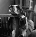
A very nice portrait. I don't know why there are no comments. You have captured a very interesting expression and pose. Nice work.
|
| Photo By: Deborah Seitz
(K:85)
|
|
|
Critique By:
Teresa Moore (K:11063)
2/16/2005 3:01:21 PM
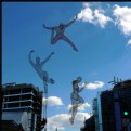
Great moment you captured! Nice work.
|
| Photo By: Deborah Seitz
(K:85)
|
|
|
Critique By:
L B. (K:13965)
1/25/2004 9:17:43 AM
To bad the hole croc ain't on it. But still a nice photo.
Lex
|
| Photo By: Deborah Seitz
(K:85)
|
|
|
Critique By:
sandy c. hopkins (K:17107)
1/12/2004 3:20:27 PM
eeeek! still frightened of clowns to this day...but this is a wonderful capture..

|
| Photo By: Deborah Seitz
(K:85)
|
|
|
Critique By:
Kees and Carolyn (K:15193)
1/11/2004 3:43:59 PM
Captivating photograph!
|
| Photo By: Deborah Seitz
(K:85)
|
|
|
Critique By:
Ersin Tek (K:355)
7/9/2003 8:25:49 AM
did you specially cut the nose?
|
| Photo By: Deborah Seitz
(K:85)
|
|
|
Critique By:
Jason Henske (K:1822)
5/25/2003 9:20:28 PM
nice tones
|
| Photo By: Deborah Seitz
(K:85)
|
|
|
Critique By:
Jason Henske (K:1822)
5/25/2003 9:18:59 PM
i am surprised you did not get more digital noise with the d100 shooting at 1600, your exposure must have been spot on without much lightening necessary. My D1 gets awful above 400, I usually try to only shoot at 200 if possible. I was just issued a D1x and this seems to be a lot better. it amazes me how fast technology moves. You might try adding a bit of red to this image in the shadows and midtones, i think I detect a hint of cyan or green. really nice work
|
| Photo By: Deborah Seitz
(K:85)
|
|
|
Critique By:
Jason Henske (K:1822)
5/25/2003 9:16:10 PM
Very good use of a mirror, with good exposure and focus in the right spot. The arm acts as a nice leading line, and the eyes are very alive. nice work
|
| Photo By: Deborah Seitz
(K:85)
|
|
|
Critique By:
Jason Henske (K:1822)
5/25/2003 9:14:21 PM
Very good detail in the statue, and the color in the sky shows that this is real and not brought out vompletely in photoshp. the scloud adds interest and fills in the white space.
|
| Photo By: Deborah Seitz
(K:85)
|
|
|
Critique By:
NN (K:26787)
4/29/2003 10:16:54 AM
Perfect!
|
| Photo By: Deborah Seitz
(K:85)
|
|
|
Critique By:
Jason Henske (K:1822)
4/27/2003 10:08:51 AM
Nice color and use of a plain background to delineate a very beautiful subject.
|
| Photo By: Deborah Seitz
(K:85)
|
|
|
Critique By:
Jason Henske (K:1822)
4/27/2003 10:05:44 AM
Your other image of police motorcycles is more successful because it makes the reader think a bit more. this is the obvious shot, the other image has multiple repeating themes, from radio antennas to helmets to the bikes themselves. They are both nice, but the other I want to look at more than once.
|
| Photo By: Deborah Seitz
(K:85)
|
|
|
Critique By:
Jason Henske (K:1822)
4/27/2003 10:04:01 AM
A nice use of line and color to make an image that draws you in.
|
| Photo By: Deborah Seitz
(K:85)
|
|
|
Critique By:
Joy Bhowmik (K:854)
4/27/2003 8:49:24 AM
good shot!
|
| Photo By: Deborah Seitz
(K:85)
|
|
|
Critique By:
Joy Bhowmik (K:854)
4/27/2003 8:49:04 AM
good shot!
|
| Photo By: Deborah Seitz
(K:85)
|
|
|
Critique By:
Detlef Rudolf Braun (K:2232)
4/27/2003 6:30:49 AM
Good shot in good lightening. Those photos are shown too much, unfortunality. But it is a good realisation. On the top of her "hat" there is a white spot. The background is a bit disturbed (esp. left upper edge. Detlef
|
| Photo By: Deborah Seitz
(K:85)
|
|
|
Critique By:
Suvomoy Mitra (K:8369)
4/26/2003 11:52:17 PM
Very aggressive, very dynamic...very smart subtle colour treatment
|
| Photo By: Deborah Seitz
(K:85)
|
|
|
Critique By:
Suvomoy Mitra (K:8369)
4/26/2003 11:48:28 PM
The violet graduation makes me mad...may be because it is green at the base
|
| Photo By: Deborah Seitz
(K:85)
|
|
|
Critique By:
Subha Pindiproli (K:10108)
4/26/2003 11:26:50 PM
deborah.. good use of lavendar filter.. however i feel u should have panned the camera out (zoom out) and got the trees in full..
|
| Photo By: Deborah Seitz
(K:85)
|
|
|
Critique By:
Ben Rasmussen (K:2130)
4/26/2003 9:50:16 PM
beautiful photo, except the barbwire fence takes away from it, i think
|
| Photo By: Deborah Seitz
(K:85)
|
|
|
Critique By:
Deborah Seitz (K:85)
4/26/2003 8:16:01 PM
Under these conditions there wasn't much of a difference. I thought they would look cool in B&W but you can only tell the difference if there is a color back ground. I have some more playing in PS to do.
|
| Photo By: Deborah Seitz
(K:85)
|
|
|
Critique By:
Arturo Nahum (K:959)
4/26/2003 5:44:42 PM
good textures and details. try also a b&w version
|
| Photo By: Deborah Seitz
(K:85)
|
|
|
Critique By:
Sandra Battaglia (K:910)
4/25/2003 7:26:56 PM
What fun this is to view!  The management of light and DOF is wonderful. Details...WOW! The management of light and DOF is wonderful. Details...WOW! 
|
| Photo By: Deborah Seitz
(K:85)
|
|
|
Critique By:
Knut Hoftun Knudsen (K:526)
4/25/2003 2:42:54 PM
sorry, why not go closer to cath what you want to show,the left part of the picture is uninteresting, looks a bit unsharp too..
|
| Photo By: Deborah Seitz
(K:85)
|
|
|
Critique By:
Fabio Keiner (K:81109)
4/25/2003 12:03:40 AM
but I like it
because of the toning and shadows all around

|
| Photo By: Deborah Seitz
(K:85)
|
|
|
Critique By:
Arturo Nahum (K:959)
4/24/2003 5:46:06 PM
great timing and action capture. needs more contrast
|
| Photo By: Deborah Seitz
(K:85)
|
|
|
Critique By:
Leslie Cohelan (K:20807)
4/24/2003 5:20:25 PM
the image is a bit dark...could use some work with levels...the composition is almost there...the unfortunate top cropping detracts from the image...it seems the center of your flower was the focus, leaving the petals very soft...the dof could be more, thus helping the petals in the foregound..
|
| Photo By: Deborah Seitz
(K:85)
|
|
|
Critique By:
Vicki Bentley (K:5080)
4/24/2003 4:39:17 PM
Much too dark, grainy and could be sharper. Keep working on it, and you'll get it .
|
| Photo By: Deborah Seitz
(K:85)
|
|
|
Critique By:
Ken Daniels (K:1000)
4/22/2003 7:19:49 PM
Tough to get detail on a white bird in that light. Possibly lower the EV a bit would help. Also would change the crop. The composition would have been better with a tighter crop to the right and more "space" in front of the bird giving the appearance of it having some place to go. Good capture though.
|
| Photo By: Deborah Seitz
(K:85)
|
|
