|
|
Critique By:
Bob Wallace (K:698)
7/10/2006 6:44:11 PM
You saw some good colors and did a good job of bringing them to the screen.
As for the composition, I wonder if it wouldn't have worked better to use the tree to frame the sun.
Most of the interest in this image is in the lower right of the frame. Had you changed your shooting angle you could have moved the sun to the left, keeping it under overspreading tree branches, and used some of the left of the frame as well.
As well, you might have been able to use more interesting color from the water rather than the dark land.
(Of course I wasn't there, so I don't know if that would have been possible. Just thinking out loud.)
A bit of sharpening will make the tree branches more distinct.
And, just a question, but is that lens vignetting in this frame? Assuming that it might be, I tried a cropped version. Removing some of the less interesting area concentrates the great stuff you captured. (IMO, of course. ;o)
|
| Photo By: Ammar Alothman
(K:14)
|
|
|
Critique By:
Bob Wallace (K:698)
7/8/2006 6:16:02 AM
Very nice job. Good exposure, focus, the whole thing.
How about a little tighter crop? Discard a little bit of the most out of focus blossoms at the bottom and some off the left to make the main subjects more dominate.
|
| Photo By: Stephen Gledhill
(K:1232)
|
|
|
Critique By:
Bob Wallace (K:698)
7/8/2006 6:13:10 AM
Nice job. Well shot.
I would be tempted to crop a little bit off the top in order to get rid of the partial panes in the upper right corner.
|
| Photo By: Hassan El-Zayyat
(K:55)
|
|
|
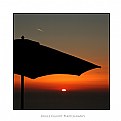
Critique By:
Bob Wallace (K:698)
7/8/2006 5:20:18 AM
I'm also for cloning it out. And cropping off the top of the frame a bit. Actually, try a crop just below the plane.
Good job of positioning the umbrella in the frame. I like the way it reaches almost all the way across to the other edge.
|
| Photo By: Bruce Elliott
(K:2434)
|
|
|
Critique By:
Bob Wallace (K:698)
7/7/2006 7:54:06 PM
Very nice image. Technically good and interesting content.
I played with your image a bit using Photoshop Elements. I used the Skew tool to straighten the verticals (door frame, window shutter), cropped bit off the bottom, and used the Highlight/Shadow tool in an attempt to pull a bit more detail from the shadows.
Just some things for you to consider....
|
| Photo By: Kursat Oner
(K:1580)
|
|
|
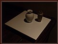
Critique By:
Bob Wallace (K:698)
7/7/2006 5:21:36 PM
I appreciate the long and informative notes. And I like the arrangement that you have created.
But I find the image too dark for my taste. The vase on the right does not separate enough from the background and I find myself wanting to see the soft glow that comes from a fine glaze.
From the distinct shadows I surmise that you had a strong light source and then presented a greatly underexposed version of what you shot. I'd like to see a somewhat brighter version.
But that's just me....
|
| Photo By: In Transit
(K:29432)
|
|
|
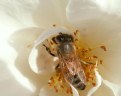
Critique By:
Bob Wallace (K:698)
7/7/2006 5:13:49 PM
This is a very good capture. Exposure and framing are very good.
I think you loose just a little due to shallow DOF. The focus point seems to be the rear of the bee, possibly the wings. As you move toward the head focus gets a little softer.
If you zoom in really tight and carefully use the Sharpening tool you should be able to give a feeling of more focus to the head area. Bringing out the catchlights will help, I think.
|
| Photo By: matthew morgan
(K:1539)
|
|
|
Critique By:
Bob Wallace (K:698)
7/7/2006 8:00:07 AM
I agree with the cropping idea. I think there's a strong image in the lower right of the frame.
Exposure and focus aren't that much of a problem. Try using the Shadow tool and some contrast boost to improve the lighting. And sharpening will help with the 'focus'.
I attached a quick and dirty version. I didn't have a lot of pixels with which to work. You should be able to do better working from the original.
Got a story behind this image? Is it a special celebration or an ordinary offering?
|
| Photo By: Tushit Jain
(K:1697)
|
|
|
Critique By:
Bob Wallace (K:698)
7/7/2006 7:37:11 AM
You did a good job with the blossoms. Focus, exposure are right on.
I think the light-colored pot in the background is intruding on your subject a bit too much. Try burning it in some and see what you think.
And/or try cropping off some of the top and left so that the image is more flower, less background.
|
| Photo By: Peter Daniel
(K:33866)
|
|
|
Critique By:
Bob Wallace (K:698)
7/7/2006 7:17:47 AM
Not a pelt, but the back of a small heifer. Unfortunately there was some assorted 'junk' in the way and I had to crop high.
I'd like to crop higher but I think that would cramp his face and her hand.
Thanks for the feedback.
|
| Photo By: Bob Wallace
(K:698)
|
|
|
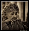
Critique By:
Bob Wallace (K:698)
7/7/2006 7:00:53 AM
Excellent photograph. Excellent notes. Great idea to illustrate a historical story with a modern era image.
Good use of sepia. Good focus and DOF.
Just a tiny thing, but there's a white spot in her hair that you might wish to clone away. Hot pixel?
|
Photo By: Studio East
(K:3349)

|
|
|
Critique By:
Bob Wallace (K:698)
7/7/2006 6:56:20 AM
I see potential here. But I don't see "passion".
The grainy foreground is interesting but the image lacks a focal point for me. I think if you worked on your still life you could pull something nice from this collection of items.
Perhaps if the red carnation were in crisper focus and a bit brighter? Perhaps the string of pearls could start out of focus at the front of the frame and lead ones eye back to the flower, increasing in focus as it goes?
Perhaps passion could be shown in a clearer version of the glass?
I'd encourage you to work on this idea some more. See if you can't produce something outstanding.
|
| Photo By: adithi seetharam
(K:3)
|
|
|
Critique By:
Bob Wallace (K:698)
7/7/2006 5:27:16 AM
I think the point that the previous critiquer was making is that the sun creates a very strong shadow and obscures some of the detail in the shot.
As someone who shoots a lot of their shots while traveling I know how hard it is to be somewhere at the right time and how one often has to take what fate gives them.
That said, I think you can shed a little light into the darkness, so to speak.
Try using the Shadow tool or Fill Flash (whatever your editing program offers) and lighten up the shadow area.
I've made a quick stab at it just to give you a rough idea what might be done. I also worked a little bit to reduce some of the blue cast in the shadow. With a more concerted effort I think you could bring your bike rider and loitering men out from the dark.
You've used a good shot angle to show the power of the building and found a good sky. A little editing might make an even better image.
|
| Photo By: Robert Waddingham
(K:3389)
|
|
|
Critique By:
Bob Wallace (K:698)
7/6/2006 6:35:44 PM
Great shot. Nice tight framing, focus on the eye area, blurred background.
I'd suggest working on the tip of the bill some with selective sharpening, etc. to make it appear to be a bit more in focus. It protrudes from the frame and if sharp I think would do so even more.
And consider punching up the catchlights a bit.
I've attached a 'quick and dirty' edit to illustrate what I'm suggesting.
|
| Photo By: Marcus Armani
(K:36599)
|
|
|
Critique By:
Bob Wallace (K:698)
7/6/2006 6:29:25 PM
It's a very good shot and shows the GG Bridge from an angle that we don't often see.
A very minor criticism, there seems to be a bit of sharpening halo on the high contrast edges.
|
| Photo By: Marcus Armani
(K:36599)
|
|
|
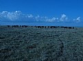
Critique By:
Bob Wallace (K:698)
7/6/2006 6:06:58 PM
"Accident" plays little role in seeing a potentially good shot and deciding to use a camera to capture it. And one has to begin by placing themselves in the situation where the image might present itself and with camera.
I played around with your shot a bit. First I rotated it so that the horizon and cloud bank were more level.
Then I cropped away some of the less interesting sky which I think creates even more of a feeling of depth (which I think is what makes this shot work).
Finally I tried to take some of the blue hue from the grass and make it closer to its natural color.
If you find your self in this situation again it might be interesting to see if you could get lower to the ground while shooting and let the cattle stand out against the sky.
|
| Photo By: Edward Ghoti
(K:5514)
|
|
|
Critique By:
Bob Wallace (K:698)
7/6/2006 5:38:23 PM
Very good image. Lots of interest stuff going on, good depth, and you framed nice and tight on your main subject.
I think you could improve the image by cropping away a bit of unnecessary stuff on the right and top. And lightening up the shadows, darkening the highlights might help as well.
Finally, what really makes this image for me is the look that the woman toward the rear is giving you. With a bit of selective sharpening on her eyes you can make that stare stand out even more.
I've attached an edited version to illustrate my ideas.
|
| Photo By: Jose Ignacio (Nacho) Garcia Barcia
(K:96391)
|
|
|
Critique By:
Bob Wallace (K:698)
7/6/2006 5:10:50 PM
I am coming from posting/critiquing on Trek Earth. That administrator did not allow members to post comments about their photos in the "critique" area. And members were limited to a single post in each critique area.
That meant that there could be no discussion between members about the photograph. One could start a separate conversation in a different part of the site but those were somewhat removed from the actual image.
Without open exchanges of opinion learning is stifled. And if those exchanges take place in a separate 'room' then others are less likely to take part.
I'm looking at Usefilm to see if it meets my needs for honest, helpful criticism and useful discussion. I stuck up an image that I had previously posted on TE to see what sorts of comments I might get and posted a quick statement to see if I could post to my own images. Had I looked around the site more I could have answered my question in a different way.
(Or if I could read the forums I might be able to find answers to my questions. Seems to me that the site would be better served if newcomers were given a limited time 'free pass' to check out all the features.)
|
| Photo By: Bob Wallace
(K:698)
|
|
|
Critique By:
Bob Wallace (K:698)
7/6/2006 4:59:24 PM
Here's what I like about your shot. You got very tight on your subject and filled the frame with her face. And you caught a good moment, a good expression.
What doesn't work for me is the lack of sharp focus. The easiest place to see this in in her hair band. The detail is missing. It's also easy to see if one looks at her hair.
You might have been too close for the camera to focus. It looks as if part of her collar might be better focused. It's a little further from the front of the lens.
OK, then let me comment on the background. It intrudes. There are lots of light-colored 'things' that tend to grab ones eye and pull it from the subject. You can improve that problem.
I've included a 'quick and dirty' edit in which I cropped away some of the top and used the Burn tool to darken the background a bit.
I'd suggest that you try again. Look up the minimum focus distance for your camera and be aware of it when you shoot. (Assuming that is the problem.)
And perhaps leave just a little more space in front of your subject's face. This one feels a little bit cramped to me.
But you've got the idea. Tight framing and good expressions make for interesting portraits.
|
| Photo By: Len Webster
(K:25714)
|
|
|
Critique By:
Bob Wallace (K:698)
7/6/2006 4:41:26 PM
I've got to agree with Dave. The upper part of the image detracts from the overall image for me. (And the details aren't very crisp. Needs sharpening? Jpeg compression problem?)
I can see two good pictures here, one cropped leaving a strip of green and one with all the green cropped away.
In the first the bit of non-reflected grass clearly establishes the main image as an reflection.
In the second all the reference to "reality" has been stripped away leaving a more 'abstract' image that requires the viewer to study the frame and think a bit more.
(And consider putting your copyright notification on the frame rather than spoiling the image.)
|
| Photo By: Marlyce Chastain
(K:4071)
|
|
|
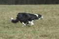
Critique By:
Bob Wallace (K:698)
7/5/2006 7:06:57 AM
As others have said, you did a very good job of capturing the dog's movement in this image.
I don't care for the dark band at the top of the image and I think there's too much blurred grass and not enough dog.
I tried a crop wherein I cut down tight on the dog, removing top, bottom, and left while leaving him room to run on the right.
|
| Photo By: Jon Slater
(K:1340)
|
|
|
Critique By:
Bob Wallace (K:698)
7/5/2006 12:03:52 AM
Good overall composition and great job of exposure. You really held the sun nicely.
I don't care for the bottom of the image. My eye is drawn to the single rock and then I ask "why?".
Try a significant crop off the bottom. That will remove the distraction and move the 'weight' of the boats to the bottom. And I think a more rectangular frame will be more interesting as it will spread the scene.
I've attached a quick crop to illustrate what I'm suggesting.
|
| Photo By: Danny Brannigan
(K:19523)
|
|
|
Critique By:
Bob Wallace (K:698)
7/4/2006 11:55:00 PM
I think you did a good job seeing a potentially great shot but missed the framing. I'd much rather see your subject positioned to the left of the frame and some additional room left on the right.
Also the protruding branch in the upper right is too out of focus for the rest of the image IMO.
I suspect that you can improve the image with some cropping on the left and bottom but it's still going to feel cramped on the right.
|
| Photo By: Mike Rexroad
(K:631)
|
|
|
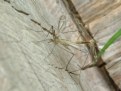
Critique By:
Bob Wallace (K:698)
7/4/2006 11:28:39 PM
It is a pretty good catch. Thing is, your subjects don't stand out from their background in order to be eye-catching.
I've posted a quick and dirty edit where I cropped down, increased the contrast and did a bit of selective sharpening. With a little effort I'm sure someone could do a much better job.
|
| Photo By: Claude Francis
(K:479)
|
|
|
Critique By:
Bob Wallace (K:698)
7/4/2006 11:23:10 PM
The lighting is good. And you did a good job with focus.
Try cropping off some of the left side and even a bit of the top. I think that will give you a more dramatic image.
|
| Photo By: Melanie Schembri
(K:1531)
|
|
|
Critique By:
Bob Wallace (K:698)
7/4/2006 11:20:01 PM
You didn't post a very large version of this image so it's a bit hard to really tell what's going on. But from what I can see you might have overexposed slightly and lost some petal detail. Or perhaps it went away during editing. (Or perhaps I just can't see it in this version.
Try cropping off a bit from the bottom and more from the top. I think that will eliminate some of the distraction and make the flower more dominate.
|
| Photo By: Bob Brins
(K:4130)
|
|
|
Critique By:
Bob Wallace (K:698)
7/4/2006 11:14:42 PM
This is a good capture in many ways but it doesn't really grab me. And that suggests that you were 'close enough'.
If you crop down significantly you can make the eagle more dominant. I'm posting a cropped version.
I also darkened a few spots that seemed pull my eye away from the subject and sharpened the fir branch on the left. You might also try some careful dodging on the bird's head to reduce the effect of the shadow.
|
| Photo By: Jon Slater
(K:1340)
|
|
|
Critique By:
Bob Wallace (K:698)
7/4/2006 10:50:23 PM
This image very well composed and has a very smooth "feel". In the best of worlds I would like to see more separation between the end of the upper branch and the dark line of trees.
Try a version where you crop off part of the sky. I think you'll find that the image gains depth and it brings the dead tree into more prominence.
I posted a version to give you an idea of my idea.
|
| Photo By: Gaetan Dery
(K:718)
|
|
|
Critique By:
Bob Wallace (K:698)
7/4/2006 6:45:35 PM
This is just a test post to determine if the site allows the photographer to carry on a discussion with other members.
|
| Photo By: Bob Wallace
(K:698)
|
|
|
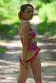
Critique By:
Bob Wallace (K:698)
7/4/2006 6:05:44 PM
Cute girl. Sexy pose.
I think the lighting and framing could be improved.
The stong backlight meant underexposing your model unless you used an additional light source (fill flash or reflector). You can correct this to some extent via the Shadow or Fill Flash tool and some selective use of the Dodge tool.
And placing your model dead center might not be the best. Try cropping away some of the left, top, and bottom.
Finally think about placing your copyright notice in a separate part of the frame rather than overwriting your image.
I've posted a quick edit to illustrate my ideas.
|
| Photo By: antonio harrison
(K:401)
|
|