|
|
Critique By:
Lisa Howeler (K:3706)
1/15/2003 6:45:46 PM
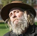
Dawna: Don't meant to be rude, (just tired at the moment, really so I sound kind of rude) but I could care less if there is a white spot on the guys face. Maybe photographers don't strive for it, but it is what happened in this photo and I frankly don't see that it ruins it that much. This photo is real for once. I know Dan can handle criticism and I know he doesn't mind criticism -- I simply expressed an opinion.
|
| Photo By: Dan Sanford
(K:300)
|
|
|
Critique By:
Dawna G. (K:7709)
1/15/2003 6:31:55 PM
Dan - this would fit the character project very well.
I think shooting this in some light shade would have made a better exposure possible, but you may not have had that option. The harsh sun on the face takes away from the quality of the image to me. If I have to shoot people in the direct sunlight, I get them to turn their back to it, and use a little fillflash.
Lisa: the overexposed areas are the bright white areas on the face, and is not what most people strive for in their work. Dan is a good photographer and I am sure does not mind hearing suggestions or comments such as this.
|
| Photo By: Dan Sanford
(K:300)
|
|
|
Critique By:
Deleted User (K:4598)
1/15/2003 4:32:23 PM
Nice capture...just a bit too centered perhaps.
|
| Photo By: Dan Sanford
(K:300)
|
|
|
Critique By:
Marc Robin (K:3385)
1/15/2003 3:17:45 PM
Wow, detail is amazing, and yes, colouring is great. I really like the half peanut left on the table.
Awesome! I only wish I had the skill, (and partially equipment) to take such a sharp picture.
Cheers, Marc
|
| Photo By: Dan Sanford
(K:300)
|
|
|
Critique By:
Dan Sanford (K:300)
1/15/2003 2:24:06 PM
Thank you for all your comments. The man in the picture, Audry was a very nice guy. I asked him if I could take his picture and he posed a few different ways for me. He seems to be a very intelligent man. He aksed me to bring him a print tomorrow.
|
| Photo By: Dan Sanford
(K:300)
|
|
|
Critique By:
Lisa Howeler (K:3706)
1/15/2003 2:18:48 PM
Can't help liking this one too, althoug I like the first version better. I like the other one because of the way his head is tipped and the expression. This one isn't as engaging as the first, but still a nice portrait.
|
| Photo By: Dan Sanford
(K:300)
|
|
|
Critique By:
Lisa Howeler (K:3706)
1/15/2003 2:17:10 PM
I don't think it looks over exposed, actually. I like the photo and I like the subject. What an interesting character to shoot. I like the way his head is tilted as if almost in a skeptical manner. I also like the brightness of the photo the way it is taken in the sun. It isn't as if it makes homelessness a good thing, but it doesn't make it as dark and scary as other photos do. It puts a face on the issue, not a feeling of foreboding.
|
| Photo By: Dan Sanford
(K:300)
|
|
|
Critique By:
Lisa Howeler (K:3706)
1/15/2003 2:12:57 PM
Oh, meant to add, nice DOF and nice background. THe addition of the table where he is standing is a nice touch. Also like the fact he is doing something. The coloring is very nice and warm
|
| Photo By: Dan Sanford
(K:300)
|
|
|
Critique By:
Lisa Howeler (K:3706)
1/15/2003 2:12:00 PM
hey there little, guy! is the first thought that came to my mind. Must mean the photo is pretty real to me. Thanks for this one!
|
| Photo By: Dan Sanford
(K:300)
|
|
|
Critique By:
Don Loseke (K:32503)
1/15/2003 1:13:16 PM
It looks a little overexposed as the highlights are blocked up. Try levels in Photoshop and use the middle slider to change the midtones. Great subject.
|
| Photo By: Dan Sanford
(K:300)
|
|
|
Critique By:
AJ Haselwood (K:2148)
1/15/2003 1:05:40 PM
Nice and sharp. The face is washed out a bit but nothing that can't be dodged down some.
aj
|
| Photo By: Dan Sanford
(K:300)
|
|
|
Critique By:
Dan Sanford (K:300)
1/13/2003 1:22:07 PM
It's a seed pod from a tree.
|
| Photo By: Dan Sanford
(K:300)
|
|
|
Critique By:
Verna Absolutestockphoto (K:2836)
1/13/2003 1:14:32 PM
Nice Camera you have there ;-) Interesting nature shot, what is it? Nice DOF.
|
| Photo By: Dan Sanford
(K:300)
|
|
|
Critique By:
R Pires (K:445)
1/13/2003 1:04:13 PM
Pretty image and beautiful colors.
|
| Photo By: Dan Sanford
(K:300)
|
|
|
Critique By:
Verna Absolutestockphoto (K:2836)
1/13/2003 1:02:46 PM
Crisp, sharp and well posed bird shot. Nice light and good pose. I just wish we could see more of her ;-)
|
| Photo By: Dan Sanford
(K:300)
|
|
|
Critique By:
J. Alberto Abreu (K:1190)
1/13/2003 12:51:36 PM
Very sharp and vivid color.
|
| Photo By: Dan Sanford
(K:300)
|
|
|
Critique By:
Andy Eulass (K:13435)
1/12/2003 7:14:47 PM
Very impressive color and detail! Like Harvey said, that eye is a real grabber. Excellent.
|
| Photo By: Dan Sanford
(K:300)
|
|
|
Critique By:
Deleted User (K:4598)
1/12/2003 4:46:28 PM
Good detail and pose and a very intense eye. Nicely composed.
|
| Photo By: Dan Sanford
(K:300)
|
|
|
Critique By:
Anne E. M. Zang (K:4135)
1/6/2003 8:29:59 AM
I really like the composition and mood in this one.
|
| Photo By: Dan Sanford
(K:300)
|
|
|
Critique By:
Deb Mayes (K:19605)
12/27/2002 6:40:08 AM
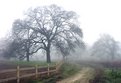
Wonderful colors, and the silhouetted trees add so much - beautiful!
|
| Photo By: Dan Sanford
(K:300)
|
|
|
Critique By:
Danny Provost (K:812)
12/26/2002 2:52:42 PM
Dan, this is a great shot. I think you framed it beautifully.
|
| Photo By: Dan Sanford
(K:300)
|
|
|
Critique By:
Kathleen Micallef (K:3)
12/26/2002 9:56:13 AM
I Love this shot. I have tried for years to capture scenery and have never felt the warmth of the sun like I have in this picture.
|
| Photo By: Dan Sanford
(K:300)
|
|
|
Critique By:
Elangovan S (K:10675)
12/20/2002 8:59:08 PM
In general, I like the composition and smooth patterns. I maybe wrong in reading. but, IMO, this picture is overexposed... You are better off metering the highlights for slides than the shadows.
|
| Photo By: Dan Sanford
(K:300)
|
|
|
Critique By:
April Atchley (K:103)
12/20/2002 7:45:52 PM
I think it's pretty good, yes the DOF is a little shallow
Hmmm what is that 'spot' on his hand?
|
| Photo By: Dan Sanford
(K:300)
|
|
|
Critique By:
Morsi Hussein (K:1128)
12/20/2002 12:20:35 PM
Beautiful!! Especially how the shadows create their own landscape within. Nicely cropped too!! I just love this. brgds Morsi
|
| Photo By: Dan Sanford
(K:300)
|
|
|
Critique By:
Jeroen Wenting (K:25317)

12/20/2002 10:53:24 AM
Good composition, but needs more depth of field. The squirrel is a bit soft around the head and tail.
|
| Photo By: Dan Sanford
(K:300)
|
|
|
Critique By:
Antonio Díaz (K:2710)
11/29/2002 8:22:25 PM
its great! i love the details on the sand and water, there?s nothing to improve here, just frame it and hang it in your wall!
|
| Photo By: Dan Sanford
(K:300)
|
|
|
Critique By:
Lexie Summers (K:2027)
11/21/2002 1:36:05 PM
I like the your choice of camera location on this shot. I think the image is much stronger because it is shot from above the scene.
|
| Photo By: Dan Sanford
(K:300)
|
|
|
Critique By:
Lexie Summers (K:2027)
11/21/2002 1:35:13 PM
I like the your choice of camera location on this shot. I think the image is much stronger because it is shot from above the scene.
|
| Photo By: Dan Sanford
(K:300)
|
|
|
Critique By:
Kim Culbert (K:37070)
11/21/2002 1:24:28 PM
This has a lot of mood and atmosphere... I can't believe the beach wasn't packed, on such a nice morning! *grin* The muted tones and colours really play off each other and the rounded beach with the dark rocks makes this shot.
|
| Photo By: Dan Sanford
(K:300)
|
|