|
|
Critique By:
Sarah Needham (K:2482)
1/28/2003 12:53:52 PM
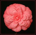
Great detail and colours. Aren't these flowers so pretty. I have a couple of bushes in my garden. What did you use for the background?
Sarah
|
| Photo By: Dan Sanford
(K:300)
|
|
|
Critique By:
Kim Culbert (K:37070)
1/28/2003 11:12:52 AM
For me, this image is too blurry. From reading your about, it sounds as if it started off sharp, and I would be interesting in seeing the original, because for me the oil painting effect just looks like hand held blurs. The colours are certainly eye catching, both the orig. and the one that Bill added.
|
| Photo By: Dan Sanford
(K:300)
|
|
|
Critique By:
Erin Naylor (K:173)
1/26/2003 7:21:41 AM
I love it. Great Job. love the brown color of the geese, and the color of their bill.
|
| Photo By: Dan Sanford
(K:300)
|
|
|
Critique By:
Erin Naylor (K:173)
1/26/2003 7:16:24 AM
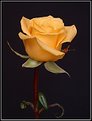
I love this picture and i love yellow roses too. Great color, form, everything. The dark background makes the rose jump out. Great job.
|
| Photo By: Dan Sanford
(K:300)
|
|
|
Critique By:
Andy Eulass (K:13435)
1/26/2003 6:18:06 AM
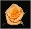
I've looked at all your yellow rose images and all of them are really excellent, but this one is the real keeper. The angle on the blossom gives it real three dimensionality and the placement of the stem is excellent. Good work on all of them.
|
| Photo By: Dan Sanford
(K:300)
|
|
|
Critique By:
Lorraine Summerfield (K:38)
1/26/2003 5:04:47 AM
Beautiful rose they are all nice but I think this is my favorite such lovely detail and colour
|
| Photo By: Dan Sanford
(K:300)
|
|
|
Critique By:
Dan Sanford (K:300)
1/26/2003 1:00:17 AM
Thanks Megan, I think I finally got the lighting right.
|
| Photo By: Dan Sanford
(K:300)
|
|
|
Critique By:
Megan Forbes (K:4617)
1/26/2003 12:32:45 AM
Wow Dan, you are really eating these up! Absolutely beautiful.
|
| Photo By: Dan Sanford
(K:300)
|
|
|
Critique By:
Vincent K. Tylor (K:7863)
1/24/2003 1:24:50 PM
Beautiful shot Dan. Nicely framed, excellent details. (9
|
| Photo By: Dan Sanford
(K:300)
|
|
|
Critique By:
Megan Forbes (K:4617)
1/24/2003 12:46:56 PM
As with all your flower shots, lovely detail on the colours of the petals. I like it 
|
| Photo By: Dan Sanford
(K:300)
|
|
|
Critique By:
John Barclay (K:3650)
1/24/2003 12:05:49 PM
I like the first one much better. This does not flow as nicely. It does not have the feeling of depth either.
|
| Photo By: Dan Sanford
(K:300)
|
|
|
Critique By:
John Barclay (K:3650)
1/24/2003 10:09:01 AM
Very, very nice. Not much to say here as the composition is wonderful the exposure dead nuts and the contrast with the black background terrific. Nice.
|
| Photo By: Dan Sanford
(K:300)
|
|
|
Critique By:
Chad Naujoks (K:1242)
1/23/2003 3:12:05 PM
I would love to hear more about lighting background, filters, post processing. I think this image is absolutly great, the D60 is a great camera (tho I shoot with a D100) I still love my Canons
|
| Photo By: Dan Sanford
(K:300)
|
|
|
Critique By:
Deleted User (K:4598)
1/22/2003 3:05:23 PM
An excellent capture of a Wood Duck with highly accurate colors and very good detail. Would like to see it just a bit less centered.
|
| Photo By: Dan Sanford
(K:300)
|
|
|
Critique By:
dave jones (K:608)
1/22/2003 2:38:52 PM
this is a very nice fog secene i feel it needs a little contrst added to it and the frame really takes away from it.the frame makes it look like a 18% grey shot. dave
|
| Photo By: Dan Sanford
(K:300)
|
|
|
Critique By:
Jeroen Wenting (K:25317)

1/22/2003 1:35:11 PM
This shot has a good wow-factor.
Excellent conditions, good willing subject.
Maybe a tad underexposed (especially the dark areas on the aft body).
|
| Photo By: Dan Sanford
(K:300)
|
|
|
Critique By:
Anne E. M. Zang (K:4135)
1/20/2003 10:54:41 AM
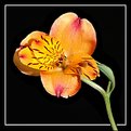
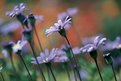
Dan, I've seen a lot of so-so flower picks and few really grab me anymore. This one does. I like how all of the colors work together - the muted reds, oranges and greens in the background work really well to contrast the purple flowers. Also, the perspective of the flowers- the side view of them leaning towards something- is very visually appealing. Great lines. It is nice to see a flower pic that doesn't focus on the inside of the bud or the flower only, but rather on the relationship of the flower to its environment...opens up the photographic subject beyond the flower itself and leaves room for interpretation. In my opinion, this is much more powerful than a flower on a plain background. In short...wonderful work!
|
| Photo By: Dan Sanford
(K:300)
|
|
|
Critique By:
Glenn Stamp (K:148)
1/19/2003 9:02:18 PM
Very rich in color, Great photo.
|
| Photo By: Dan Sanford
(K:300)
|
|
|
Critique By:
Keith Loveday (K:348)
1/17/2003 3:21:38 PM
hey dont listen to her dude... this shot is all about symmetry... its almost perfect... very good!
|
| Photo By: Dan Sanford
(K:300)
|
|
|
Critique By:
Deleted User (K:4598)
1/17/2003 3:08:40 PM
Nice mist and subdued colors. Well balanced. I think the contrast IMO is fine. Any more might detract from the mood.
|
| Photo By: Dan Sanford
(K:300)
|
|
|
Critique By:
John Barclay (K:3650)
1/17/2003 1:44:26 PM
Nice moody image. I feel like it could stand a bit more contrast however. The path is nicely placed in the frame and makes this work. Without it, it would be boring.
RE: The lens question... I own the 2.8 version. My thought is that it depends on what your looking for. The f4 is lightweight and more portable and indeed does cost less. The image quality will be very close to the 2.8. The 2.8 however will be much brighter to look through and having the 2.8 to work with regarding DOF is a nice benefit.
You should be able to get a great deal on a used 2.8 as many are selling to get the IS version. Check the classifieds at www.photo.net
|
| Photo By: Dan Sanford
(K:300)
|
|
|
Critique By:
Dan Sanford (K:300)
1/17/2003 1:13:56 PM
Hi Scott.
I bought the lens from B & H Photo on the web. Seems to be the best rated photo shop on the web. I paid $579 for the F/4.0L lens. The F/2.8L lens sells for $1129. Thats $550 more. These are the USA lenses, not the imported models.
|
| Photo By: Dan Sanford
(K:300)
|
|
|
Critique By:
Scott Marceau (K:479)
1/17/2003 1:06:20 PM
Very nice, I like the path type thing there, it gives it more effect with the fog.
Off the subject though, do you think that lens (Canon 70-200 f/4L) is a better deal than the f/2.8, since its about 300 dollars cheaper? Like would the 300 dollars be worth it to have a f/2.8?
|
| Photo By: Dan Sanford
(K:300)
|
|
|
Critique By:
Andy Eulass (K:13435)
1/16/2003 7:34:41 PM
Dan, of your "Audry" shots, this one really stands out to me. Details are magnificent and oh man are those eyes piercing. Definitely seems to have his laps around the track. Excellent job.
|
| Photo By: Dan Sanford
(K:300)
|
|
|
Critique By:
Dawna G. (K:7709)
1/16/2003 1:22:51 PM
I like this much better Dan! Audry has a haunting look in his eyes, and having him look away helps to accentuate that. well exposed this time allowing us to see more detail and color in his face...
|
| Photo By: Dan Sanford
(K:300)
|
|
|
Critique By:
Anne E. M. Zang (K:4135)
1/16/2003 7:39:19 AM
I am completely drawn to this squirrel's toes and fingers. I like the sharpness and how you got him kind of scrunched down and gripping something. I can't help it...I keep wanting to make cutesy noises when I see this...next time maybe try tickling him...
|
| Photo By: Dan Sanford
(K:300)
|
|
|
Critique By:
Marc Robin (K:3385)
1/15/2003 9:45:23 PM
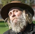
And he has a really cool hat!
Cheers, Marc
|
| Photo By: Dan Sanford
(K:300)
|
|
|
Critique By:
Dawna G. (K:7709)
1/15/2003 6:59:53 PM
this guy is VERY photogenic imo and another photo op is fanastic - go Dan go!!!
|
| Photo By: Dan Sanford
(K:300)
|
|
|
Critique By:
Dan Sanford (K:300)
1/15/2003 6:53:24 PM
Thank you all for your comments. I was actually surprised how well it came out considering it was in direct sun light. It's so easy for the white on the belly to be overexposed.
|
| Photo By: Dan Sanford
(K:300)
|
|
|
Critique By:
Dan Sanford (K:300)
1/15/2003 6:47:56 PM
Actually when I see Audry again tomorrow I plan on asking him if I could take his picture again, but this time under the shade of a nearby tree. I knew when I posted it that I would get comments on the bright sun. I still liked it though and wanted to post it. Maybe tomorrow I will have new ones of him.
Thanks for all comments, they are all welcome, good or bad.
dan
|
| Photo By: Dan Sanford
(K:300)
|
|