|
|
Critique By:
Toni Martin (K:5092)
2/25/2003 12:50:27 PM
Pretty much excellent, Dan. Maybe better square, too much stem. I love what you did with the tip of the bloom and the border!
|
| Photo By: Dan Sanford
(K:300)
|
|
|
Critique By:
Dean Cochrane (K:335)
2/20/2003 5:48:16 AM
The colours ('colors' to you Americans  ) are great. Two things: first, you've got some grass that's very close to the lens, it's way out of focus and is more or less just some discoloured smears on the image. Second, this is in need of a fairly major crop on the bottom. The composition doesn't benefit from the white sand in the foreground. I'd crop this off at about the roots of the clump of grass that's your main subject. ) are great. Two things: first, you've got some grass that's very close to the lens, it's way out of focus and is more or less just some discoloured smears on the image. Second, this is in need of a fairly major crop on the bottom. The composition doesn't benefit from the white sand in the foreground. I'd crop this off at about the roots of the clump of grass that's your main subject.
|
| Photo By: Dan Sanford
(K:300)
|
|
|
Critique By:
Greg O'Conner (K:2398)
2/19/2003 7:31:43 AM
Very nive, but I think would look even better in B&W
|
| Photo By: Dan Sanford
(K:300)
|
|
|
Critique By:
António Matias (K:292)
2/15/2003 3:27:08 AM
It's a nice shot, a great idea, but the frame's too tide on bottom. IMHO you should give it more space and isolate the motive.
|
| Photo By: Dan Sanford
(K:300)
|
|
|
Critique By:
Cemal Ekin (K:2309)
2/14/2003 9:08:14 PM
If this were a painting with a brass plate under it, it would read "Sir Francis Flamingo, II" or somthing like that. It looks so intensely and purposely at the camera I cannot help but wonder if it knew what was happening. Super.
Cemal
|
| Photo By: Dan Sanford
(K:300)
|
|
|
Critique By:
Cemal Ekin (K:2309)
2/14/2003 9:03:59 PM
Very lovely Dan. It is like a silk print. Camelia is a very lovely flower and you ahve relaly captured its essnce, its elegance. I like the color, lighting, and even eh sharpness. The soft surfaces may make it appear not sharp enough but the edges and texture are finely sharp on my monitor.
Well done
Cemal
|
| Photo By: Dan Sanford
(K:300)
|
|
|
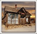
Critique By:
Cemal Ekin (K:2309)
2/14/2003 8:57:56 PM
I like the building very much. It has much character, even an attitude with one "shoulder" up in the air, the head cocked back, daring the viewer to present a challenge. The exposure on the house is very good.
I find the sky itself quite attractive but not fitting for this image. The primary reason is the misfit lighting. The house is lit by the sun from the front and high above evidenced by the shadow of the overhang on the door. That puts the sun somewhat behind me as I look at this photograph and quite high in the sky.
On the other hand, the sky shows the glow of what appears to be a sunset in the horizon. The clouds are illuminated from the opposite direction of the sun that illuminates the house. So this photograph implies a dual sun situation and I cannot resolve that in my mind.
Cemal
|
| Photo By: Dan Sanford
(K:300)
|
|
|
Critique By:
Joe Smith (K:352)
2/14/2003 4:18:44 PM
Not really sure why this picture draws me in but I like it a lot!
|
| Photo By: Dan Sanford
(K:300)
|
|
|
Critique By:
Mike Fuller (K:94)
2/14/2003 10:47:34 AM
Hi Dan...Nice shot of the geese...the colors/tones work well together. The only "technical" thing is maybe the "overlap" where the head of the second goose is partly obscured...(by the way, I did the same thing not long ago...) Nice shot...
|
| Photo By: Dan Sanford
(K:300)
|
|
|
Critique By:
Deleted User (K:6775)
2/13/2003 3:14:16 PM
Hi Dan...good exposure on this and the black background works good. Only thing i would change is to make a crop on the bottom. The stem at the bottom is competing with the flower...tighten it up a little and you have a great shot ....*smile* Maggie
|
| Photo By: Dan Sanford
(K:300)
|
|
|
Critique By:
Deleted User (K:6775)
2/13/2003 3:13:35 PM
Hi Dan...good exposure on this and the black background works good. Only thing i would change is to make a crop on the bottom. The stem at the bottom is competing with the flower...tighten it up a little and you have a great shot ....*smile* Maggie
|
| Photo By: Dan Sanford
(K:300)
|
|
|
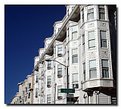
Critique By:
Andy Eulass (K:13435)
2/13/2003 2:06:26 PM
Wow, this is really stunning Dan. The colors and detail are so wonderful. The lighting is perfect for the dark background. Outstanding work.
|
| Photo By: Dan Sanford
(K:300)
|
|
|
Critique By:
Karen Johnson (K:2951)
2/11/2003 3:51:09 PM
I think your composition here is very good, the strong diagonal works well, very good detail captured also.
|
| Photo By: Dan Sanford
(K:300)
|
|
|
Critique By:
Mattias Eklund (K:2921)
2/11/2003 3:07:11 PM
nice! Almost looks like a painting.
The tree is not quite in focus, which I think is a pity.
/m
|
| Photo By: Dan Sanford
(K:300)
|
|
|
Critique By:
paul durrant (K:1047)
2/10/2003 4:30:03 AM
great shot dan! the subject is a very beautiful old house by the looks of it.
|
| Photo By: Dan Sanford
(K:300)
|
|
|
Critique By:
Uncle Frank (K:1642)
2/7/2003 5:44:46 PM
Excellent work, Dan. The hues are delicate, and there are wonderful textures in the petals and leaves.
|
| Photo By: Dan Sanford
(K:300)
|
|
|
Critique By:
Dan Sanford (K:300)
2/7/2003 3:41:31 PM
Thank you all for your comments.
|
| Photo By: Dan Sanford
(K:300)
|
|
|
Critique By:
jeff lynch (K:4770)
2/7/2003 3:20:09 PM
A very nice job with the replacement man. I really like this one. Great work.
|
| Photo By: Dan Sanford
(K:300)
|
|
|
Critique By:
John Doe (K:155)
2/7/2003 10:34:09 AM
Nice image. Very interesting structure. The shadows in the windows hint that the sun isn't really setting behind the building, but it has a cool surreal quality. Nice.
|
| Photo By: Dan Sanford
(K:300)
|
|
|
Critique By:
AGUS DWIANTO (K:-14)
2/7/2003 9:59:39 AM
beautiful shot Dan, I like the atmosphere...
well done
|
| Photo By: Dan Sanford
(K:300)
|
|
|
Critique By:
Matt Hardy (K:474)
2/7/2003 9:37:12 AM
Beautiful shot Dan, I love what you have done with the sky. Great color saturation as well.
|
| Photo By: Dan Sanford
(K:300)
|
|
|
Critique By:
chen lin andrew (K:36)
2/6/2003 11:24:30 PM
I agree with Toni, too many leaves. It's better if you make it simple.
|
| Photo By: Dan Sanford
(K:300)
|
|
|
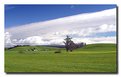
Critique By:
Gary Auerbach (K:3935)
2/6/2003 4:38:41 PM
Hi Dan,
Appreciate you posting your image of the ocean coast. It certainly is a beautiful spot. Your light is nice late afternoon. I presume it is on the west coast...because of the shadows. The only thing I think this photo lacks to get a better score is to bring up the horizon line some. You have room on the bottom, and my eye just wants to see a little higher on the green hills. Thanks...
GA
|
| Photo By: Dan Sanford
(K:300)
|
|
|
Critique By:
Toni Martin (K:5092)
2/6/2003 3:22:01 PM
Dan, it looks a little busy. I would crop the stem out, keeping 3/4 of the shot. Just my opinion.
|
| Photo By: Dan Sanford
(K:300)
|
|
|
Critique By:
M.M. Meehan (K:3751)
2/6/2003 1:15:09 PM
This is a wonderfull photo. I love all the colors and the composition. Perfect background. Don't change a thing on it.
|
| Photo By: Dan Sanford
(K:300)
|
|
|
Critique By:
Afzal H Mohamed (K:909)
2/6/2003 11:18:31 AM
Great capture!
|
| Photo By: Dan Sanford
(K:300)
|
|
|
Critique By:
Megan Forbes (K:4617)
2/6/2003 9:26:23 AM
Really beautiful.
|
| Photo By: Dan Sanford
(K:300)
|
|
|
Critique By:
Marc Robin (K:3385)
2/5/2003 11:06:04 PM
Cool shot! it's almost like you took multiple exposures on a single wrench moving back each time!
Marc
|
| Photo By: Dan Sanford
(K:300)
|
|
|
Critique By:
Alan Carrington (K:4)
2/5/2003 3:34:21 PM
Very nice abstract. Perfect lighting.. Love it.. New use for hex wrenches..
|
| Photo By: Dan Sanford
(K:300)
|
|
|
Critique By:
Toni Martin (K:5092)
2/5/2003 1:46:59 PM
Just needs to be tighter on the flower.
|
| Photo By: Dan Sanford
(K:300)
|
|