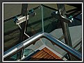
|
|
Critique By:
Brian Rueger (K:7341)

3/4/2006 1:40:19 AM
Very nice shot. I llike the contrast between the paint and the natural wood color.
|
| Photo By: Glenn Morgan
(K:1029)
|
|
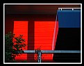
|
Critique By:
Laura Haw (K:2696)
3/4/2006 1:39:59 AM
Very nice splash of colour. I agree that there is a bit too much blur in the foreground. Maybe it would be even better if cropped lengthwise? Nice capture though.
|
| Photo By: Glenn Morgan
(K:1029)
|
|
|
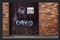
Critique By:
Alicia Popp (K:87532)
3/4/2006 1:27:15 AM
REalmente rústica... excelentes texturas. Felicitaciones!
|
| Photo By: Glenn Morgan
(K:1029)
|
|
|
Critique By:
Alicia Popp (K:87532)
3/4/2006 1:10:41 AM
Me gusta la rusticidad de la imagen, u exclente abstracto!. Felicitaciones!
|
| Photo By: Glenn Morgan
(K:1029)
|
|
|
Critique By:
Gustavo Scheverin (K:164501)
3/4/2006 1:04:55 AM
Muy buenos lo detalles y las texturas.
Felicitaciones!
|
| Photo By: Glenn Morgan
(K:1029)
|
|
|
Critique By:
Gonçalo Franco (K:1773)
3/4/2006 12:53:09 AM
i lilke this
|
| Photo By: Glenn Morgan
(K:1029)
|
|
|
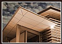
Critique By:
Larry Donnelly (K:644)
3/4/2006 12:42:12 AM
I think this is a cut above architectural shot, like the tone and contrast is gradual, the one hot spot of sun reflection draws your eye back to the building, the angle is neat and you either used wise dof or blurring to make you know its a sky in the back, but doesn't detract from the building. Close to the perfect shot.
|
| Photo By: Glenn Morgan
(K:1029)
|
|
|
Critique By:
Cenk Tuna (K:1015)
3/4/2006 12:34:09 AM
Very nice photo. İf there is no any blur section , it would be more attractive.My best regards
|
| Photo By: Glenn Morgan
(K:1029)
|
|
|
Critique By:
Gonçalo Franco (K:1773)
3/4/2006 12:22:39 AM
interesting!
|
| Photo By: Glenn Morgan
(K:1029)
|
|
|
Critique By:
Cenk Tuna (K:1015)
3/4/2006 12:20:47 AM
Nice colors , nice macro. Best regards
|
| Photo By: Glenn Morgan
(K:1029)
|
|
|
Critique By:
H L (K:11377)
3/2/2006 8:29:02 PM
Glenn, this is simple and effective, I do like the coordination on frame this elements properly.
Great shot!
Cheers,
Harry
|
| Photo By: Glenn Morgan
(K:1029)
|
|
|
Critique By:
brian underdown (K:-960)
3/2/2006 12:15:00 AM
hi glenn, what makes this appealing to the eye is the colour blend any other choice would have produce a bland shot . my only critique which sticks out a mile is the sky and its blending via a layer. it softens the roof edges of the building . also i that overexposed spot becomes distracting. on the whole as i said above the colour really does help for pleasant viewing.
brian
|
| Photo By: Glenn Morgan
(K:1029)
|
|
|
Critique By:
Glenn Morgan (K:1029)
3/2/2006 12:13:56 AM
Hi Mark, Thank you so much for your contstructive comments. Very interesting for all us to get diverse critiques - this is a great idea from usefilm.
I recently bought photoshop CS2 and I might need to tone down my prehaps over zealous first attempts. I am hearing from lots of good comments than somtimes subtle is best.
I am working today but look forward to visiting your site soon
Kind regards Glenn
|
| Photo By: Glenn Morgan
(K:1029)
|
|
|
Critique By:
Glenn Morgan (K:1029)
3/2/2006 12:06:18 AM
Thanks Miranda - I sort of like this one too - good to see differing views. CU Glenn
|
| Photo By: Glenn Morgan
(K:1029)
|
|
|
Critique By:
Mark Longo (K:12760)
3/1/2006 6:21:54 PM
I like the lines, patterns, and eprspectives in this very much. I don't think there are too many lines here. There are some non-parallel lines in there that kind of mess with the apparent perspective, which is interesting.
I like the light flare at the intersection of the roof and wall (I assume that is added?), though it seems like a slightly unnatural location for it. It does call attention to the junction of planes, which is effective, I think.
As purely a matter of taste, I don't like the red tint much, though others will. As a positive, the tint lends it a sort of retro look that seems to go with the architecture (post FrankLloydWright).
Something in the lighting looks unnatural (which might be your intent) but I can't quite put my finger on it. Perhaps the sky wants to be brighter? Perhaps it's the light fall-off to the left side of the roof?
This critique not withstanding, you've shown this architecture to great advantage and I expect the architect would very much like what you have done. Excellent work!
Mark
|
| Photo By: Glenn Morgan
(K:1029)
|
|
|
Critique By:
João F * Photography (K:41945)
3/1/2006 2:01:23 PM
glenn i love this one great compo great light and great tones, well done dear friend.
joão
|
| Photo By: Glenn Morgan
(K:1029)
|
|
|
Critique By:
João F * Photography (K:41945)
3/1/2006 2:00:30 PM
Great job, nice tones, yellow and blue colors a great combination dear Glenn.
regards
joão
|
| Photo By: Glenn Morgan
(K:1029)
|
|
|
Critique By:
João F * Photography (K:41945)
3/1/2006 1:58:55 PM
I lioke it Glenn well done nice tones here.
joão
|
| Photo By: Glenn Morgan
(K:1029)
|
|
|
Critique By:
João F * Photography (K:41945)
3/1/2006 1:58:04 PM
Beautiful light and so wll croped.
have a nice day dear Glenn
regards
joão
|
| Photo By: Glenn Morgan
(K:1029)
|
|
|
Critique By:
João F * Photography (K:41945)
3/1/2006 1:57:23 PM
Nice and well done this dark like night shot composition this is photogrphy...
regatrds dear Glenn
joão
|
| Photo By: Glenn Morgan
(K:1029)
|
|
|
Critique By:
João F * Photography (K:41945)
3/1/2006 1:55:57 PM
Dear glenn, in firt place i want to tell you wow much i apreciate your coments in my photos,and this make me happy because you like it!
In second place i wnt to tell you that i have pass in your all photos here in your portofolio and they are all amazing...i realy fell and like your photos sincerely.Thi one is well composed with so nice tones.
regards
joão
|
| Photo By: Glenn Morgan
(K:1029)
|
|
|
Critique By:
Danny Brannigan (K:19523)
3/1/2006 1:53:40 PM
Good abstract Glenn.Your portfolio is full of good interesting stuff.
|
| Photo By: Glenn Morgan
(K:1029)
|
|
|
Critique By:
Miranda Legg (K:409)
3/1/2006 1:46:02 PM
i think this totally works and disagree that it is too busy...i think the lines are very clean and the cluds are striking yet not taking away at all from the building because of the muted colour of the sky. The flash of light also just adds something special to the picture.
|
| Photo By: Glenn Morgan
(K:1029)
|
|
|
Critique By:
Rashed Abdulla (K:163889)
3/1/2006 11:50:37 AM
very powerful b/w image and with very great contrast,tone and so pleasant to view ,
|
| Photo By: Glenn Morgan
(K:1029)
|
|
|
Critique By:
Rashed Abdulla (K:163889)
3/1/2006 11:49:36 AM
simple yet very interesting with great contrast and details , all of the best my friend.
|
| Photo By: Glenn Morgan
(K:1029)
|
|
|
Critique By:
Glenn Morgan (K:1029)
3/1/2006 2:18:08 AM
Thanks very much for your comments Jeanette and I appreciate eveything you say. Will take your ideas or board for future. Wanted to get a surreal feel to this one rather than just another straight shot. So thats why I altered the colours and focus a bit. I sometimes find including too much or too little to be an issue hard to decide upon...less is more quite often though I guess. Love your work and thanks again. CU Glenn
|
| Photo By: Glenn Morgan
(K:1029)
|
|
|
Critique By:
Bruce Harper (K:5305)
2/28/2006 10:18:17 PM
Very original presentation Glenn, I like it a lot.
|
| Photo By: Glenn Morgan
(K:1029)
|
|
|
Critique By:
Kevin H (K:22502)
2/28/2006 3:10:29 PM
Just an awesome perspectve and you captured it right in this composition. The different lines just brought such interest to me and makes me woder around the picture seeing where these lines guide me. Keep up the good work.
|
| Photo By: Glenn Morgan
(K:1029)
|
|
|
Critique By:
Rob Patrick (K:2177)
2/28/2006 12:39:04 PM
Glenn, outstanding colour and composistion. This is a great photograph! rp
|
| Photo By: Glenn Morgan
(K:1029)
|
|
|
Critique By:
Rashed Abdulla (K:163889)
2/28/2006 12:35:58 PM
wonderful perspective and very powerful details and beautiful colors and contrast here , all of the best my friend .
|
| Photo By: Glenn Morgan
(K:1029)
|
|