|
|
Critique By:
Karin Stenvall (K:426)
11/19/2006 7:58:49 PM
I really like the first pose, it conveys great energy and her face is beautiful. In the other, she is a bit dark under the eyes, I know it's partly because of the light and the angle of her face, but they aren't really that flattering, and her face looks like a little girl's face attatched to a grown-up's body. There's a little paradox there, and it doesn't quite work for me. The posture of the body is great, though.
And I love the wallpaper!
|
| Photo By: Ulrich Lindenthal
(K:36)
|
|
|
Critique By:
Karin Stenvall (K:426)
11/19/2006 7:54:10 PM
This brought a smile to my lips. It's warm humour, and the colours are great, they make me dream of something else than this grey Scandinavian winter.
Is this really a photograph or is it a montage? The bear looks very much as if it has been cut into the picture afterwards, the shadows don't make sense to me and its fur looks a bit odd.
|
| Photo By: Gerhard BuschEFIAP/AFIAP
(K:18382)
|
|
|
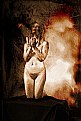
Critique By:
Karin Stenvall (K:426)
11/19/2006 7:44:26 PM
The edges of whatever she is sitting on look odd. I suppose that you tried to make this look like a studio shot, or shot it in a studio but had to clean stuff away?
As you most certainly know, in studio shots things usually have sharp edges, but the blurryness of the edges in this shot isn't at all good. It's not smooth at all, which makes it look really unprofessional.
I like her energy lots, though, it really makes that picture.
|
| Photo By: Paulo Teixeira
(K:1004)
|
|
|
Critique By:
Karin Stenvall (K:426)
11/19/2006 7:39:11 PM
I like how abstract it is; but I think that the colours are just a little bit too bright (and the tone shifts in the upper left corner are a bit too high-contrast to blend into each other) to be elegant. If I were you, I would desaturate it just a notch, perhaps give it a slightly pinkish tint as well. Otherwise, I really like it.
|
| Photo By: Yilmaz Uslu
(K:712)
|
|
|
Critique By:
Karin Stenvall (K:426)
11/19/2006 7:36:28 PM
:'D I almost died. It's gorgeous!
Some of the tones feel a bit flat though.
|
| Photo By: Kevin Greggain
(K:2572)
|
|
|
Critique By:
Karin Stenvall (K:426)
11/19/2006 7:34:40 PM
This is one of the best pictures on usefilm for ages - where is she going? Is she the guide for somebody, or something, in that swampy forest, or is she lost?
To me, she is like the spring in the middle of a dead forest, bringing light into the darkness but at own risk, and a high risk it is to take, too; and at the same time, she is like a princess or a queen entering her realm, bringing deceitful light for the poor lost ones who think of her as a rescuer when she in actual fact will devour their spirit and soul.
It is like a fairy tale, and it's absolutely perfect as it is. Wonderful work. *
|
| Photo By: Kenvin Pinardy
(K:65)
|
|
|
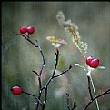
Critique By:
Karin Stenvall (K:426)
11/19/2006 7:29:31 PM
The grey tones in the background look odd and the image itself flat - is this an inbuilt BW-mode or have you converted it afterwards?
But the black figure is still impressing. I can't identify it, which makes me think of it as the goddess of the forest, or a nightmare regaining its shape; it's almost like a bad figure in a fairy tale.
|
| Photo By: Suki Days
(K:1684)
|
|
|
Critique By:
Karin Stenvall (K:426)
11/19/2006 7:19:59 PM
I really like the colours in the picture; they're not that candy bright, and they are elegantly desaturated.
Have you put two pictures together for that texture in parts of the picture? First it looked like spider web, but at second thoughts it can't really be.
I get a nice autumny feeling off it, but not really much more than that. I wish there had been something to provoke the mind.
|
| Photo By: Eligiusz Langner (ennio)
(K:3006)
|
|
|
Critique By:
Karin Stenvall (K:426)
11/12/2006 12:10:40 PM
It looks to me that the grass is sharper than that first kitten and you've tried to get it right digitally - I think it shows, and that's a pity.
|
| Photo By: marek madzo
(K:354)
|
|
|
Critique By:
Karin Stenvall (K:426)
11/12/2006 12:08:03 PM
Finally, something else than these endless images of foreign people and domestic animals.
Contentwise I don't think this has as much to offer as that picture of yours that I commented on recently; but what you have done to it looks just as great.
I just don't think that a great-looking picture is enough.
|
| Photo By: Niels Hansen
(K:293)
|
|
|
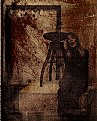
Critique By:
Karin Stenvall (K:426)
11/12/2006 12:02:12 PM
I like this a lot - would you care to share how you've done this?
What I like about it especially much is that this isn't really a "safe" picture to post. It's a bit dirty-looking (not content-wise but just visually, as if you've scratched it and washed it in mud or whatever), and the colours, the scratches, the unidentifiable parts all sum up to a great-looking picture.
|
| Photo By: Niels Hansen
(K:293)
|
|
|
Critique By:
Karin Stenvall (K:426)
11/12/2006 11:55:40 AM
Not sure about that texture, but the colours are wonderful, a bit washed out, and very calm and peaceful. Makes the viewer feel that she, the girl in the picture, is far away, unreachable in a way.
The pose seems odd, makes you wonder why she has her arms crossed over the chest like that because it doens't look quite natural.
But the light that strikes her face is great and without it, this wouldn't be even near the same powerful image as it is now.
|
| Photo By: Agnieszka Borkowska
(K:1427)
|
|
|
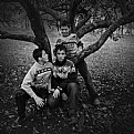
Critique By:
Karin Stenvall (K:426)
11/10/2006 9:08:43 PM
Yeah, agree with Cleveland Smith about the over sharpened bits around the tree, they _are_ rather distracting.
Apart from that, I really like this image and the natural feeling of it; what IS a bit distracting though is that the background is lighter than their faces and draws therefore quite a lot of attention.
Otherwise than that, I have no critique.
|
| Photo By: Olga Marken
(K:11)
|
|
|
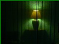
Critique By:
Karin Stenvall (K:426)
11/10/2006 2:03:49 PM
I really enjoyed the colours and the intensity of this particular image.
It's very atmospheric; as if the lovers already have gone to bed but forgot the light on. It's a safety in the dark, a breath of warmth.
|
| Photo By: Nikola Lucic
(K:97)
|
|
|
Critique By:
Karin Stenvall (K:426)
11/10/2006 1:59:54 PM
Oh, they are almost like pearls on a string.. I like the symmetry vs the asymmetry in that the electrical cords are symmetrically put but the birds couldn't care less about with what distance they are sitting from each other.
Or, just as Alan said, they look like musical notes almost.
What I think could improve this image is just a bit more dramatic look to the sky so that it doesn't look so gray and flat.
|
| Photo By: Luca Bettosini
(K:413)
|
|
|
Critique By:
Karin Stenvall (K:426)
11/8/2006 9:38:59 PM
This picture seems to be far too light for the viewer to feel what you want to express - if the picture had been just a bit darker you would have succeeded far better because of the tension added by the shadows.
The colours are nice though.
And there's probably a button for switching off that date down in the corner. It's just distracting and makes your picture look unprofessional.
|
| Photo By: tuhin kar
(K:45)
|
|
|
Critique By:
Karin Stenvall (K:426)
11/8/2006 9:30:25 PM
I don't mind that it isn't sharp, you see a lot of pics like that anyway - I actually would have liked to see more creative blurriness instead. Or, if you wanted it to be sharp - do use a tripod as Brenzef Shopovlev already suggested. This feels just too little - there's too little sharpness for it to be sharp, but there's also too little blurryness to make one feel that it is well-founded.
What I DO mind is, though, that it is over-exposed and another thing that bothers me is that date down in the corner. It draws a LOT of attention for, basically, nothing - what interests people is what you've taken a picture of, not WHEN you took it.
There probably is a button in the menu where you can turn it off. Please do.
|
| Photo By: Amr Hussien
(K:200)
|
|
|
Critique By:
Karin Stenvall (K:426)
11/8/2006 9:26:04 PM
This picture is really heartwarming; the colours, the innocence of it, and Pinocchio's wonderful smile. He really seems to be in motion.
I've actually been thinking of doing something similar with the drawers and the rope of clothing but I never got around to doing anything - I don't think I ever will after seeing this picture, either. It's positive and warm in every way; the room feels safe and secure although Pinocchio's escaping it.
|
| Photo By: WALT MESK
(K:10691)
|
|