Sorry for my Repost - Editing information was not lucky.
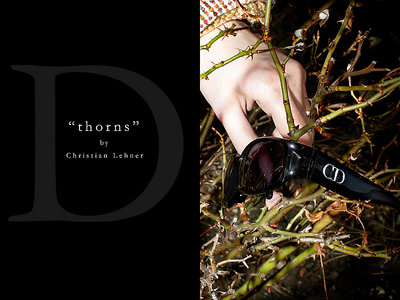
A new attempt do realize a Editoral (Product) shot for sunglasses. Does it work for you? Please let me know your thoughts ! It was intentional to implement no Dior Brand Name on the right top as result of copyright concerns.
Thanks for your words,
Christian
P.S. Sorry to Ken Tinley who has rated this work that good. Maybe you will do it again ?! :)
Kommt in dieser Aufmachung auch sehr gut! Das Bild für sich habe ich ja schon gesehen, aber so als Werbefolder entwickelt es erst die volle Aussage! Prima gelungen!
Yes you'r right - it was my intent to make not a standard "product shot". If this would be my intent I would do it like my "office lamp portfolio". The brightness of the hand is really a concern for me. On one hand it makes this shot to seem more artificial on the ohter it becomes very dominant.
I try to post a second version with a more darker "surface" of the skin - to give the viewers here a chance to decide which version will work better.
thanks for your very helpful and informative words
At first I thought that maybe the glasses don't pop enough for the casual viewer to really pay attention, but this is a different kind of "advertising shot" and the viewer is more encouraged to wonder what is going on. The design is very good. I do think that maybe the hand is a little too bright. I like the little we see of the coat sleeve.