|
|
Mary Brown
 {K:71879} 6/13/2005
|
What magnificant architechture. You have captured and presented it so very well.
Mary
I appreciate your comment on my In Gracious Splendour
|
|
|
|
|
sherif hussein
{K:13815} 6/6/2005
|
Very nice shot with fantastic details and beautiful colours
Sherif
|
|
|
|
 alberto baez duarte
{K:8175} 6/6/2005
alberto baez duarte
{K:8175} 6/6/2005
|
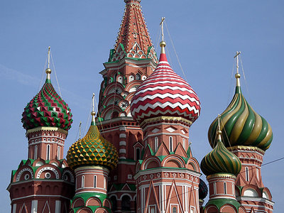
Of course this is the picture I am sure you wanted first...maybe I was wrong in deciding to add first the details of it and kept the full picture for later on....sorry if this didn't match with your ideas....I hope I did it right and uploaded and attached the new picture. If not youl see it tomorrow.
Bye.
|

|
|
|
|
|
Konstantin Yudintsev
{K:3253} 6/6/2005
|
Dear Alberto,
OK. Understood your position and accept it. Although, I can asure of my ability to read carefuly.
Obviously, the image contains a number of pieces, domes and spikes..Amen!
Regards,
Konstantin
|
|
|
|
|
alberto baez duarte
{K:8175} 6/6/2005
|
I could agree with you...but there is one thing you should take notice when you see pictures....you must read the description of the photo....it says : Details of the San Basislio Church.....
and when you take " details " you must agree with me that it means " just part of it " ...details....
Thanks for your comments.
ABD.
|
|
|
|
|
Konstantin Yudintsev
{K:3253} 6/6/2005
|
Dear Alberto,
You're right. One should explain why.
The reason with me is very simple. It lacks basic composition skill. First off, cutting the spike is the mistake because it destroys the composition. It really knocks it down. Otherwise, I'd just skip by. Second, shooting just domes for the sake of domesd is also very boring IMHO. And that's what I see here. I understand, that being in Moscow colours in good weather could be eye catching, but would one want cutting the top of Eiffel Tower?
I know that feelings were hurt but what I say, I say honestly with no malice. I was a little brutal. Next time it could be the other way around. Hope it helps clear the mud.
Regards,
Konstantin
|
|
|
|
|
alberto baez duarte
{K:8175} 6/6/2005
|
It would be better if you explain why it is horrible. I don;t mind if some one doesn't like but wouldn't you think it would be nicer if you explained why..? that would help a lot...
|
|
|
|
|
Konstantin Yudintsev
{K:3253} 6/6/2005
|
Horrible. Sorry.
|
|
|
|
 Khaled Mursi Hammoud
{K:54005} 6/6/2005
Khaled Mursi Hammoud
{K:54005} 6/6/2005
|
I like the clear details and colors of this one.
Thanx for sharing Alberto, regards,
Khaled.
|
|
|
|
 Roberto Baez Duarte
{K:5317} 6/6/2005
Roberto Baez Duarte
{K:5317} 6/6/2005
|
esta muy buena, tanto los colores como el enfoque. lastima que te falto un pedacito arriba y que tenia un cable adelante.
pero esta muy buena.
|
|