|
|
|
Dirck DuFlon
{K:35779} 2/6/2005
|
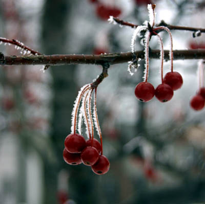
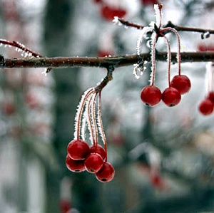
Hi Toni (and Audra again! :) Well, if memory serves (hah!), what I did was to create a duplicate layer, then adjusted the levels on the overlaying layer to bring out the mid-tones a little (where most of the cherrie's red was). I then erased away all the bright areas, such as the ice on the stems, to let the original brightness through from the background layer and not blow out the highlights. Merged the layers together, then did a little more dodgeing on the reds.
Of course, all this was just my interpretation of Audra's excellent image - a different perspective, not a better one! She said it perfectly - hers showcases the richness and depth, mine the 'crispness' and pop of color.
You are absolutely right about the difference in monitors, too, by the way - what looks just right on my home PC looks dark on my monitor at work!
|
|
|
|
Antonia BauerleinSehnert
 {K:30599} 2/5/2005
|
Hey Audra, I've never tried messing with White Balance...now it's next on my list...thanks! Antonia
|
|
|
|
|
Antonia BauerleinSehnert
{K:30599} 2/5/2005
|
...and you know the color of the berries as you saw them, so the next iteration by Dirck might not be realistic for you. This happens to me...I lighten something, put it up, and then someone comments it's dark...lol. One thing I have figured out through comments is that people have their monitors adjusted to different brightness, and that effects how they see things. I've had comments that things were too dark and for the life of me couldn't imagine why... In those cases, it's likely a difference in monitors. One of my favorite features here is the ability for people to show me what changes they have in mind and tell me how they did it. Then I immediately see what they are driving at. It is also a compliment to your image that people take the time. This really is such a lovely capture!
|
|
|
|
 audra erin
{K:3837} 2/5/2005
audra erin
{K:3837} 2/5/2005
|
oops..heh...I just realized you were asking Dirck what HE did to this image..not me...sometimes it's hard to tell because it just lands in my email as a comment...I didn't recognize the name..thought it was a typo...sry.
But well since I'm here..That IS waht I did...it was alot darker and less contrasty when I first
pulled it onto my computer...so to me...by comparison..it lookes pretty damn good. ;0)
|
|
|
|
|
audra erin
{K:3837} 2/5/2005
|
Hey Toni...I took this into PS and worked with the colors..added a little red to the shadows
then messed with the White Balance..and contrast to give it a pop...thanks I'm glad you like it!
|
|
|
|
|
Antonia BauerleinSehnert
{K:30599} 2/5/2005
|
Hey I stopped back by and had fun reading the comments...so true about nudity..it cracks me up to see the views fly with no comments...but I don't mind. Though I liked the image very much to begin with, I really like what you did for the color, Dirck, and I'm curious about how you went about it.
|
|
|
|
|
Ferdinand
{K:3516} 2/3/2005
|
A beautiful world, yes. The ice on the stems is remarkable. Brilliant photo.
|
|
|
|
|
audra erin
{K:3837} 2/3/2005
|
no not at all!
I actually like them both...mine is rich..yours is crisp...making it a little lighter really brought out the reds..looks sharper too...nice..thanks!
|
|
|
|
|
audra erin
{K:3837} 2/3/2005
|
You know....this CAN be a rather sexy shot...depending on how one views it..... :0)
|
|
|
|
|
audra erin
{K:3837} 2/3/2005
|
well thank you!
|
|
|
|
|
audra erin
{K:3837} 2/3/2005
|
Oh thank you!
such a great comment!
|
|
|
|
|
Dirck DuFlon
{K:35779} 2/3/2005
|
This is quite beautiful, Audra - I love the detail of the ice crystals on the stems and the way they pick up the light! The color palette being limited to the reds, grays and whites - repeating as they fade into the background - gives this some great impact, too!
It seems a little dark to me - I hope you don't mind my taking a stab a 'punching it up' a little?
|

|
|
|
|
|
Jim Gamble
{K:12164} 2/3/2005
|
I understand what ya mean, sex sells, and gets views here too.
I like this shot, good DOF.
Jim Gamble
|
|
|
|
 Peter Daniel
{K:33866} 2/3/2005
Peter Daniel
{K:33866} 2/3/2005
|
Wonderful Photograph Audra, Great colors, clarity and Composition.
Thanks for sharing?
Peter Daniel
|
|
|
|
|
Francisco N-G
{K:28728} 2/3/2005
|
...at least you are a woman, female's work have a lot more comments and views than males; it would be interesting to run a correlation study in similar pictures by gender against the number of views/comments/ratings. Just an idea for a sociological study. :-)
Oh, my main reason for clicking was to congratulate you in the beautiful capture of your frozen world. I like the contrast of colours and the DOF. Keep the good work.
|
|
|
|
 Paul Lara
{K:88111} 2/3/2005
Paul Lara
{K:88111} 2/3/2005
|
A nice shot...I think. It's too small to see the fine detail of the ice crystals, Audra.
|
|
|
|
|
Michael Alexander
{K:5293} 2/3/2005
|
It?s always nice to discover another Detroiter here on usefilm. This is a nice shot, I?ve got some similar shots I took yesterday but nothing worth posting.
And you are absolutely right about getting more views with some skin, I agree.
~Mike
|
|
|
|
 Mark Julian
{K:36866} 2/3/2005
Mark Julian
{K:36866} 2/3/2005
|
Yes my dear, you're getting a handle on how things work around here (wait till I switch back to my travel shots soon). This is very nice and a good idea. Love the shallow D O F. Very nice job. Mark
|
|
|
|
|
Antonia BauerleinSehnert
{K:30599} 2/3/2005
|
no views? Sometimes it takes awhile ... but I'm here!!!! And I love the view. Beautiful piece of life. Wonderful wonderful... great use of DOF. The frost on the stems is delightful. Antonia
|
|
|
|
|
audra erin
{K:3837} 2/3/2005
|
Thanks Evelyn!
|
|
|
|
|
audra erin
{K:3837} 2/3/2005
|
Well.... when theres a shot of a person unclothed
( attractive or not..heh ) it'll get like 100 views in an hour.... but stuff like this..well...
|
|
|
|
 Jim Budrakey
{K:24393} 2/3/2005
Jim Budrakey
{K:24393} 2/3/2005
|
This is very nice but I don't understand the title.
|
|
|
|
|
Evelyn Mayes
{K:8132} 2/3/2005
|
Love the backlit ice on the stems! Very pleasing colors and composition.
|
|